This post will take you through the RWD Berlin Number Nine Grid & Flex exercise step by step.
Here are the starter files. Please drag the project folder onto the Atom icon in your dock.
Make a new index.html file and a new styles.css file. Don’t forget to connect the stylesheet to the index page.
Start With The Markup
When making any HTML page, start by marking up the content. Before you write any CSS, make sure that your HTML makes sense to search engines and screenreading software for the blind.
This means choosing appropriate HTML5 tags.
Conversely, don’t obsess about the semantics unduly: many times, what to use is a judgement call.
Give the document a title like Berlin | Number Nine. The idea here is that you have a site name (our imaginary site being called Number Nine, and something page-specific, Berlin).
If you look at the Desktop screenshot, you’ll see that there are three main blocks to the document, so add them into the HTML, after the opening BODY tag.
<header class="site-header"></header>

<main class="gallery"></main>

<footer class="site-footer"></footer>
The Site Header
The site-header has three visual blocks:
- the site name
- the site logo image.
- the “hamburger menu” icon and the search icon
I would mark them up like this:
<header class="site-header">
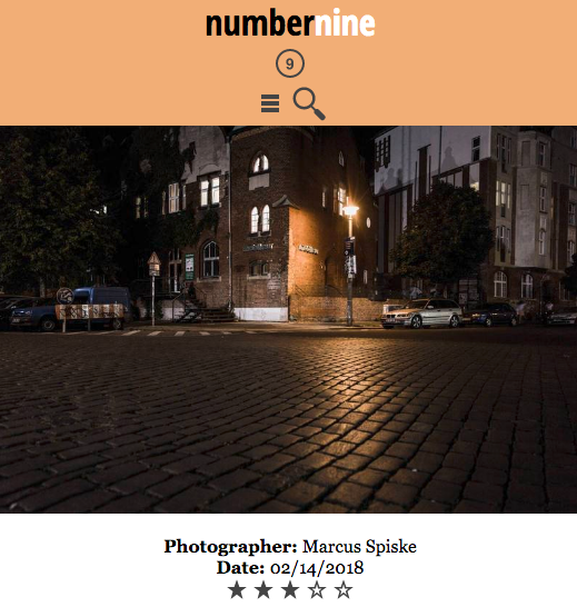
<h1>number<span>nine</span></h1>
<div class="logo">
<img src="icons/png/number9.png" alt="Number 9">
</div>
<div class="hamburger-search">
<img src="icons/png/hamburger.png" alt="Menu">
<img src="icons/png/search.png" alt="Search">
</div>
</header>
The reason I have put the span inside the H1 is that we will eventually need to make one word a different color. So the span is purely for styling purposes, in other words.
The icons for search and the hamburger menu would presumably be wrapped in anchor tags, but we’ll leave that for now.
The Main Area
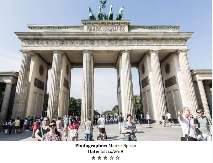
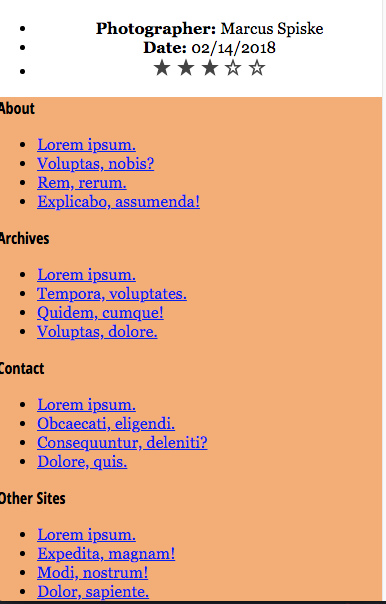
Inside the MAIN area are 11 boxes, each with an image, a photographer credit, a date, and a star rating. The text and star ratings are identical, but this is just a mockup. Presumably we would use varying data in testing.
Here’s a look at one of these boxes:
I would probably use a DIV rather than an ARTICLE for each of these boxes (reasoning that the content isn’t complete enough to quality as an independent article), but that might be a judgement call.
Here’s the first markup I would apply to this content:
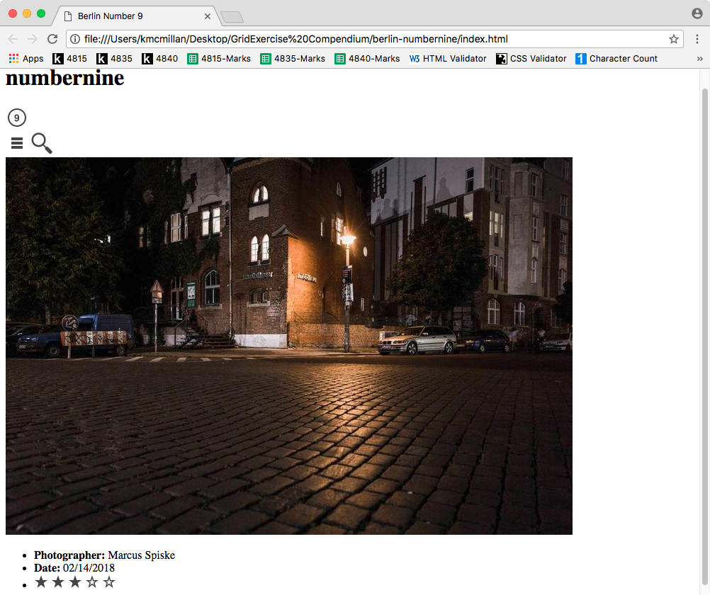
<div class="image-box">
  <img src="berlin-images/landscape/berlin-01.jpg" alt="Berlin at night">
  <ul class="photo-meta"></ul>
</div>
The idea is that I’ve got two main content chunks in each .image-box: the photo itself and the accompanying data about it.
That data I would probably mark up as a list: after all, it’s a collection of information about the image.
I definitely wouldn’t use paragraphs for that data because the content is not a collection of sentences. Using a LIST is also appealing from an authoring perspective, because it makes the code much easier to read than if each piece of data were a DIV.
In other words, here is how I would continue the markup:
    <div class="image-box">

      <img src="berlin-images/landscape/berlin-01.jpg" alt="Berlin at night">

      <ul class="photo-meta">

        <li class="photo-credit"><b>Photographer: </b>Marcus Spiske</li>
        <li class="photo date"><b>Date: </b>02/14/2018</li>
        <li class="photo-rating">
          <img src="icons/png/star.png" alt="star">
          <img src="icons/png/star.png" alt="star">
          <img src="icons/png/star.png" alt="star">
          <img src="icons/png/star-outlined.png" alt=" ">
          <img src="icons/png/star-outlined.png" alt=" ">
        </li>  <!-- end .photo-rating -->

      </ul> <!-- end .photo-meta -->

    </div>
I’m also not using heading levels here: this content doesn’t seem to me to be a subheading of anything.
When choosing classes, consider prefixing them with something that describes their use. By repeating the word photo in the classes above, we make it easier to mentally connect the CSS we will write with the elements we’re styling. Having a worked-out class naming convention also makes it easier to guess what styles you might have employed in your markup.
Finally, note the empty ALT value for the empty stars. The idea is that this information is purely visual, so describing it might be more confusing to a screenreader than having nothing at all. This practice of using an empty ALT for purely decorative images, incidentally, is a long-accepted practice
Save the file and test the page in a browser. We’re going to copy the .image-box, so we should make sure it’s actually working before we replicate it.
Once you’re sure it’s working, copy it and paste it ten times.
That will leave us with 11 image-boxes in the MAIN area.
On to the footer.
The Site Footer
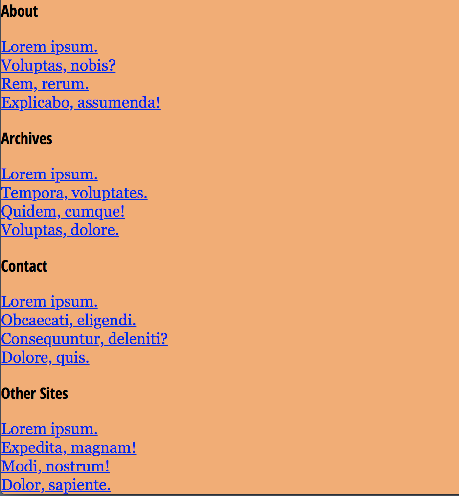
In this layout, the footer is where we find most of the site navigation.
You can find the text used in the footer in the file called the-main-text.html Or just copy it from here:
About

Lorem ipsum.
Voluptas, nobis?
Rem, rerum.
Explicabo, assumenda!

Archives

Lorem ipsum.
Tempora, voluptates.
Quidem, cumque!
Voluptas, dolore.


Contact

Lorem ipsum.
Obcaecati, eligendi.
Consequuntur, deleniti?
Dolore, quis.


Other Sites

Lorem ipsum.
Expedita, magnam!
Modi, nostrum!
Dolor, sapiente.
Put that text into the .site-footer.
In the screenshot it looks like this:

So we see four groups of links, each with a titling element of some sort. I would mark it up like this:
- a single NAV around all four boxes
- a div to function as a title for each menu part
- a list for each of the four menu parts
- anchor tags around the text inside each list item
- a DIV around each “title” and “menu part” combination
And here’s the code. Mark up yours.
<footer class="site-footer">

    <nav class="site-navigation">

      <div class="menu-submenu">

        <div class="menu-title">About</div>

        <ul>
          <li><a href="#">Lorem ipsum.</a></li>
          <li><a href="#">Voluptas, nobis?</a></li>
          <li><a href="#">Rem, rerum.</a></li>
          <li><a href="#">Explicabo, assumenda!</a></li>
        </ul>

      </div> . <!-- end .menu-submenu -->

      <!-- three more menu-submenus ommitted for brevity -->

   </nav>

</footer>
Styling The Document: Mobile First
The first style we write, as always, should be the responsive images code:
/* RESPONSIVE IMAGES =====================  */
img {
  max-width: 100%;
  height: auto;
}
Test your page. If the images don’t shrink when you scale the page, make sure you’ve connected the stylesheet, and used the correct path.
This style does most of the heavy lifting of our phone layout.
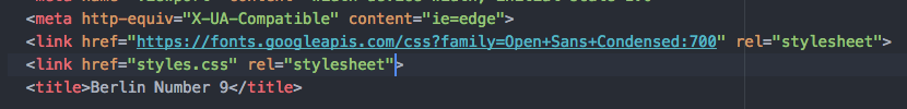
Next, go to Google fonts and get the code link for Open Sans Condensed at the 700 weight only.
Paste that code into the HTML of your document, above the link to your own stylesheet:
Add the following styles:
body {
  text-align: center;
  font-family: georgia, times, "times new roman", serif;
  margin: 0;
  padding: 0;
}

.site-title,
.menu-title {
  font-family: "open sans condensed", "arial narrow", sans-serif;
  font-weight: 700;
}

.site-header, .site-footer {
  background-color: #F3AE72;
}

.site-footer {
  text-align: left;
}
On the body we remove margin and padding to make the content go right to the edge of the browser window. There we also set the default font for the document.
Next we set the two uses of Open Sans Condensed, and give the same background-color to the header and footer.
Because most of the text in the document is centered, I put that property on the body so it would apply to everything and then set the text-align in the site-footer back to the default left.
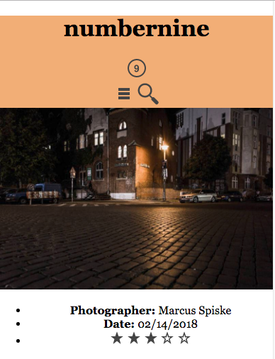
This is what the top looks like now:
And here is what the bottom looks like:
Obviously, the space above the header needs to be zeroed out. To figure out what is causing that space, use the Inspector to navigate up and down the document tree. Eventually, you will click on the H1 inside the .site-header in the Inspector. At that point, the Inspector will look like this:
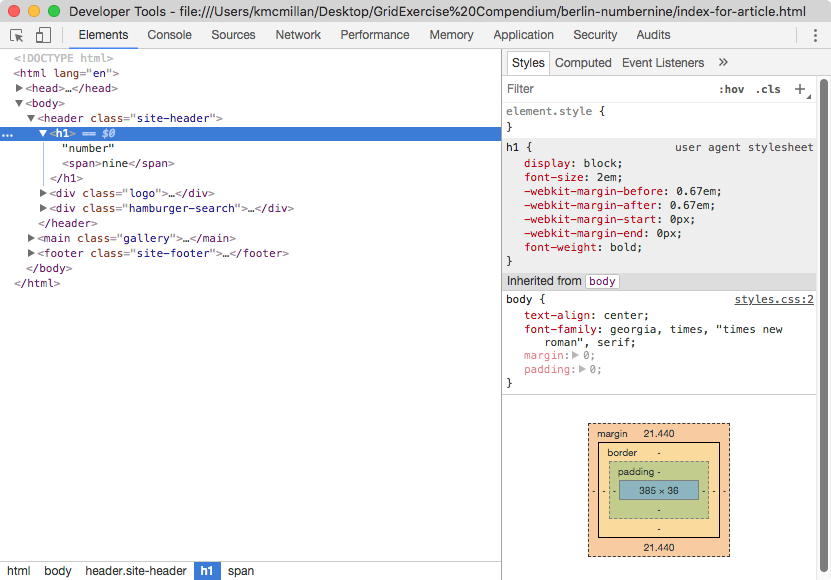
Both the user agent stylesheet section in grey (which shows the browser defaults) and the box model diagram show what’s causing the problem: the h1’s default margin.
To fix that, add the following styles:
.site-title {
  margin: 0;
}

.site-title span {
  color: #fff;
}
Test the page. That space should now be closed up (and the second word will now be white, too).
Sometimes, I will make my style going from the top of the HTML to the bottom.
Other times, I’ll take care of the broad strokes first. Going in that direction this time, let’s take care of the annoying dots on the LISTs in the main and footer areas.
/* MAIN =================================== */

.image-box ul {
  list-style-type: none;
  padding-left: 0;
  margin-left: 0;
}

/* SITE FOOTER ============================ */

.sub-menu ul {
  list-style-type: none;
  padding-left: 0;
  margin-left: 0;
}
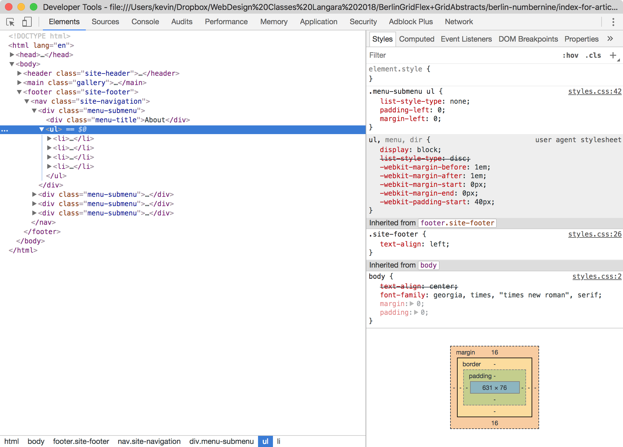
This is what we’re left with:
And this is what the bottom looks like:
The layout screenshot has the submenu title in black, the submenu links in white, and the space between each submenu and its title removed.
To take care of the first two of those characteristics, add the following to your styles:
.menu-title {
  color: black;
}

.menu-submenu a {
  color: #fff;
}
How to clear up the space between the title and the submenu? Inspect.
Again we see that there is a default margin, this time on the UL.
So add margin-top: 0 to your .menu-submenu ul style.
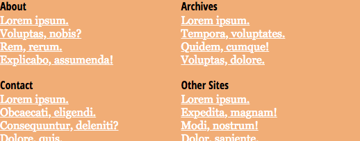
And the result is this:
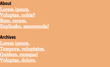
Header and Footer Layout
The Footer
Look again at the header and the footer in the screenshots you downloaded.
At phone size, the footer items are 2 x 2.
At all sizes, the header items are arranged in a single row.
Let’s do the footer first. The 2 x 2 equal-spaced layout immediately suggests Grid.
Remember, of course, that Grid is about how parent elements arrange their children.
If we want to arrange the submenu items in the footer, in other words, we need to set the .site-footer nav as the grid parent.
.site-navigation {
   display: grid:
   grid-template-columns: 1fr 1fr;
}
Here we are making two equal-width grid columns.
All we need to do now is pad the footer or the NAV a bit, so that the menus are not touching the edge of the browser window.
Here I’m adding some padding to the NAV: 2rem on top and bottom and 2% on left and right.
.site-navigation {
  display: grid;
  grid-template-columns: 1fr 1fr;
  padding: 2rem 2%;
}
The Header
Now let’s tackle the header.
Open the screenshots. We see that the header layout is the same across the responsive states.
A short description of the header layout: a single row, with the elements spaced out equally from left to right with any extra space to the left or right of the center element.
We could do this with Grid, but it’s easier with Flex.
First, set the header to be a single non-wrapping row.
.site-header {
  display: flex;
  flex-flow: row nowrap;
}
This produces this layout:
Almost done. Now space the elements out:
.site-header {
  display: flex;
  flex-flow: row nowrap;
  justify-content: space-between;
}
Is it perfect? No, not yet.
Problem 1: Unequal Spacing
The main problem here each child element of the header is a different width, and the “space-between” justification just distributes the extra space equally to all three children. To make the spacing equal, we just need to set the flex-basis of the 1st and 3rd element the same.
At the same time, I would decrease the .site-title (h1) size a bit, and make sure that each of the three children have the desired text-align values:
- .site-title: text-align: left
- .logo: text-align: center
- .hamburger-search: text-align: right
.site-title {
font-size: 1.25rem;
left-align: left;
}

.logo {
  text-align: center;
}

.hamburger-search {
text-align: right;
}

.site-title,
.hamburger-search {
  flex: 1 0 40%;
}
The rationale of what we’re doing here: if we make item 1 and item 3 start at 40% (the same width, in order words: the flex basis), the extra space is distributed equally, so the logo DIV ends up in the middle.
The overlooked part in this kind of this is the text-align of the elements. If it’s not clear, add a different background color to each of the three children of the .site-header to see how the boxes are behaving.
Now we can remove the diagnostic background-colors.
Problem Two: Vertical Alignment
The next thing for us to fix is the vertical alignment of the elements in the .site-header.
Put simply, they aren’t vertically aligned.
First let’s add a bit of padding so the elements are not touching the edges of the browser window:
.site-header {
  display: flex;
  flex-flow: row nowrap;
  justify-content: space-between;

  padding:1rem 2%;
}
The padding moves the elements away from the edge nicely:

But the elements are still not quite vertically centered.
Fortunately, flex has another useful property: align-items.
When we are in row orientation (flex-direction, or flex-flow), justify-content arranges things horizontally.
When we are in column orientation, justify-content arranges elements vertically.
What align-items does is take care of the so-called cross-axis. All you need to remember here is that align-items takes care of the axis that justify-content is not applied to.
If that is confusing, about 10 or 15 minutes playing Flexbox Froggy will refresh your memory.
So amend your .site-header style to control the align-items property.
.site-header {
  display: flex;
  flex-flow: row nowrap;
  justify-content: space-between;
  align-items: center;

  padding:1rem 2%;
}
In this example, the effect is subtle.
However, if you inspect the .site-header and in the Inspector, toggle the .align-items property on and off, you will see the site-title move up and down.
Now we’re on to our bigger layouts. Having followed the Mobile First methodology, this will be a breeze.
The Medium and Large Size Layouts
Examine the screenshots again.
At the medium size, the images-boxes go 4 per row.
( The special treatment of items 1 & 2 we will get to shortly. )
Time for a couple media queries:
@media screen and (min-width: 480px) {

  main {

    display: grid;
    grid-template-columns: 1fr 1fr 1fr 1fr;
    /* this could also be done as
      grid-template-columns: repeat(4, 1fr);
    */
    grid-gap: 1rem;
  }

  .site-navigation {
    grid-template-columns: repeat(4, 1fr);
  }

  .image-box {
      border: 1px solid black;
  }

}

@media screen and (min-width: 800px) {


}
And that’s it, we’re almost done: mobile first gives you great bang for the design buck.
We could (should) do a bit more tweaking of the typography (and make the star images a bit smaller), but I’ll leave that to you.
Our Last Tweak: the First Two Image Boxes
If we have a bunch of identical elements on a page, one way to select individual items is to use classes.
Another powerful way is to use the nth-of-type pseudo-class. You’ve already used pseudo classes if you’ve ever styled a:hover.
To see what I mean, modify your queries to target the first image, and then also the second one:
@media screen and (min-width: 480px) {

  main {

    display: grid;
    grid-template-columns: 1fr 1fr;
    grid-gap: 1rem;

    max-width: 1600px;
    padding: 1rem 2%;

}

  .site-navigation {
    grid-template-columns: repeat(4, 1fr);
  }

  .image-box {
      border: 1px solid black;
  }


  .image-box:nth-of-type(1){
    grid-column: span 4;
  }


}

@media screen and (min-width: 800px) {

  main {
    grid-template-columns: repeat(4, 1fr);

  }


  .image-box:nth-of-type(1),
  .image-box:nth-of-type(2) {
    grid-column: span 2;
  }


}
If you’re wondering how I chose the breakpoints for the above queries, I just resized the browser while the inspector was open: that will show your screen size in the top right corner.
Since our images are only 800px wide, for example, we had to make sure that our wide breakpoint came no later than 1600px. Otherwise the grid gap would appear to get bigger as the page got bigger than 1600px (when the images were two abreast).
Finally, when the images are two-abreast, their contain can’t get wider than 1600px (or we’ll run out of image: the box will get bigger, but the image won’t).
So add a max-width to your MAIN element to prevent that from happening.
I also added a tiny bit of padding to that element in the first query.