In this exercise, you will make a MOBILE-FIRST layout using Grid and Flex.
The first step in the mobile-first method is realizing that by default most elements are already mobile friendly (as long as we scale our images).
For that reason, we should put any styles that are common to all our responsive states in the main part of the stylesheet, but put the code for the wider breakpoints into min-width-based media queries. Each successive breakpoint will build upon the previous ones. This way, we do not need to “unbuild” for different breakpoints.
First, please download the starter files. Once the zip archive is unpacked, open it as a new project in your editor (likely Visual Studio Pro).
Make a new index.html file, with a new styles.css file connected.
Ignore the Instructions file that is in the downloaded file. Please consult the screenshots, however.
There are three different responsive views: narrow, medium, large.
Any sans-serif type is the google font open sans condensed.
The stars are images. If we have gone over icon fonts in class, use icon fonts for the interface graphics. Otherwise, use the supplied images, including the stars, the “hamburger” menu icon, and the search icon..
Narrow View
To save space, I have included here only the top and bottom of the phone view, first the top then the bottom. As noted, I have also included screenshots in the files you downloaded: please open them so see what I am describing here.
The important thing to recognize in this view: most of the content is a single-column text-centered layout.
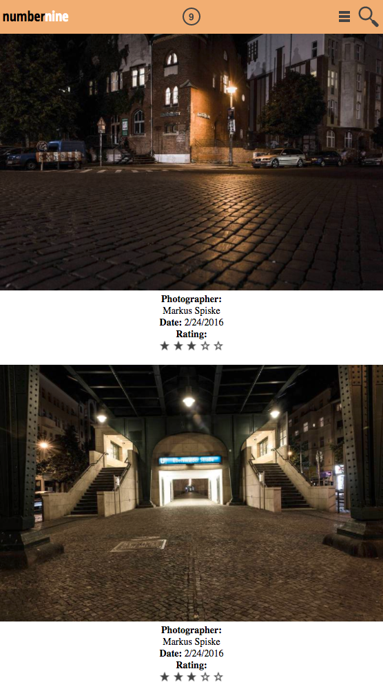
And here’s the bottom:
At this width, the footer menus are 2 x 2.
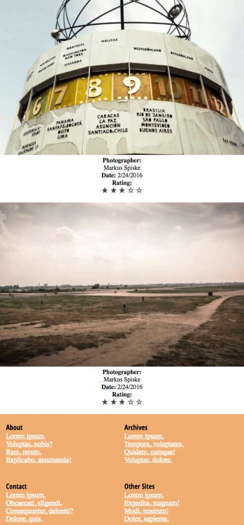
Medium View
In this view, the layout of the main content changes from the typical single-column phone view to multi-column. The first image box takes up 100% of the main content container.
The footer also changes from being two-column, to being four-column.
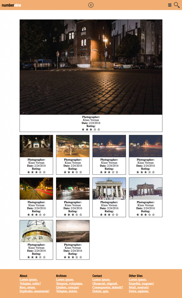
Wide View
And finally, the full desktop view. The only difference is that now our layout has the first two image boxes taking approximately 50% of their container.
About The Breakpoints
I am not giving you the responsive breakpoints. Test the page by resizing the browser window. You decide where the layout needs to change.
Obviously, you want to avoid layout issues like this:
The HTML
In our index.html file, put the three main content containers: header, .gallery, and footer.
Build The Header
The header has three separate child areas:
- the logo text (h1)
- the logo image
- the menu and search icons.
These three boxes could be all DIVs, or you could just style the H1 directly, and use two DIVs for the other elements.
The key here is that we will use these boxes to space the elements out via CSS.
To put the images where we want them to be in each box, we will use the TEXT-ALIGN property on each box. Images are inline elements: they behave like words in text, lining up beside each other automatically. This makes them respond to TEXT-ALIGN (when it is applied to their parent element.)
Now build the rest of the document.
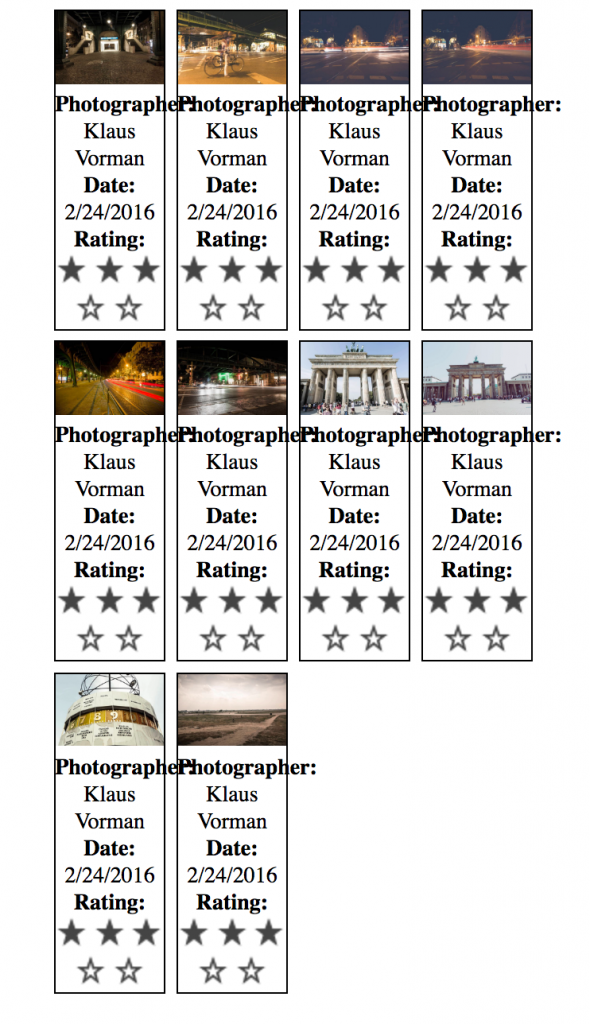
All images used in exercise © Markus Spiske / raumrot.com