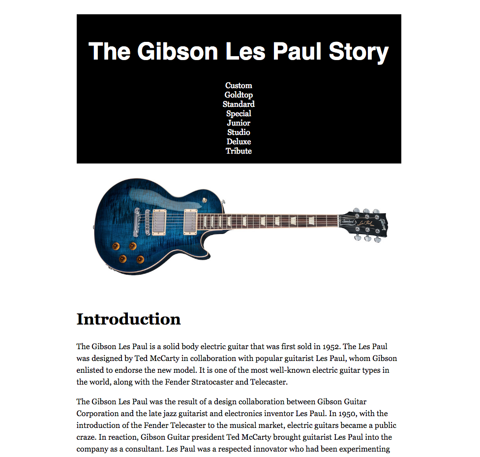
For this exercise, we are going to make a website that looks like this:
Please download the necessary image and text files. Unzip the file and then rename the folder to yourname-gibson-gallery. Inside this folder is an images folder, and a textfiles folder. Inside the text files folder are six text files.
The text for the index page will come from the introduction-text.txt file.
Make an index.html file and save it in the top level of the site. Inside the index.html file, insert the HTML skeleton template by pressing ! tab (exclamation mark then tab).
If you’re using Atom, you must have the Emmet package for this to work: instructions on how to install that are here, if you need them. If you are using Visual Studio Code, Emmet is built in.
Once you’ve done that, copy into the index.html the text from the introduction-text.txt file. Make sure that you paste that text between the body tags. Give the page a TITLE of Gibson Les Paul World: Home. The title is in the HEAD area of the HTML skeleton file you made in the previous step.
Make a new folder called models inside the main folder. Make five html files inside the models folder. Each one will correspond to the other text files: goldtop.html, custom.html, junior.html, special.html, and standard.html.
Copy the respective text into the new html files. Give each page a title of Gibson Les Paul World: Model Name ( example: Gibson Guitar World: Custom ). For the index page, put Home instead of the model name.
Make a HEADER section
Now let’s add some content to the index file: a main heading and a menu for the site.
Above the copied text, but below the opening of the BODY tag, insert an h1 with the text The Gibson Les Paul Story inside it.
Then below the H1 make an unordered list (ul). Each item inside a list must be marked up with an li. Make the first of these LIs. Inside this new LI put the word Custom. Then wrap the word custom in a link to the page custom.html. Make sure that the link a tag is around the word, but inside its parent LI element.
For the href attribute for the link, remember that the custom.html file is inside the models folder, and you are editing a file (index.html) that is outside that folder.
Once you’ve done that, test the link.
If it works, copy the LI and paste it inside the UL seven times, leaving us with a menu of eight items.
Finally, change the text of each link so that the model names are
- custom
- goldtop
- standard
- special
- junior
- deluxe
- studio
- tribute
Make sure that the first five menu items link to their respective pages.
Because I haven’t included text about the last three models, make those links have the just the # symbol for the href value. This works as a test link: it will look like a link, but won’t go anywhere when clicked.
Two New Tags: Nav & Header
Two tags introduced with HTML5 are the nav and header tags.
Nav
The nav tag is meant for significant menu areas. So wrap your UL in a NAV tag. Make sure that the opening nav tag is before your opening ul, and that your closing nav tag is after your closing ul tag.
The purpose of a nav tag is to signify to search engines and to software that assists the visually impaired that this is a navigation menu. It also gives us a unique tag hook for styling, which we will get to shortly.
It’s important to note, however, that the nav tag does not need to be used with all links: just the significant link collections like a menu.
Header
The header tag signifies a main banner area of a page. It can also signify the main “top” area of some other elements, but ignore that for now: its most common usage is for the top area of a page, which will typically repeat from page to page in a site. When we start styling the page, we will be able to visually turn the header element into a distinct part of the site look.
In our header area, we will put the h1 and the nav. So select the h1 and the nav and wrap a header tag around them. You will have, in other words, a header tag with an h1 and a nav inside it.
For readability of your code, make sure that your opening and closing nav, ul, and header tags are all on their own lines.
Format The Copied Text
Make the first line of the copied text in each document be an H2.
The rest of the copied text needs to be marked up as paragraphs. Use your editor’s multiple cursor functionality for this.
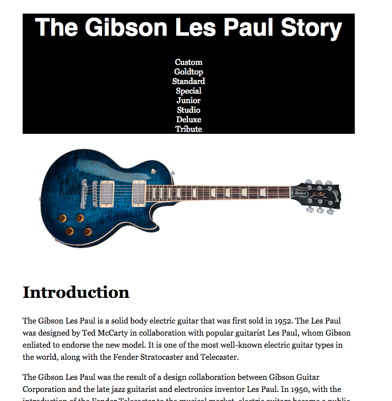
Add an Image
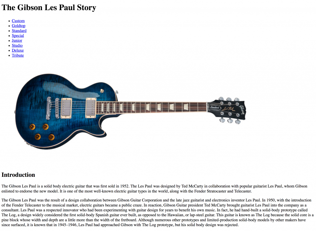
After the end of the header and before the h2, put in an image. For the index page, use the file entitled standard-cobalt-blue.jpg.
Test your page. At this point, it should look like this:
Make a Stylesheet. Link it to the Home Page
At this point, we have all or most of the content we want for the home page. Let’s now work on styling it.
Make a new file and save it as styles.css in the top level of the project (ie on the same folder level as the index.html page).
In this file, we will put all the information the browser will need to style the content of the page.
Inside the head (not the header: the head) of the index page (generally after the title), type link and press tab.
The line of code that’s produced tells the browser to look into an external file for instructions on how to format the page.
For the href value, put the path to the styles.css file.
Because that file is in the same folder as the file we’re editing (index.html), the path is just the file name: styles.css.
(Later when you connect the other pages to the stylesheet, the path will change, because of the way we’re organizing the files in our site).
Test Your Stylesheet
CSS (Cascading Style Sheets) syntax goes like this:
selector {
  property: value;
  property: value;
  property: value;
}
A selector is any element you want to style (for example, the h1 or p tags, or classes, or a number of things).
Let’s make our first css rule.
In an age of responsive design, this rule should go in all your sites.
I always make it first, but I typically put it at the bottom of the stylesheet because once I make it I never need to change it. Anyway, press Return to go down a few lines and then add the following:
img {
  max-width: 100%;
  height: auto;
}
Test your page. Make the page wider or narrower. Notice what happens to the image: it shrinks as its parent element (in this case the body) shrinks, but never gets bigger than its own 990px width.
NOTE: If we changed max-width to just width there, the image would potentially get bigger than its own 990px width (if its parent element got bigger than 990px). That, of however, would degrade image quality because the image would be scaled beyond its native resolution.
This max-width style, then, should be included in practically any stylesheet you write.
CSS Comments
Add a comment above the img style.
Even though the comment code is different, if you’re using ATOM or Visual Studio Code, the keyboard shortcut for a css comment is the same as that for an HTML comment: command-/ (command slash, control-slash on a PC).
/* Responsive Images: With this code, images will never get bigger than their parent elements. As their parent elements shrink, images will shrink. Using max-width means that images will not grow bigger than their own innate dimensions. */

img {
  max-width: 100%;
  height: auto;
}
Typographic Styles
Font Family
Now let’s style our type.
Near the top of the stylesheet, make a comment like this
/* Typography ================================ */
The “====” part is just to create a dividing line.
In other words, this comment here is just to create easily-scanned sections for our stylesheet, so we’re organized when we edit. The browser ignores comments in your html, css, or javascript.
After that comment, though, make the following values (to better commit these patterns to memory, type the code yourself rather than cutting and pasting):
html {
  font-size: 16px;
}
body {
  font-family: georgia, times, "times new roman", serif;
}

h1 {
  font-family: helvetica, arial, sans-serif;
  font-size: 2.5rem;
}

h2 {
  font-size: 1.5rem;
}

p {
  font-size: 1rem;
  line-height: 1.5;
}
Test your page (reload it if its still open in the browser). If you don’t see any changes, make sure that your html and css files are saved. Then check the path again if it’s not working.
You should now see much more readable type.
By giving the body a font declaration, we have set the font-family for every element on the page. Then we overruled that with a more specific selector, by stating that H1 elements would have a sans-serif font stack.
So why did we choose the fonts we did? The idea here is that we are choosing fonts likely to be on our users’ computers. By specifying a number of fonts and then ending in a generic category like serif or sans-serif, we are setting preferences for our content rather than absolute requirement.
In other words, if the user’s computer does not have georgia, it will try to use times. If it doesn’t have times, it will try to use times new roman. If it has none of those fonts, it will fall back to a generic serif.
To find which font stacks are common out in the real world, go to CSS Font Stack.
Line Height
The other important css concepts in this typographic section are line-height and the use of REM units.
Line-height is simply leading (or line-spacing, if you prefer): the height of the line the type sits in.
Typically, we will use line-height without a unit of measure. If our line-height does not have a unit specified, the value is interpreted as a multiple of the font-size of the element it is applied to.
So in the paragraph style we’re currently using, the line-height value of 1.5 equals 1.5 x the size of the paragraph font-size.
The advantage of not using a unit with line-height is that this will make the line spacing always relative to the type size. If we change the type size, we typically don’t need to then change the space the line sits in.
Rem Units
Similarly, the REM unit stands for root ems. Items specified in REMS are calculated as a multiple of the value of the HTML tag font-size (default or explicitly declared). The ROOT element in any html document, in other words, is the HTML tag right after the Document Type Declaration.
To see what I’m getting at here, edit the style for the html element, setting the font-size set to 20px. Notice how all your type then grows?
The advantage here is that once we set up a typographic hierarchy among our various elements, we can adjust all our type sizes for the whole page by changing that one value. In this way, we can change our font-size for different screen sizes without disrupting our typographic proportions (but we can do that, too, if we need to, just by changing the REM value of individual elements).
Set the HTML font-size back to 16px. This is a typical browser default value for the HTML element, but it does not hurt to specify it explicitly. I would probably increase that size to 18px, though, to aid readability.
HTML Sectioning
Remember how we wrapped the H1 and the NAV elements in a HEADER tag?
Make a style for that element, along with a comment starting our LAYOUT BLOCKS section:
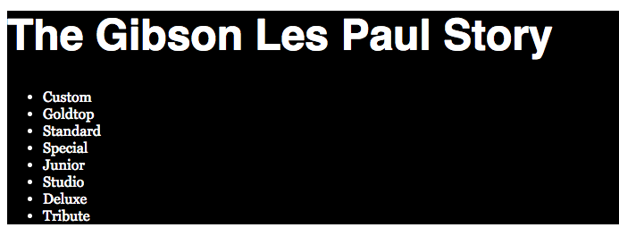
/* Layout Blocks ============================== */
header {
  background-color: black;
  color: white;
}
Test your page. This illustrates a stylistic advantage of nesting elements. By setting the background color of the header element, its two children (the h1 and the nav) then have black backgrounds.
Overriding Browser Defaults
You’ll no doubt have noticed, however, that only the h1 type went white: the links stayed blue.
The reason for this is that most browsers style links blue by default.
We can, of course, overrule almost any browser default.
Make a new section in your stylesheet:
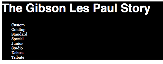
/* Menus & Links ============================= */

header a {
  color: white;
  text-decoration:none;
}
Test the page. The header area should look like this:
Our links are now white and have no underlining.
In this code, we have used Descendent Selectors. Specifically, we are styling the anchor tag, but only when it appears inside a HEADER.
We have, in other words, told the browser that all links in the header will be white.
Descendent selectors, in short, allow us to be very granular in our styling.
More Menu Modifications
A menu is a list of choices, so it makes complete sense to have marked it up as an unordered list.
However, we typically remove the dots in our menu lists. To do that, add the following code.
nav ul {
  list-style-type: none;
}
Test the page. The list dots should now be removed.
Notice, though, that the space where the dots normally sit is still present. That’s a browser default. Let’s get rid of it. Most browsers use the css box model property of padding, but a few older ones use margin, so we typically set both to zero on this element.
nav ul {
  list-style-type: none;
  padding: 0;
  margin: 0;
}
Of course, our links are now touching the edge of the header box. Let’s fix that. Add the following text-align declaration to the header style:
header {
  background-color: black;
  color: white;
  text-align: center;
}
Test the page: the header area isn’t perfect yet, but we’ve now centered all the text inside the header element.
We will come back to this area, after we make a more significant change to our layout.
Two More Sectioning Tags: Article & DIV
Wrap the content after the header in an article tag. In other words, just before the img tag and just after the last p tag, there should be the respective opening and closing article tags.
The article tag is meant to signify a complete piece of content. Think of what the word would signify in a magazine: a complete story. On the web, think of the type of content that is commonly shared.
We won’t style that yet, but we’ll keep it in anyway: this signifies to the search engines that this content is a semantic unit.
Now, though, we are going to add another tag: DIV. This one has no semantic value, but it is very useful for styling. It stands for division.
Specifically, add the following to your HTML. We are going to wrap in a DIV all of the content inside the BODY. The DIV here, in other words, allows us to group the header and the article into a single component.
</head>
<body>

<div class="wrapper">

   <header>
     ...content omitted...
    </header>
    <article>
      <img src="images/standard-cobalt-blue.jpg" alt="LP Standard">
      <h2>Introduction</h2>
      ...content omitted...
    </article>

</div>

</body>
</html>
The use of the CLASS attribute is another way we can style in a very granular way: we can have multiple DIVs (or other elements) and style them differently with the use of classes.
To style a class, make sure that its selector in the stylesheet begins with a dot (only in the css, not in the html attribute value).
In the layout section of your stylesheet, then, add the following:
.wrapper {
  max-width: 660px;
  margin: 100px auto;
}
Test the page. We should see the content starting 100px down from the top of the screen, with 100px below the content.
With two values are used for margin, the first value is used for top and bottom, while the second value is used for left and right.
The use of auto for margin-left and margin-right, then, makes the wrapper div center in the window if the page is bigger than the wrapper.
This technique (left and right margin values of AUTO) is very useful: it always centers a block element in its container.
Your Task: Complete the Site
Now make the all the other pages in the site look the same as the home page. You’ll need to connect the stylesheet, add the images, and modify the HTML a bit. Make sure that all pages have both menus—and that the links are correct.
Once you’ve done that, move on to part two of this exercise, where we will improve our menu and do a bit more with classes.