By the end of part one of this exercise, we had made a basic but usable website.
The main things we did to ensure a workable site were the following:
- Setting up responsive images. By making an img style of max-width:100%; height: auto, we made the page much more fluid than it would otherwise have been. All the images in the site are 990px. Our responsive images code means that the images are allowed to shrink if their parent element shrinks. Without that code, the page would never adapt to phone or tablets, some of which are as narrow as 320px. This responsive images code should be included in every site you make.
- Limiting the line-length of all our content. We did that by wrapping all our content in a DIV. We styled that DIV with a class attribute. Class attributes are like styles we make up the names for (as opposed to styling pre-existing elements like p, h1, ul, li, etc). In our style for that “wrapper” div, we again used max-width. In this case, we chose a max-width value that would limit the paragraphs to a readable length. To illustrate, consider the difference between width:660px and max-width:660px. The first declares that the element must be exactly 660px. The second states only that the element can never get bigger than 660px. That means it can shrink, which is of prime importance with responsive web design.
- Maximizing white space. We did this by increasing the line-height of our type. As well, by giving our “wrapper” DIV a margin-right and margin-left value of AUTO, we centered our main content block. This is a very useful technique.
These are probably the most important techniques in that part of the exercise, so if any part doesn’t make sense, please get me or an Instructional Assistant, if we have one, to go over them.
Now let’s see what we can do to improve the site.
Phrasing/Inline Elements
Open up the index page and look at the first paragraph. Perhaps we want to add some visual emphasis to some of the words. For example, the three guitars named — Gibson Les Paul, Fender Stratocaster, and [Fender] Telecaster — could be italicized.
HTML has two ways of italicizing: the i tag or the em tag. Both will look the same. The difference however, is that the i tag is only visual, whereas the em tag also provides semantic emphasis.
For example, consider a sentence like “My all-time favorite novel is Crime and Punishment.” The phrase “all-time-favorite” would have emphasis: we would speak with a a different tone. The name of the novel, in contrast, is italicized only by visual convention. We aren’t emphasizing the title.
The b (bold) and strong (bold emphasized) work the same way.
Anyway, in the first paragraph, wrap an i tag around the first use of the phrase Gibson Les Paul and another one around Fender Stratocaster and another one around the word Telecaster.
Similarly, at the end of the next paragraph, wrap an i tag around the phrase The Log.
To illustrate the other use of italicized text, add the following sentence as the last paragraph in the article:
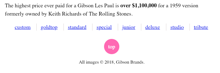
<p>The highest price ever paid for a Gibson Les Paul is <em>over $1,100,000</em> for a 1959 version formerly owned by Keith Richards of The Rolling Stones.</p>
In this case, use the em tag around the value of the guitar: here we want to emphasize semantically, not just visually distinguish, the words—because that is an insane amount of money to pay for a guitar. A screenreader for a blind person would use a slightly different tone to convey the sense of emphasis here. A search engine will also presumably treat semantic emphasis differently from visual emphasis.
The elements we are using here (the em and i tags) are called phrasing elements. They are also commonly referred to as inline elements.
The important distinction with inline elements is that they appear typically within sections of text or other block elements. Unlike block elements like paragraphs, headings, lists, list items, etc, they do not take up the full width of their container, and do not start on a new line.
Why this is important will become clearer in the next section.
Menu Modifications
We made some modifications to the menu in the last exercise. Specifically, we
- Removed the dots. We did this by declaring list-style-type: none; in our NAV UL style. The reason we use two tags here is to limit the styling to ULs only within NAV elements. ULs outside NAV elements will still have their default dots.
- Cleared the space reserved for the dots. Browsers use box model properties to reserve space for the dots (or numbers, etc). Most use padding, but a few older ones used margin. To clear that space, we set margin and padding to 0. (It would be enough, actually, to set padding-left and margin-left to 0 rather than apply it to all sides).
- Centered all the text. By setting text-align-center on the HEADER element that contains the h1 and the nav, we centered all the text in the top “banner area” of the page.
Display Property Tweaking
For a quick discussion of what we will do in the next section, please watch this short video on the Display property.
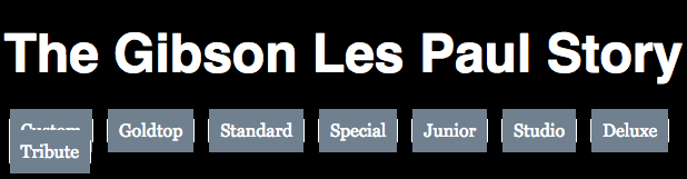
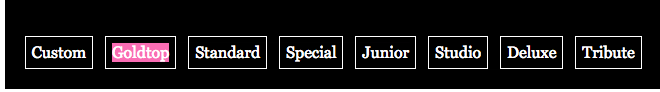
Referring back to the discussion of inline and block elements, modify your NAV UL style to have a background-color of hotpink.
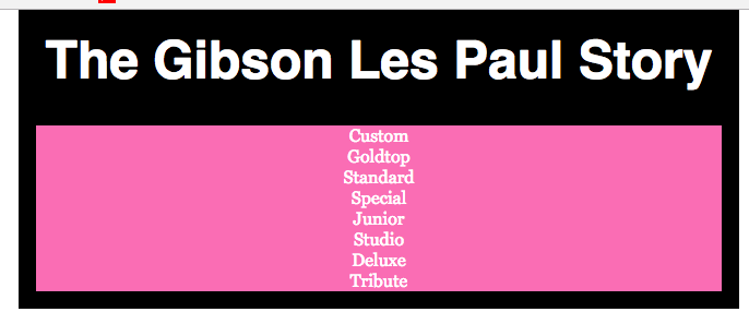
This shows us that a UL is a block element: it takes the full width of its container: here it is going all the way to edge of the header (the header is padded a bit, though).
Now add a pink (not hotpink) background-color to the NAV LI style. If that style doesn’t exist, make one. Also put two pixels of margin on the NAV LI.
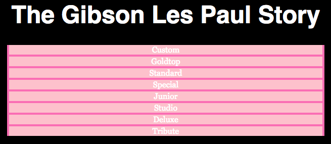
This demonstrates that an LI is also by default a block element. It takes up the full width of its container. We are seeing the hotpink on the NAV UL because of the margin we put on the NAV LI.
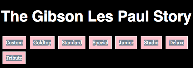
Finally set the NAV A style to have a background-color of slategrey.
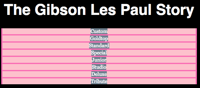
This demonstrates that an a tag is an inline element. It takes up only the width of its content (the word or words in the link, in other words).
The reason why this is important is that we can modify all this default behaviour through the use of the DISPLAY property.
Turn an Element From Block to Inline
Modify your NAV LI style by adding display: inline to it.
What this does is make your List Items (the ones inside NAVs, that is) behave as inline elements. In other words, they are now behaving like text, flowing from left to right beside each other.
To illustrate this further, make the browser window narrow and you will see the LIs flowing to the next line like text.
Remember that we centered all the text in the header, which is why the LI items are appearing not left-aligned. If we temporarily remove (or better, yet, comment out) the header style’s text-align:center; declaration, the LIs will be left-aligned.
At this point, let’s do a bit of housekeeping, cleaning up things we were doing for diagnostic purposes.
- Add back in or uncomment the Header’s text-align:center declaration.
- Remove the hotpink background-color from the NAV UL declaration.
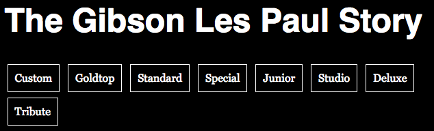
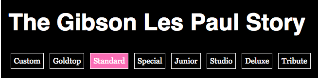
Now give the NAV LI style this declaration: border: 1px solid white. This will be the result:
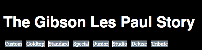
So our LIs now have a border, and the background-color is being supplied by the child a elements (the links) inside the LIs.
Our next thing to fix should definitely be the fact that the link text is touching the LI borders.
There are a number of ways we might attack the problem, but we’ll typically be adjusting padding or margin on various elements.
First we’ll try a few solutions that will fall a bit short.
Padding on the LI Elements
Add 10px of padding to the NAV LI elements. Here is the possibly unexpected result:
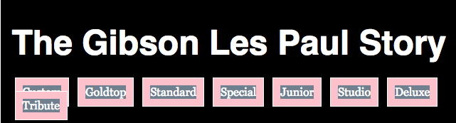
Two problems are immediately evident:
- the link text background-color doesn’t go to the edge of the LI
- wrapped LIs are sitting on top of the previous line.
Problem One: the first effect is created by the LI padding “pushing” the start of the A element box ten px in from the edge. In other words, the link does not start until 10px inside the LI box.
Problem Two: the second problem occurs because when we added padding to the LIs we increased their width and height. However, because we set them to be inline elements, they behave like text and the line-height of that text is all the vertical space the box has.
So the LIs are now sticking out of the “track” created by the line-height.
This will not work, in other words.
Padding on the A Elements
Remove the 10px of padding from the NAV LI style and put it on the NAV A style. This will be the result:
Upon testing, we’ll realize we’ve created similar problems.
Turn an Element From Inline to Inline-Block
Here is the beginnings of a fix: change the NAV LI element’s display property from inline to inline-block. Move the 10px of padding from the a element back to the nav li element. Here is the result:
This fixes the overlapping problem. The NAV LI now is not tied to the line-height: it behaves like it’s inline (by going left to right), but also like a block element in that the padding increases its available height.
There’s only little problem however.
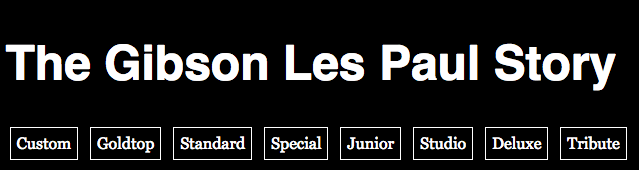
If we now remove the diagnostic background-color declarations from the NAV LI and A styles, it will look like we have created nice buttons for our menu.
To make them all go on the same line at full page width, I will reduce the padding from 10px to 6px.
That’s nice, but mouse over a button just inside the border (so that you’re over the button but not over the text). What you will see here is that the link doesn’t trigger until you’re over the text.
This will look even worse if we add the following style right after our a style: nav a:hover {background-color: hotpink;}
Because the link is an inline element by default, the hover effect is going only as far as the text.
The solution?
Turn An Element From Inline to Block
A block element takes up 100% of its container.
That is exactly what we want to have happen with the link: we want the link’s “live area” to extend to the edge of the parent LI and the hover effect to be triggered immediately when the cursor is inside the LI box “button” .
To do that
- add to the NAV A style this declaration: display:block
- move the padding from the LI style to the NAV A style (so that the padding is inside the A, not outside it as part of the parent LI’s box model properties).
Hover over one of the LIs to see the result:
A Bit More Fun
For a bit more fun, add the following to the NAV A style: transition: background-color .35s;
Test it: you will see a smooth transition in your background colors when you hover over the link.
Things For You to Figure Out
- Make the text of the first paragraph of each page be 1.25rem. All other paragraphs need to be 1rem.
- Make the first paragraph of each page be italicized without adding either an i or em tag. This will be a CSS solution. You will likely need to google this one.
- On every page except for the index page, make the H1 a link back to the home page (we don’t need the home page to have a link to itself).
- Make that link change background color on hover.
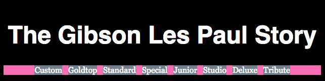
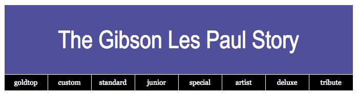
- Make that link take the full width and height of the area above the nav menu, like in the screenshot below. The link, in other words, needs to trigger any time the user hovers over the area above the NAV element (not just the words The Gibson Les Paul Story.
Don’t worry about making the nav menu spacing exactly the way it is in the screenshot, though. There are much better ways than using inline-block to get pixel-perfect alignments. We will encounter a number of them in later class exercises.
Additional Things to do
In addition, please do the following. You will probably need to google one or two things.
- add a footer as the last HTML element inside the .wrapper div.
- into that footer, copy the top nav menu. Make sure that all the links on all the pages work.
- add a small tag, with All images © 2018, Gibson Brands as the text in it. The small tag is for things like legal notices (ie fine print).
- add a working link back to the top of the page.
- style these elements as closely as you can to the style below.
- on hover, make the back-to-top link change to the same blue background color you made the h1 change to on hover.
Finally…
If you are at Langara, please make sure that the project folder is named yourname-gibsongallery, then zip it and hand it into our BrightSpace course.
If you are at Emily Carr, please make sure that the project folder is named yourname-gibsongallery, then zip it, and hand it into our Moodle course shell.