The Menu
To get the menu working for the way it is in the Phone view layout ( 2 buttons per line ), we have a number of options. We could use
- display: inline-block on the LI elements
- display: grid on the NAV UL element
- display: flex on the NAV UL element
The first method works in even the oldest browsers, which is an advantage, but it’s very fragile: white space in the markup can break it.
That leaves grid or flex. We could do it with either.
Regardless of whether we’re using GRID or FLEX, though, remember that each display mode concerns the relationship between parents and children.
If we have not learned FLEX yet, please build this menu with Grid.
Add the following to your stylesheet:
nav ul {
  list-style-type: none;
  margin: 0;
  padding: 0;

  display: grid;
  grid-template-columns: 1fr 1fr;
  grid-gap: .5rem;
  text-align: center;
}

nav a {
  text-decoration: none;
}
Test the page:
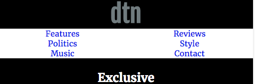
This works, but you’ll notice that you have to mouse over the actual words in the menu to find the link.
To fix that, let’s modify the nav a style, turning it to a block display, adding some padding, and adding a background to show the edge of the box we’re creating:
nav a {
  text-decoration: none;
  display: block;
  padding: 1rem 0;
  background-color: #eef;
  color: black;
}
Display:block makes the link take up the full width of the container LI. The padding on the link makes the active area of the links (illustrated by the background-color) bigger.
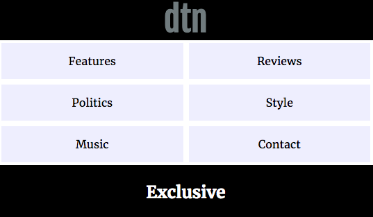
That’s our menu working in phone view. There are of course a number of different ways to build it though. The key is that if you’re comfortable with box model properties and the grid and flex display modes, you can build practically anything.
Note: if you know Flex, this menu could be built just as easily with that DISPLAY property method.
The Gallery
The screenshot for the Mobile view shows that the Around Our City gallery consists of three rows of images with three columns.
.section-around-our-city {
  display: grid;
  grid-template-columns: 1fr 1fr 1fr;
  grid-gap: 2%;
}
Here we’ll use grid.
With this code, we are creating a grid with three equal columns and specifying 2% of space between the columns and rows.
Test the page. The initial results might be disconcerting:
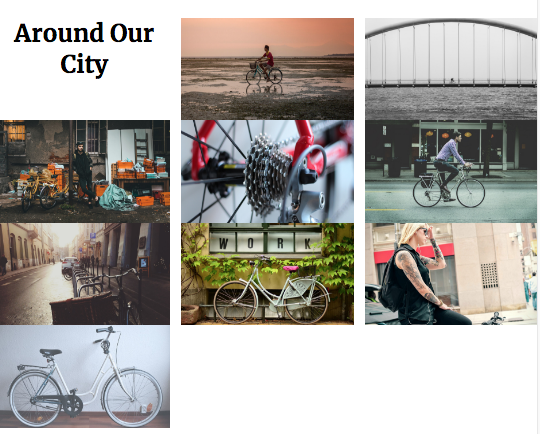
Two problems are evident:
- The grid-gap isn’t working between the rows
- The around-our-city section heading is jammed into the first grid column
Both issues are easy to fix.
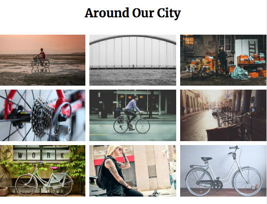
Let’s start with the grip-gap problem.
When we try to use percentages on the vertical axis (in many different contexts, not just grid layout), it can be very unpredictable, so change the grid-gap value to a value like .5rem. Non-percentage horizontal widths can often affect our layouts (depending on what methods we are using), but the nice thing about GRID is that this display mode was designed precisely to take care of the math for you. In other words, with GRID, the browser will subtract the space required by the grid-gap.
For the second problem, the issue with the section-title h2, we just need to make sure that it spans all three columns (ie: the entire first row).
There are several ways this can be done in grid. In a style target the .section-title of the .section-around-our-city section, and use one of the options below.
( Note that we don’t need to specify the row here: the element is already placed there by virtue of its location in the HTML ).
.section-around-our-city .section-title {
  /*  USE EITHER */

  grid-column-start: 1;
  grid-column-end: 4;

  /*  or */

  grid-column: 1 / 4;

    /*  or */

  grid-column: 1 / -1;

    /*  or */

  grid-column: 1 / span 3;
}
The options in the style above work out as follows:
- Longhand: grid-column-start and grid-column-end explicitly stated
- Shorthand v1: grid-column-start and grid-column-end combined in property (grid line 1 to grid line 4)
- Shorthand v2: 1 = first grid line in row / -1 = last grid line in row
- Shorthand v3: 1 = start at first grid line in row / span 3 = “go three more lines”
Whichever option you use here, this should be the result:
The Site-Footer
Now, the site-footer.
Open the file logos.ai in Adobe Illustrator. If this is an Emily Carr class and you don’t have access to Illustrator, skip this section.
There are six logos in six artboards.
We will here export them as SVG: to do so, open up the Asset Export palette from the Window Menu.
Then drag one logo at a time into that palette. Name each asset: in order of artboards, they are: sass, atom, wordpress, javascript, css3, and html5. This will make the filenames easier to work with.
Make sure that there is only one image format being exported: SVG.
From the options menu in the top corner of the palette, you can turn off Create Subfolders if you want. That will stop the program from creating a subfolder for each image format exported, which will shorten your image paths.
Select all six logos in the Asset Export palette: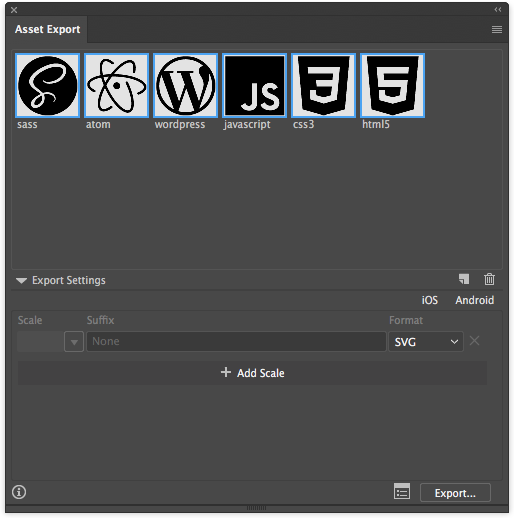
Then click the EXPORT button. Save the images into images/logo (you’ll have to create the logos folder as part of that process).
Marking Up the Site-Footer
There are tons of ways one might mark up the content in the site-footer. Here’s how I might do it:
<footer class="site-footer">

    <p>

    <span>DTN Magazine is made with:</span>

    <span class="site-footer-logos">
        <img src="images/logos/html5.svg" alt="HTML5" title="HTML5">
        <img src="images/logos/atom.svg" alt="Atom" title="Atom">
        <img src="images/logos/javascript.svg" alt="Javascript" title="Javascript">
        <img src="images/logos/sass.svg" alt="SASS" title="SASS">
        <img src="images/logos/wordpress.svg" alt="WordPress" title="WordPress">
        <img src="images/logos/css3.svg" alt="CSS3" title="CSS3">
    </span>

    <span><small>© 2018, Langara College</small></span>

    </p>

</footer>
My reasoning here is that it’s just one long sentence. SPAN elements are like inline DIVs: they have no default appearance other than being inline. But because they are inline by default, it is valid HTML to put them inside a paragraph.
If that doesn’t make sense, don’t worry at this point. There’s lots of other ways you could mark this up. Three DIVs would work.
Utimately, I’m doing to make the SPANs behave like DIVs by giving them display: block declarations anyway.
Test the page: the logos are huge. This is because SVG images are vector elements: as such, they have no resolution, so they expand to fix their containers.
To fix that just give a size to them. Add to the stylesheet in the LAYOUT section something like the following code:
.site-footer {
  text-align: center;
}

.site-footer span {
  display: block;
  margin: .5rem 2%;
}

.site-footer img {
  max-width: 24px;
  height: auto;
  margin: 2px
}
Test your page. For the most part, our phone view is done.
And now we’ll move on to our media queries.