Our next task is to make the layout work at other sizes.
To do that, we will use one or more media queries to deliver additional styles for larger screens.
Choosing Responsive Breakpoints
Often I will guess at a breakpoint or two, and then modify them later. Another approach is to open the Inspector and then resize the page. That will cause the browser to display its dimensions in the upper right corner.
Doing this and looking at the flow of type makes me think that the paragraph lines are getting a bit long starting at between 660px and 700px.
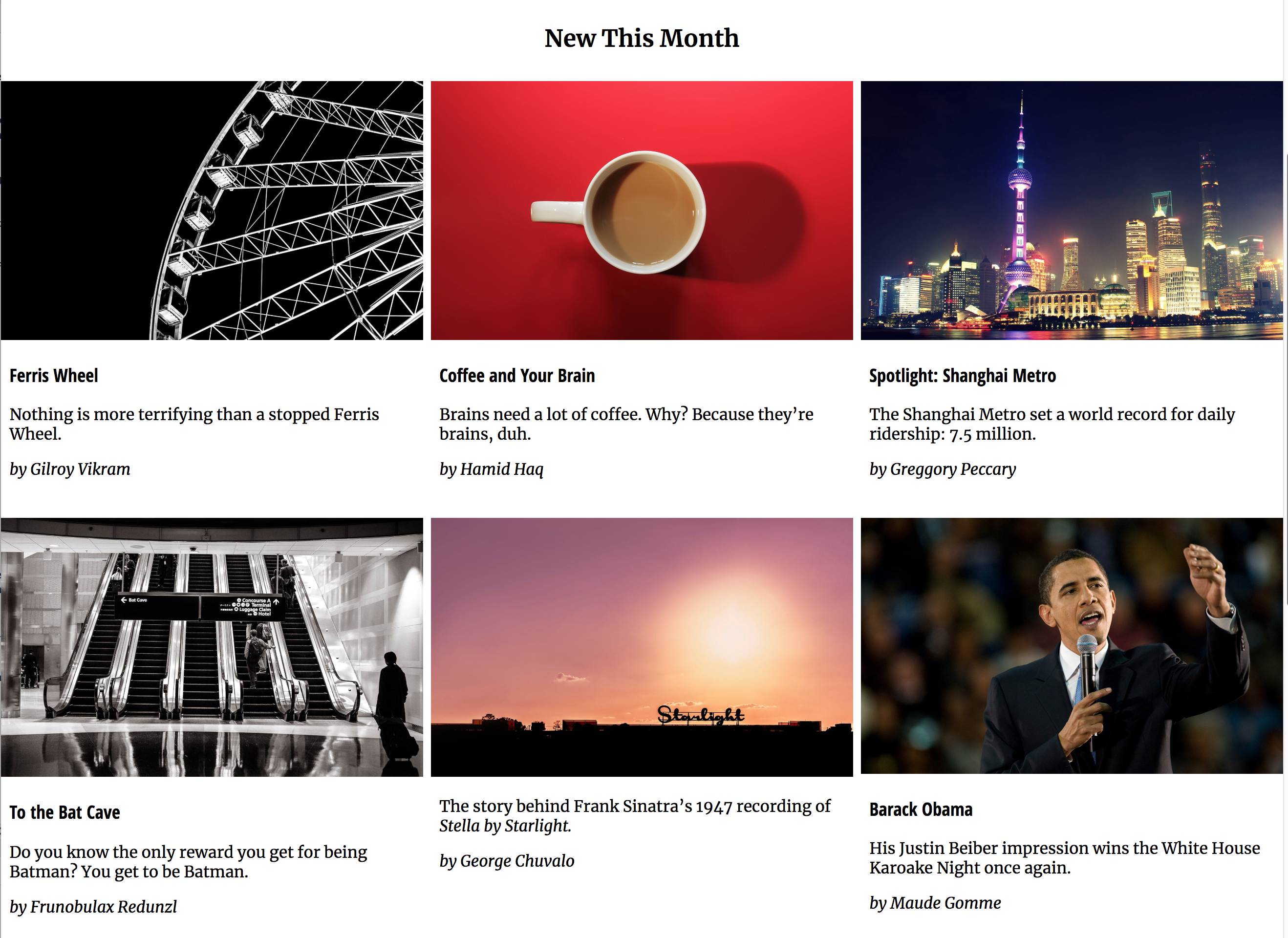
We’ll split the difference for our first breakpoint. Here I want to arrange the New This Month section into two rows of three equal columns.
The Feature section will have the same grid, but the content will be arranged differently across it.
Add the following CSS to your stylesheet:
/* MEDIA QUERIES ======================================= */

@media screen and (min-width: 680px) {

  .section-feature,
  .section-new-this-month {
    display:grid;
    grid-template-columns: 1fr 1fr 1fr;
    grid-gap: .5rem;
    background-color: orange;
  }

}
Test your page. The New This Month section looks good, but it has the same problem the Around Our Town gallery had: the section-title is taking up only one column, when we need it to span all three columns in the first row.
The same thing is happening in the FEATURE section, too, but there’s an additional problem there that we will get to shortly.
First, though, lets make both section-headers span their entire rows. Add this inside the query:
  .section-feature .section-title,
  .section-new-this-month .section-title {
    grid-column: 1 / span 3;
  }
And here are the results: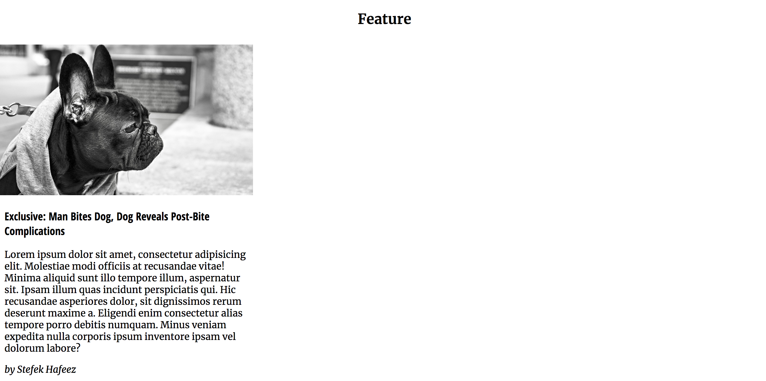
A Very Useful Tip
HINT: another useful way thing you can do with grid is to “count” from either side of the grid. If a grid-column value has a negative in front of it, it means the column line count is being done from the right side.
So if write
grid-column: 1 / -1;
it means cover the full row, starting at the first grid line on the left and continuing to the first line of the right. In other words, this will always make the styled element take the entire row.
Some Troubleshooting Needed…
The New This Month section works great, but what’s up with the Feature section?
Well, remember: grid is a Relationship Between Parent and Children. If we look at the code for the Feature section, what we did earlier might not work, because the FEATURE section has only two children:
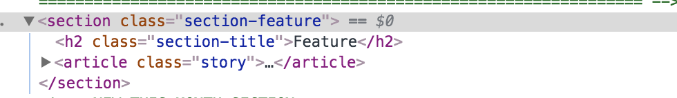
Here is the HTML for the article inside the FEATURE section: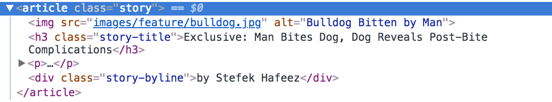
In other words, we actually don’t need to turn the .section-feature into a grid. Instead, we need to turn its descendent article into a grid.
So change your query section to this:
@media screen and (min-width: 680px) {

  .section-new-this-month {
    display:grid;
    grid-template-columns: 1fr 1fr 1fr;
    grid-gap: .5rem;
  }

  .section-new-this-month .section-title {
    grid-column: 1 / span 3;
  }

  .section-feature .story {
    display: grid;
    grid-template-columns: 1fr 1fr 1fr;
    grid-gap: .5rem;
  }

}
/*  End 680px query */
This gets us closer.
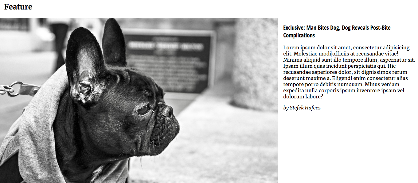
However, we need to bundle up the text inside that article so that it can be treated as a single child of the article (with the image taking two columns, and all the text combined taking one column).
Right now, the article has four children.
Instead, we want it to have two.
So change the HTML to this, wrapping a DIV around the .story-title, p, and .byline:
<section class="section-feature">
<h2 class="section-title">Feature</h2>
<article class="story">
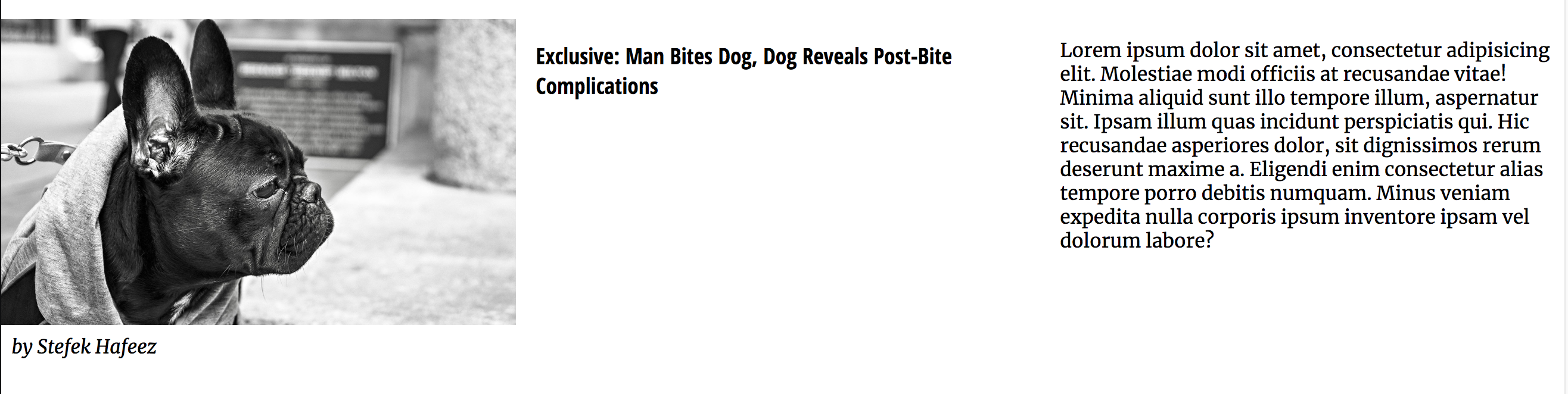
<img src="images/feature/bulldog.jpg" alt="Bulldog Bitten by Man">
<div class="story-text">
<h3 class="story-title">Exclusive: Man Bites Dog, Dog Reveals Post-Bite Complications</h3>
<p>Lorem ipsum dolor sit amet, consectetur adipisicing elit. Molestiae modi officiis at recusandae vitae! Minima aliquid sunt illo tempore illum, aspernatur sit. Ipsam illum quas incidunt perspiciatis qui. Hic recusandae asperiores dolor, sit dignissimos
rerum deserunt maxime a. Eligendi enim consectetur alias tempore porro debitis numquam. Minus veniam expedita nulla corporis ipsum inventore ipsam vel dolorum labore?</p>
<div class="story-byline">by Stefek Hafeez</div>
</div>
</article>
</section>
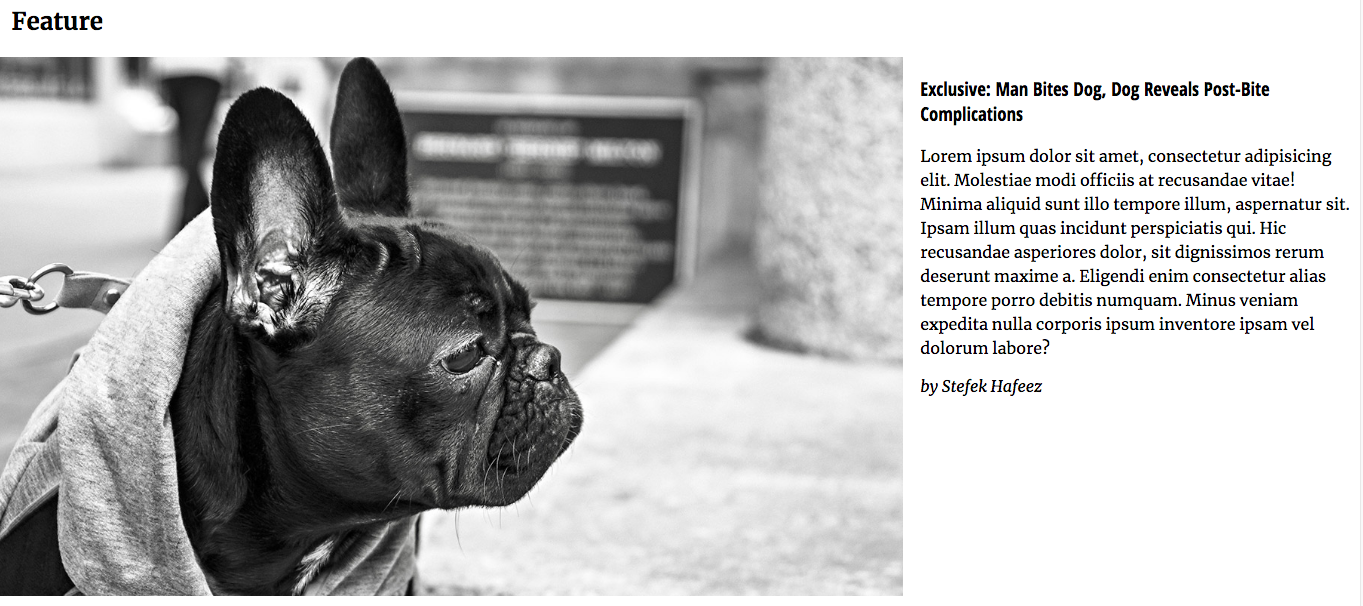
That leaves us with this: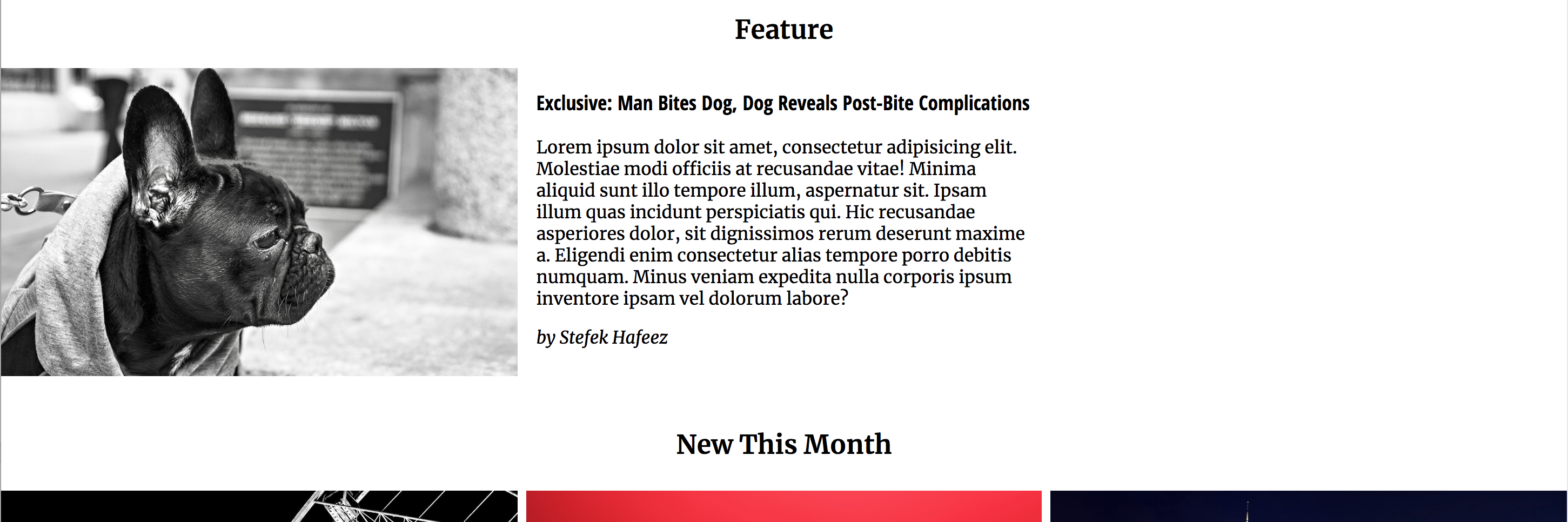
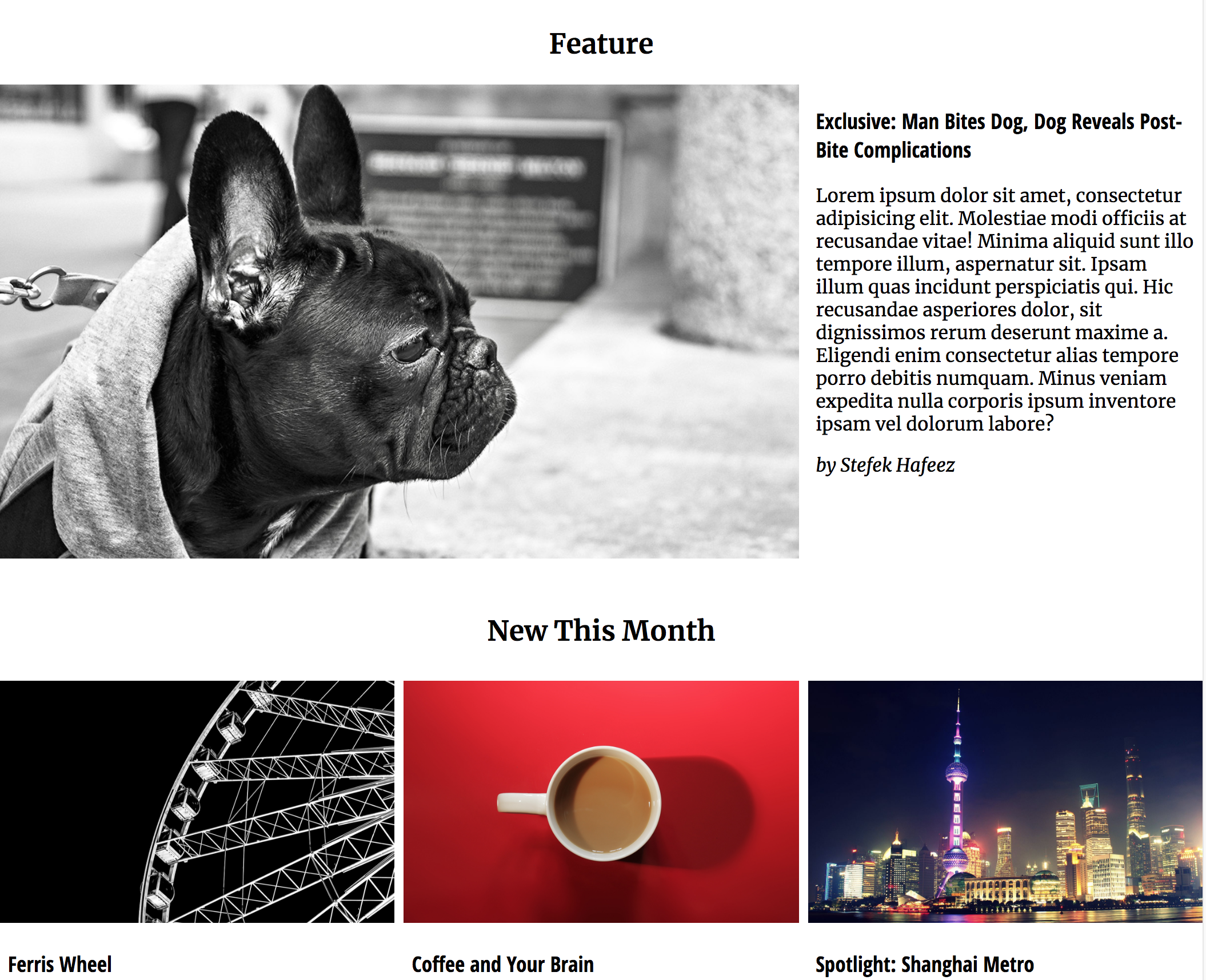
The only thing left to do is to make the image take two of the three columns. Add a class of story-feature-image to the image in that section, then add this CSS to your query:
.section-feature .story-feature-image {
  grid-column: 1 / span 2;
}
The Exclusive Section
If we look at the desktop screenshot, the EXCLUSIVE section doesn’t follow the same layout as the other ones.
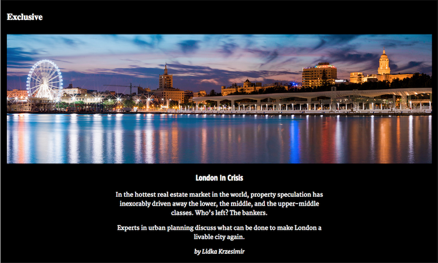
That micro-layout could be achieved very easily just by adding margin on each side of the paragraph, .story-title, and .story-byline elements. Or, better yet, just wrap those elements inside a DIV and style that directly:
.section-exclusive .story-text {
    margin-left: 20%;
    margin-right: 20%;
    text-align: center;
}
At this point, another typographic observation. The screenshot has the section-titles on the left in this view (as opposed to the centered alignment in the phone view).
Let’s fix this, too:
  .section-title {
    text-align: left;
    margin-right: 1%;
    margin-left: 1%;
  }
Finally, we haven’t done anything with paragraph line-height, and it really affects readability particularly at the greater screen width. So let’s fix that too. I’d try a value of 1.5 in our original paragraph style and see if it’s still ok in the phone view on all elements.
In that regard, compare the next two screenshots:
They make it really clear that the default line-height is much too tight.
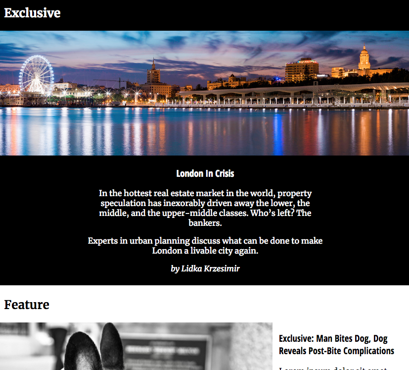
One last thing I want to fix here: the London panarama image is 1600px wide. Since that element takes the full width of the layout, we need to limit the layout width.
To that we can either set BODY to max-width: 1600px; margin: auto, or do the same thing to a .wrapper DIV. Your choice.
And our Desktop layout is more or less done.
I’ll let you tweak the rest of it.
Next we’ll move on to the “bonus points” positioning tasks.