The bonus tasks in the exercise both involve the use of CSS positioning.
Here I am referring to:
- the border effect on the section-titles
- the placement of the category on top of the photo (with a translucent background)
The border treatment changes a little bit between breakpoints, but not massively (just a text alignment difference). The text-on-photo treatment is the same on desktop and phone views.
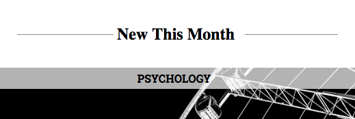
The Border Treatment
CSS Positioning allows us to have elements disrupt the normal flow of elements on a page—to a small or large degree.
The key thing to remember is that a relatively positioned element is positioned in relation to its own default position in normal flow.
To see what I mean, make the following style, before your query section in your stylesheet:
.section-title {
position: relative;
top: 2rem;
}
Here’s the result:
What is happening here is that the .section-heading is moved down from its “normal” position. The other elements in the page do not move, and the space that the .section-heading originally sat in did not close up.
The element is now out of normal flow.
If we had used a negative value for the TOP property, the .section-heading element would have moved up rather than down.
Now go to your HTML, and wrap a SPAN element inside all of your .section-titles. Here’s an example:
<h2 class="section-title"><span>Feature</span></h2>
Now change the CSS to the following:
.section-title {
  border-bottom: 1px solid #ccc;
  text-align: center;
  margin-bottom: 3rem;
}

.section-title span {
  background-color: white;
  position: relative;
  top: 1rem;
  padding-right: .5rem;
}
Here’s the result:
What we’re doing here is pushing the SPAN down from its position in normal flow approximately 1/2 its height, to the point where it’s sitting on the heading’s border. With a white background on the span, it looks like the heading’s border is being interrupted, but in reality, it’s just being covered for a short SPAN.
To understand what’s going on here in greater depth, change some of the values and see what happens. For example, if you remove the margin-bottom from the .section-title, you’ll see it get to close to the next content. Because we’ve moved the text down from its normal position, we had to add some margin-bottom to compensate (since the spacing created by positioning elements is created by their original position rather than their moved position).
All we have to fix here is to compensate for the reversed background and text colors in the Exclusive section, and the need for equal margins on the span when it’s centered.
.section-exclusive .section-title span {
  background-color: black;
}

.section-title span {
  padding-left: .5rem;
}
The Text-on-Photo Treatment
This effect will use absolute positioning. The important thing to remember here is the following:
With absolute positioning, the element is positioned in relation to another element: its nearest positioned ancestor.
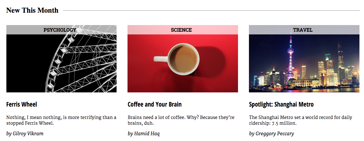
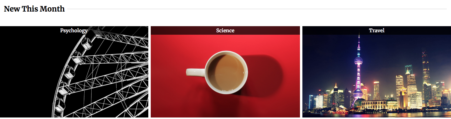
First, let’s create the positioning context for the .story-category DIVs.
.section-new-this-month .story {
  position: relative;
}
Here we are targeting only elements with a class of story that are inside the .section-new-this-month section.
Test your page. You will see no change. Relative positioning places an element in relation to its starting position in the regular flow of elements. If we do not have top, left, right, or bottom specified for a relatively positioned element, it will not have moved.
Again, here, the key is that this creates the positioning context for one or more other elements.
We will now position the story category in relation to its parent container, the article (class of .story). First, though, find the style where we termporarily hid the .story-category with display:none and remove that property.
Now add this following style to your CSS:
.section-new-this-month .story-category {
  position: absolute;
  top: 0;
  right: 0;
  left: 0;
  color: white;
  background-color: rgba(0,0,0,.7);
}
This should result in the category moving to the top of the article.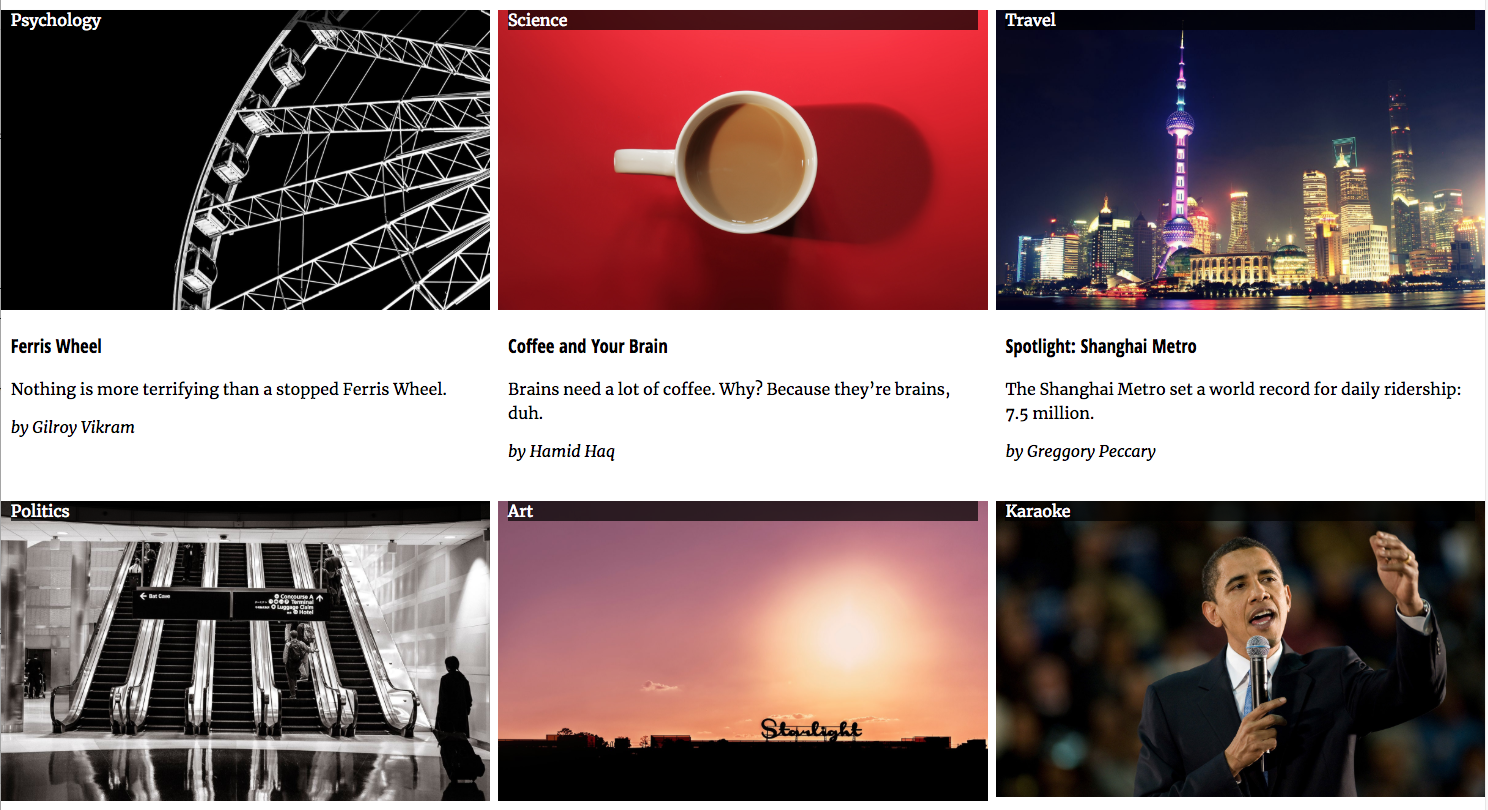
This code tells the browser to position the .story-category in relation to its nearest positioned ancestor. That element is the article, the parent of the category DIV in the HTML.
Comment-out the position:relative property on the .story style and you’ll see what that means.
At first, it looks like the category has just disappeared. But if you scroll to the top of the document, you’ll see that in the absence of a positioned ancestor, the positioned element is placed in relation to the body or the browser window:
Now un-comment-out the position:relative declaration and we should be close to what we want to achieve.
So why is the text sitting on top of the image? Because when we position something, we take it out of normal flow: other elements do not get moved or otherwise affected by positioned elements.
Two final notes: positioned elements stack according to their order in the HTML: elements coming later stack higher than elements coming earlier in the code). You can, however, change that with the use of z-index: number where number is stacking order. The higher the number, the higher the stacking order.
Finally, if we look at the screenshot of the text on the pictures, we’ll see that there is one more thing we need to tweak:

That will be revealed by Inspecting the element.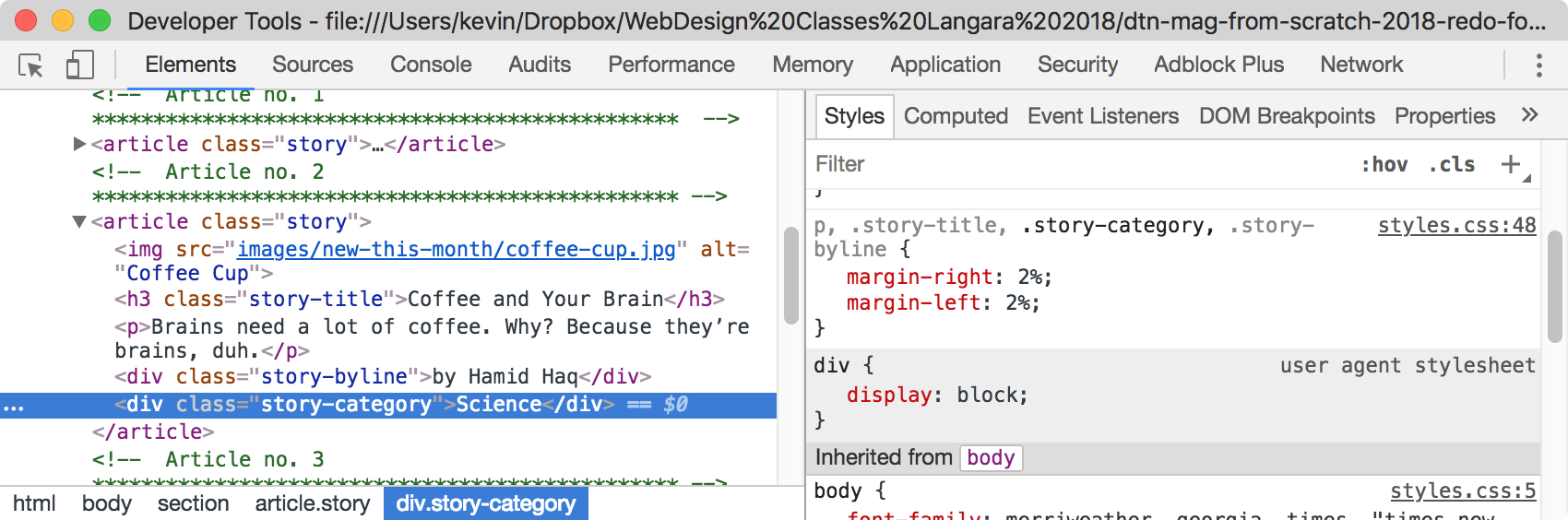
Specifically, we added 2% of margin-right and margin-left to .story-category, earlier when we were still working on the layout.
That margin is definitely not needed at any screen size. It’s better, then, to remove it from the original style than to just overrule it in another one (which could very well happen if you didn’t use the Inspector here).
The inspector tells me here that the original code is in line 48 of my stylesheet. So I just need to remove .story-category from that declaration.
Using the Inspector before adding code, in other words, helps you write cleaner, more logical, and more easily edited code.
We’ll leave this task with one last little tweak to align the text and give a tiny bit of padding to it. Add the last two lines to the style:
.section-new-this-month .story-category {
  position: absolute;
  top: 0;
  right: 0;
  left: 0;
  color: white;
  background-color: rgba(0,0,0,.7);

  text-align:center;
  padding: .25rem 0;
}
(If the use of rgba color was unfamiliar, the a value refers to alpha. That’s transparency. Values range from 0 to 1, which is from completely transparent to completely opaque).
On to the last part of the exercise: the final menu tweaks for desktop view.