Our last task is to do a few tweaks to the menu.
In an earlier part of this exercise, we set the menu up for the phone view:
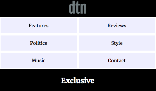
Let’s modify that just a bit. Our CSS for the links in the menu is the following:
.site-navigation-main a {
  text-decoration: none;
  display: block;
  margin: .25rem;
  padding: 1rem 0;
  background-color: #eef;
  color: black;
}
Remove the background-color declaration. We were just using it to see the box-model behaviour of the links.
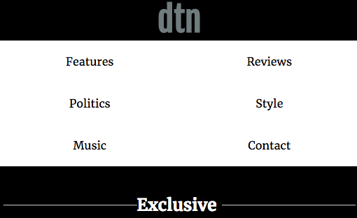
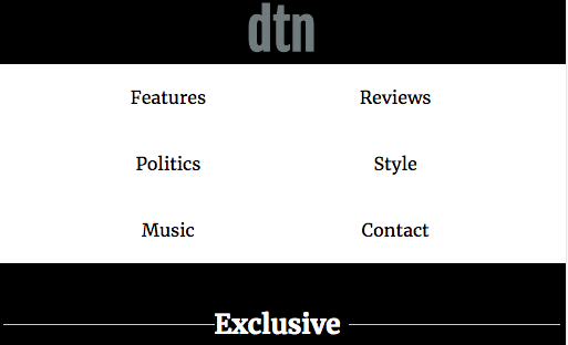
As well, the original screenshot has the menu items closer together. One way we could do that would be to give a margin to the .site-navigation-main ul style, such as margin: 0 10%.
Here’s how the menu looks without the margin:
And here it is with the margin:
Responsive Changes to The Menu
Now it’s your turn. Make the header layout for desktop and tablet screen sizes look as close as possible to that area in the full size screenshot.

Once you’re done that, you’re done.
Thanks for your patience with a very long exercise.