So we’ve marked up our content.
Let’s style the mobile view. The idea in the Mobile First methodology is that is always easier to build up, so we will set the stylistic properties that are present at the smallest screen size, as well as those that are present across all breakpoints.
First, make a styles.css file. Then in the head of your HTML document, add a link to that file.
First Style For Every Stylesheet
Before we do any type styling, let’s add the responsive images code to our stylesheet file:
/*  RESPONSIVE IMAGES ================================= */

img {
  max-width: 100%;
  height: auto;
}
I always make this style first, because it has a huge impact on the site’s responsiveness. In many respects, fluid image sizes are one of the foundational techniques of responsive web design.
Typography
The instructions for the exercise include this information:
- Site Name (dtn): Fjalla One / Color #707B7F;
- Article Titles: Open Sans Condensed / Font-Weight 700
- Paragraphs: Merriweather / Font-Weight 400
- Menu: Merriweather
- Sections h2: Merriweather / Font-Weight 700
- Story Author Credits: Merriweather / Font-Weight 400 / Font-style italic
So now go to the Google Fonts site and select those fonts and weights. The Google Fonts sidebar will show your selection:
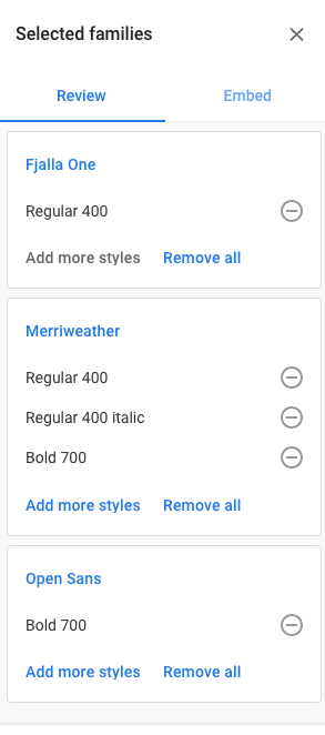
To add the Google fonts to your document, click on the Embed tab and copy the first line of code in the section (a LINK tag with a long URL).
Paste that above the link to your stylesheet in your HTML pages.
Since the font-family used the most in the document is Merriweather (in the menu, the paragraphs, the h2s, and the bylines), make a style for BODY in your stylesheet. That way, it will become the default font for the document.
/* TYPOGRAPHY ============================================  */

body {
  font-family: merriweather, georgia, times, "times new roman", serif;
}

.site-title {
  font-family: "Fjalla One", "arial narrow", sans-serif;
  color: #707B7F;
  background-color: black;
}

.section-exclusive {
  background-color: black;
  color: white;
}

.section-title {
  text-align: center;
  font-weight: 700;
}

.story-title {
  font-family: "Open Sans Condensed", "arial narrow", sans-serif;
  font-weight: 700;
}

.story-byline {
  font-style: italic;
}
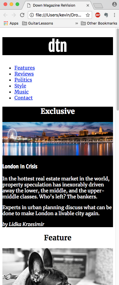
Test your page. Check that the styling is consistent: if it isn’t, go check that your HTML is correct and that your classnames in the HTML are consistent (please ignore the fact that the site-title color in most of the rest of the screenshots is incorrect. I discovered that later. )
With fairly basic styling, we’ve set up a significant part of our mobile view. We will tweak the typography more, of course, but first let’s take care of some broader elements.
Next: some box model properties.