If you look at the screenshot that ends the previous article in the series, or at the current state of the layout in your own file, you’ll note that there are some box-model issues that need to be dealt with.
For example, our header is not going all the way to the edge of the page. Nor are our images, or the black background in the Exclusive section.
The solution is to open the Chrome Inspector and select elements to see what CSS box model values are in effect, either from our code or from the browser’s defaults.
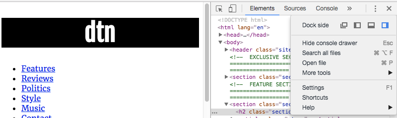
So right-click or control-click in the browser window and choose Inspect. When the Inspector comes up, it might be docked to your screen:
I always undock it, so that I can see more of the code. To do that, click on the vertical ellipsis ( ⋮ ) in the top right corner, then choose the first icon in the top row of the resulting menu.
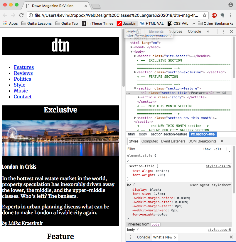
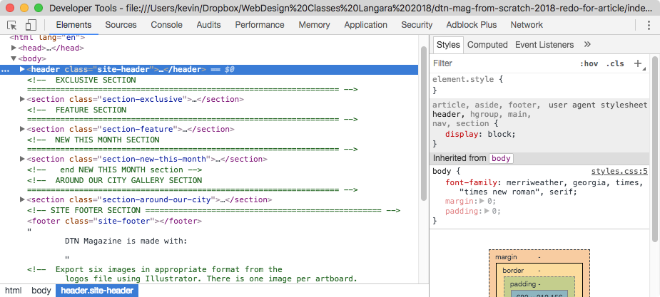
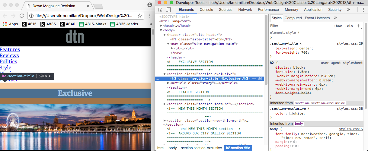
Now you can make the inspector window bigger while still seeing your page. Click on the BODY element in the HTML part of the Inspector:
When we click on that element, the Inspector shows us on the right side what CSS is actually in effect:
- In the white area, we see the font we set for the body. We also learn that we did that starting in line 5 of the stylesheet.
- In the grey area underneath that, we see what is referred to as the user agent stylesheet. The is the browser default. It is listing a default margin of 8px
- The box model diagram, also, is showing the values of the box model properties of the BODY element.
So in your stylesheet edit the BODY element to have a margin:0 value. (Add padding:0 for some older browsers too.)
Test your page.
It might appear that this change worked only partially: the content is now going all the way to the right and left of the browser window, but there’s still empty white space at the top of the page.
This is common: the reason is that other elements have default values.
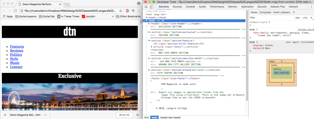
Let’s find them by going down the document tree. Click on the name of the HEADER element in the Inspector:
Here we see two important things:
- we don’t currently have any styles of our own applied to the header
- the header element does not have a default margin.
( All sectioning elements—such as header, footer, section, article, div, and main—will have no default margins or padding. Their only default property is display:block. )
So let’s keep going. Click on the disclosure triangle beside the HEADER. This will open it up and reveal the H1 inside it. Now click on the H1 element itself.
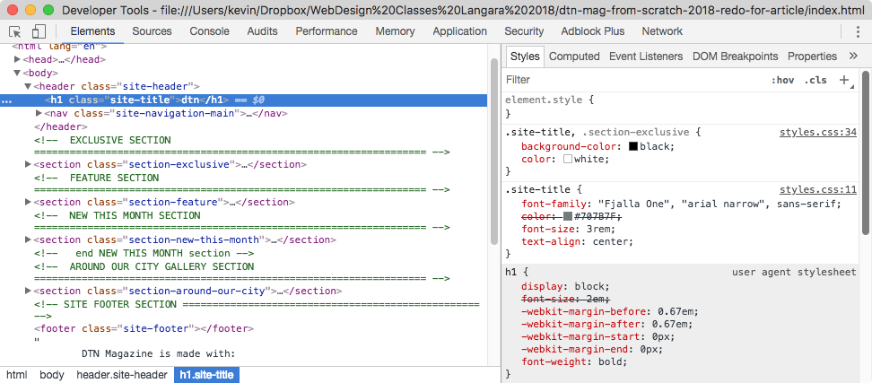
We again see that we have not added margin or padding in our own styles.
However, the default styles listed in the grey area reveal that the browser is applying margin before and after the element. ( At this point, don’t worry about the -webkit- prefix there.)
We could confirm our theory by adding margin:0 to our .site-title style in our stylesheet. Before we do that, though, we can actually test our idea right in the browser.
To do that, go to the .site-title style in the the inspector and click on the text of the last property: text-align.
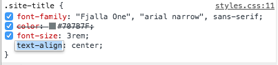
Now tab twice. That will take you, in succession, to the text-align value (currently center) and then to a new line. In the new line, type margin then tab again and type 0.
You will see right away in the browser that our hunch is correct: the h1 default margin is responsible for the unwanted white space.
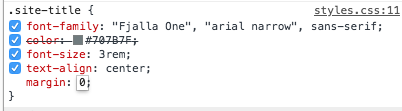
So add margin:0 to the .site-title style in your stylesheet. (The Inspector even shows you where to do that: the style you’re looking for is in line 11 of the styles.css file).
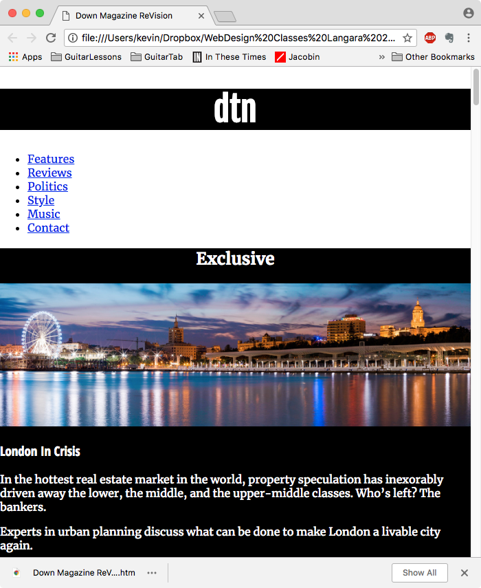
Now that we’ve removed the default BODY margin, our images and background-colors of other elements go right to the edge of the screen. This is what we intended. However, there is an unintended effect: now all our text is going to the edge of the screen.
To fix that, add a margin-left and margin-right value of 2% to the paragraph, .story-title, .story-category, and .story-byline elements. If you group your selectors, you can do this in one style:
p,
.story-title,
.story-category,
.story-byline {
  margin-right: 2%;
  margin-left: 2%;
}
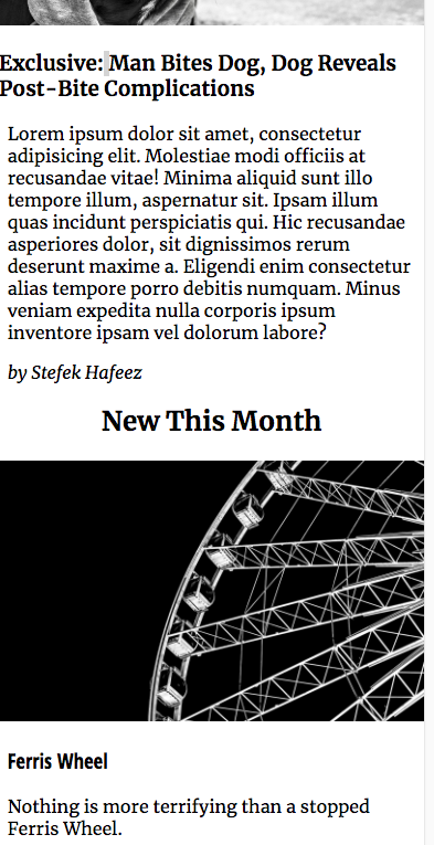
Test your page. We see in the screenshot below that the text is now comfortably in from the edge of the browser window (the images, on the other hand, we are allowing to go completely across the full width of the screen at small sizes).

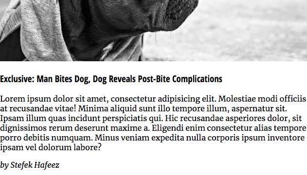
When I scrolled through my page, however, I noticed an oversight. The story-title in my FEATURE section did not appear to have a margin:
To troubleshoot, I went right back to the Inspector. If you right-click or control-click any element on the page, you will be taken right to the element in the Inspector.
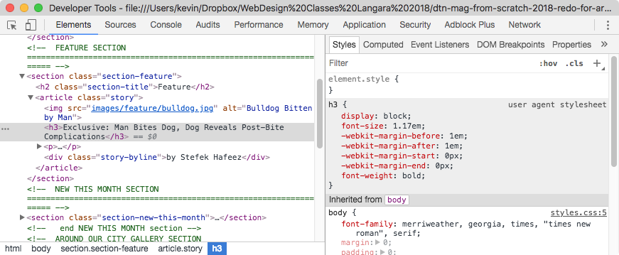
Our intended margin value is indeed not being applied to the H3: the reason is that we forgot to add the class of story-title when we were doing our markup. This happens all the time: errors and inconsistencies are just a fact of life; the important thing is to calmly find them.
Fix this by adding the story-title class to the H3 in the FEATURE section of your HTML.
The Menu Box Properties
Let’s turn our attention to the menu.
First, let’s remove the dots, the margin, and padding on the UL that’s inside the NAV element:
nav ul {
  list-style-type: none;
  margin: 0;
  padding: 0;
}
Test your page.

Again, the result might not be quite what we expected:
- although the dots are gone,
- and the top space above the UL has closed up,
- and the space to the left of the UL has closed up,
- there appears to be extra space below the UL.
We can find the reason for this by returning to the Inspector.
If we select the UL in the NAV, here’s what we see:
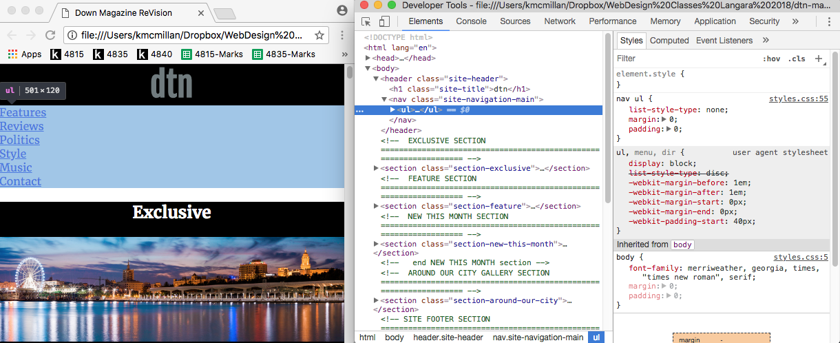
Notice the blue selection of the UL on the left (in the browser window)? This shows that the UL has no declared or default box-model property creating the space below it.
So it’s another element, then.
If you remember that sections, divs, articles, etc, do not have any default margin or padding, the likely source of the additional space becomes clear.
Open the disclosure triangle beside the next opening Section tag, and then click on the h2 (.section-title), here’s what we see:
The orange selection area above and below the word EXCLUSIVE in the browser window represents the margin value applied to the H2. And if we look to the right, to the user agent stylesheet, we see that margin is definitely being applied by default.
So add margin-top:0 to your .section-title style.
Test your page.
We will now see that menu area extra space has closed up.
Unfortunately, though, the removal of the margin top has brought the h2 text to the top of its parent box (the word “exclusive” has moved right to the top of the section, in other words). The solution is just to add some padding to your SECTIONS:
/* LAYOUT ============================================= */
section {
  padding: 1.5rem 0;
}
That works well.
A Few Article Tweaks
If we scroll down the page and compare the present mobile layout to that in the screenshots folder, we realize that we’re getting reasonably close to that layout.
But there are a few box-model tweaks to do to the articles in the New This Week section. Put the next two styles in the LAYOUT section of your stylesheet.
First, we’ll hide the .story-category div for now. We’ll make it visible later when we do the “bonus tasks” of this exercise.
.story-category {
  display:none;
}
Then let’s add some space at the bottom of every article in that section. By using a descendent selector, we will limit the styling to only articles in that particular section.
.section-new-this-month .story {
  padding-bottom: 2rem;
}
Now let’s work on the menu, gallery, and site-footer.