First please download the starter files and screenshots.
In this exercise, you will make the front page of an imaginary worldbeat music magazine.
If this is a test, you can use the internet and your notes, speaking to anyone other than me or the Instructional Assistant will result in you receiving a mark of zero.
The index file in the download has all the text content of the file, and some HTML markup.
However, you will need to add additional HTML: use your judgement to create a semantic and easily styled page. You will definitely need to add DIVs and articles, etc. You can make any changes you want to the HTML.
About The Screenshots
The screenshots show the feature image as being tinted. You do not not need to do this.
The screenshots show that some text flow is hyphenated. You do not need to worry about this either.
Those features are in the screenshots because I plan to use this exercise in a number of different classes.
About the Site Title
The phone, tablet, and desktop screenshots show the entire page: they are not cut off. The heading text placement is intentional.
Images
The images are supplied in folders in the download, but are not included in the HTML. You need to write the code to include the images in the page. There are HTML comments in the file at each place where you need to include an image.
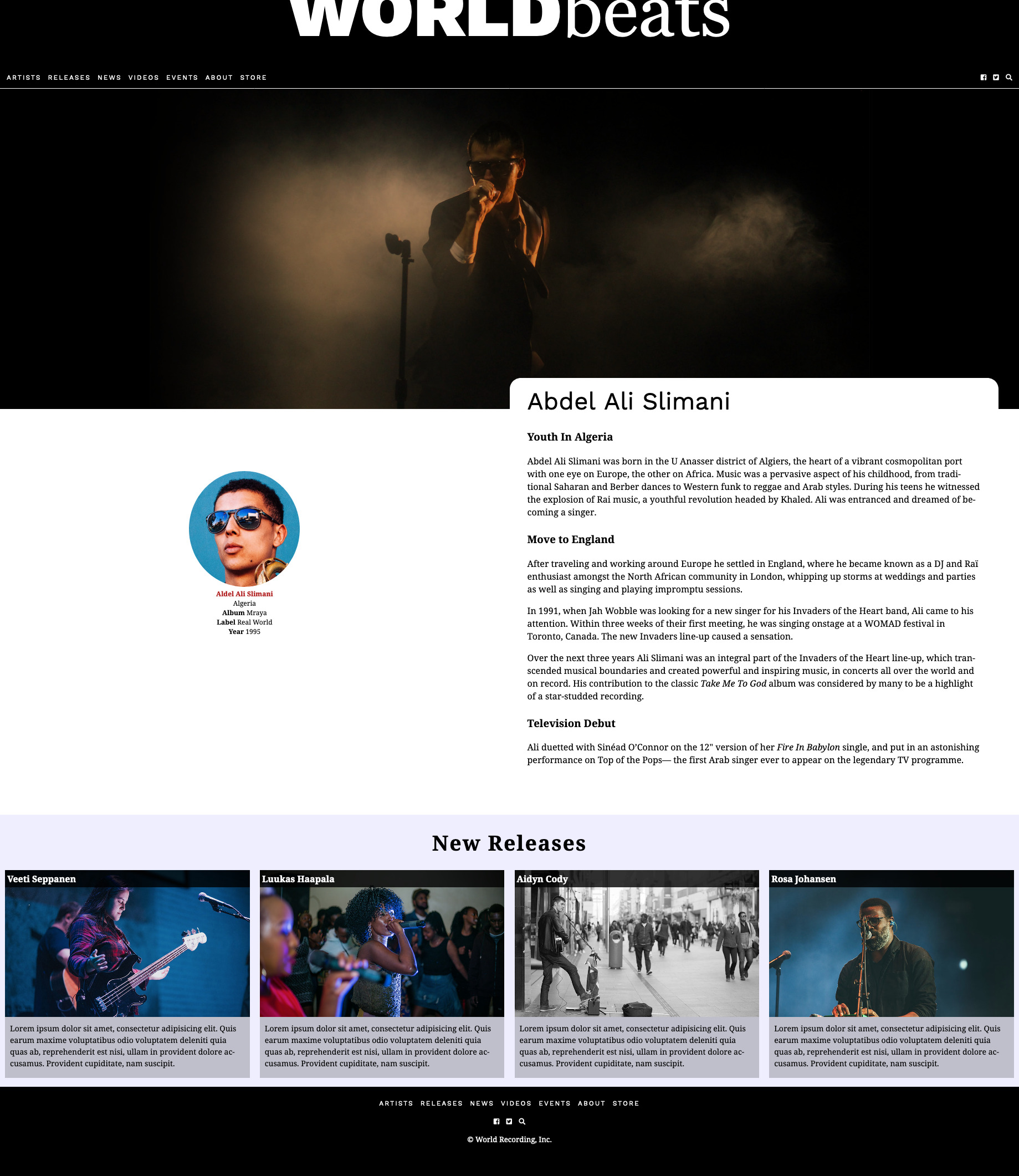
Feature Image
For the feature image (the big one at the top), use the first one in the images-feature folder. Make sure the following things occur with it:
- the image never gets wider than 1300px
- above 1300px screen width, it is always in the horizontal center
- the remaining space on the left and right has a black background
To illustrate, I’ve created a explanatory screenshot below with a border on the image:
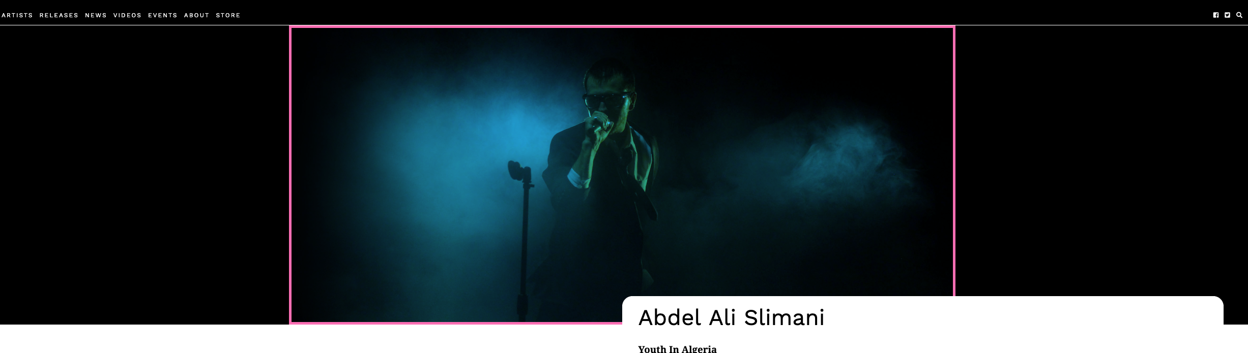
Do not include the border in your work.
Fonts
The fonts used are from google: Work Sans and Noto Serif. You will need to look at the screenshots to decide which fonts, sizes, and weights to use. The word “beats” at the top of the page is in the georgia, times, ‘times new roman’, serif font combination.
The three icon symbols are from font-awesome. The links for facebook, twitter, and search will not show the actual words, but they need to remain accessible to search engines and the visually impaired.
Responsive States
Please study the screenshots for the three responsive states: phone, tablet, & desktop.
Menu States
The header and footer menus look identical at phone and tablet sizes, but look different at desktop size. Consult the screenshots.
The hover states of the menu items (which need to apply to both menus in the top and the bottom of the document) are shown in separate screenshots. The hover background color is firebrick.

Validation
Don’t forget to validate your HTML and CSS. This part of the exercise is also known as “free marks”.
What Each Part is Worth
If this is a test, the mark breakdown will be as follows:
| Menus | 5 |
| Typography | 5 |
| Images | 2 |
| Phone | 2 |
| Tablet | 3 |
| Desktop | 6 |
| Validated HTML & CSS | 2 |
If this is just a weekly exercise, it will be marked, as usual, out of 1.