First please download the files and graphics you will need for this exercise:
- the site files to install (updated jan 2024)
- the screenshots
- the additional graphics files
Inside the first ZIP archive you downloaded, you will find a duplicator package (an installer.php file and another zip archive with a long name).
Install the site in a new testing environment. As part of the Duplicator installation process, make yourself a new admin account so that you can log into the site.
Update WordPress and Plugin
Once you’re installed the site, please update WordPress. You can update from the top area of the Dashboard sidebar.
Duplicator will also likely need an update. If so, you will see a “red circle” at the Plugins area in the dashboard. Please update Duplicator.
Install a Theme and Plugin for the Exercise
Into the site, now install the Miyazaki theme and the MetaSlider plugin.
Make sure you activate both.
If you are using a Langara College lab computer, the lab (wired) network blocks such installs, so you might need to manually download themes and download plugins, then install them in the appropriate folder inside wp-content.
Figure out how to delete all themes except for Miyazaki and the latest of the default “Twenty” themes.
About the Exercise
If this is a test, the percentage for each task is given as a percentage of the total.
If this is a lab exercise, the mark you will receive is out of 1. You must do the “bonus” section, even though there are no bonus marks.
Site Configuration Tasks (35%)
- Site Name: change the site name to greater than (all letters lower case).
- Default number of posts: set the default number of posts that load to 16. You might need to google how to do this.
- Default Feature Image: set the site to use a default feature image for posts that don’t have one. You will find the image to use in the additional graphics you downloaded. Do not just manually add that image to all the ones that don’t have feature images.
- Menu: make a menu that has the categories as top level links. Do not make nested, or drop-down, menus.
- Menu: make that menu show up at the top of the site, at the bottom, and in the mobile view.
- Favicon: set the pink gt logo for the site favicon. The image is in the additional graphics you downloaded.
- Post Data: on the home page, category archives, and search results, enable the display of date and author name for each post.
- Post Data: on single (full) views of posts, enable the display of the date, the author name, and the category.
- Date Format: set all dates on the site to display in Year-Month-Day format
- Set the site to use Next Page and Previous Page links to load posts beyond the new 16 post default—rather than using the theme’s default Load More button.
Plugin Configuration Task: Meta Slider (25%)
Make a five-slide slideshow of images: just use images that are already sitting in the Media Library.
Each slide must have a caption of five random words. I recommend using Emmet to quickly generate each caption text, which you can then paste into the slideshow.
Make sure that images do not scale up when viewed on a bigger screen. Make sure, in other words, that you use full size images here. You can find the full size of the images in the media library.
You do not need to give the slides any links.
Add the slider after the fifth paragraph of the first post: Fugiat, dolorum nihil.
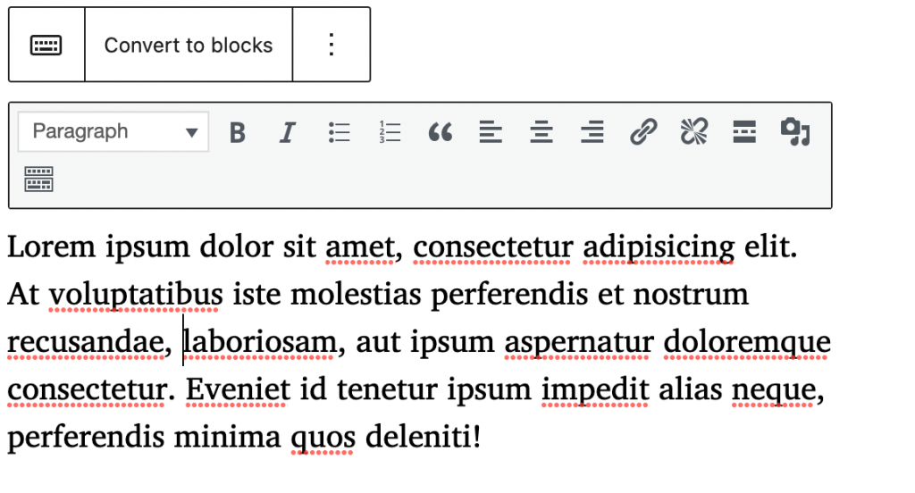
Make the slider take the full width of the page. To do this, you must first convert the post to blocks (as the content was made before the release of the Gutenberg editor). To do that, click Classic Block and choose Convert to Blocks.
There’s no need to convert the other posts to blocks.
Make sure to view the post with the browser window as wide as it can be.
Make sure that the slider images maintain high quality.
Hint: to find the size of the original images uploaded to the site, go to the Media Library and click on one.
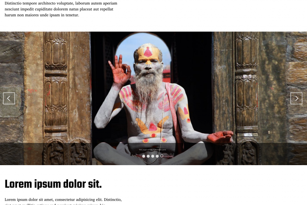
Set the slider theme to the one that looks like this (square arrows, round buttons):
CSS Tasks (40%)
Home Page: Site Name Overlap Fix
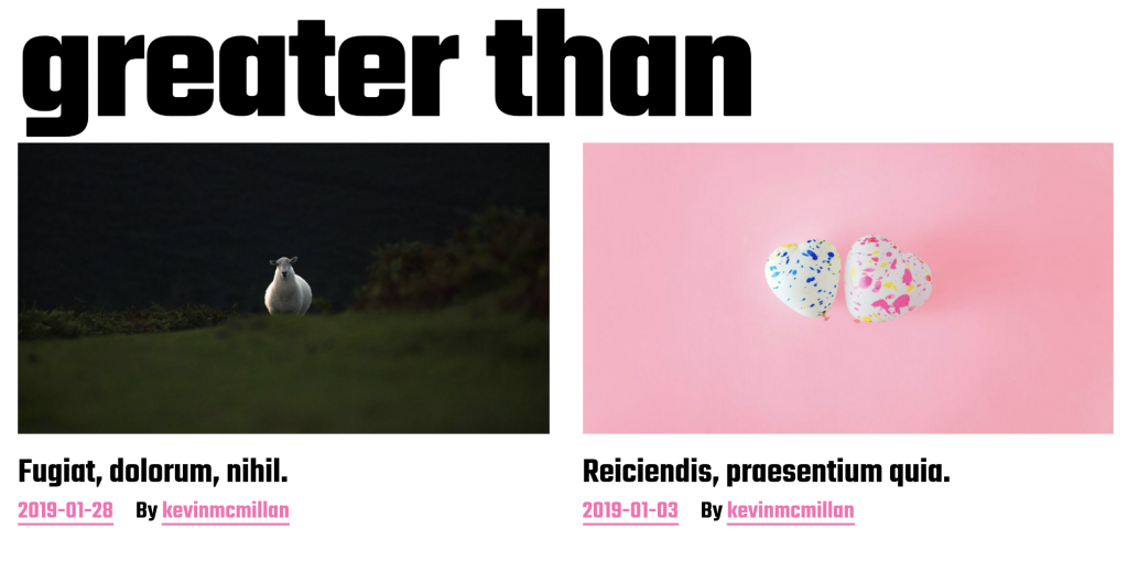
The original design of this theme puts the site name in huge letters on the home page. The type treatment is attractive, but the text hanging over the feature images of the first row of posts is, putting it politely, extremely annoying. Please fix it so that problem is removed:
Search Text Color
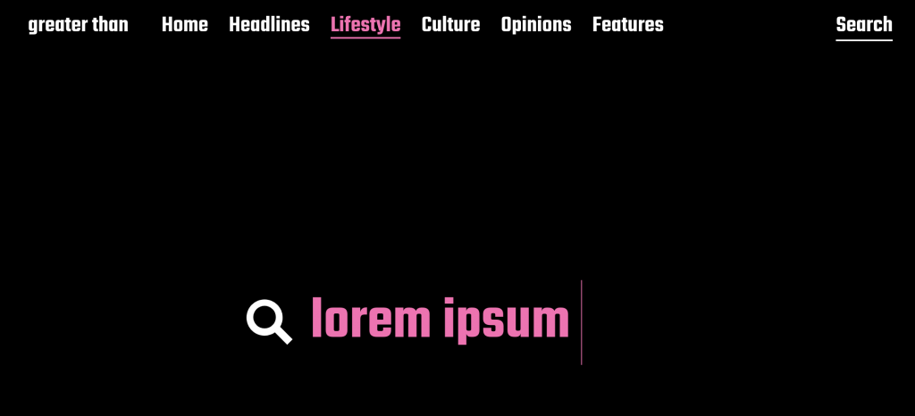
Make the color of the text the user types into the search field be hotpink (of course). Make sure that it is that color at all screen sizes.
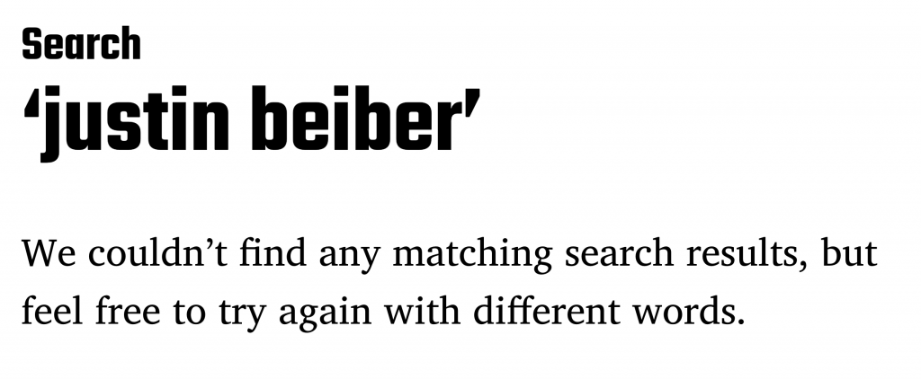
No Search Results Text Size
When a search returns no results, set the message about not being able to find matching results to be 5rem.
Main Site Accent Color
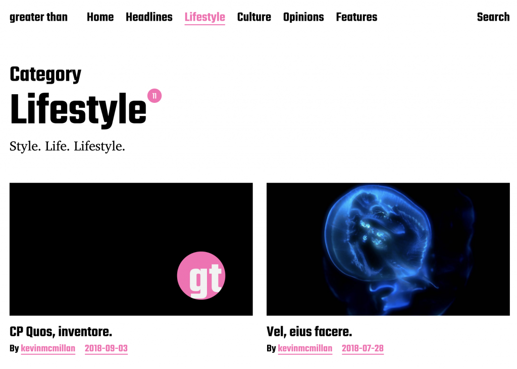
The theme uses the color red in a number of prominent locations:
- for links,
- for the return count in search results,
- for the return count in category archives,
- for post meta information,
Change all those usages of the color red to the morally superior color of hotpink. These changes are visible in the screenshot below.
Make sure that the line underneath links does not stay red.
Site Selection Color
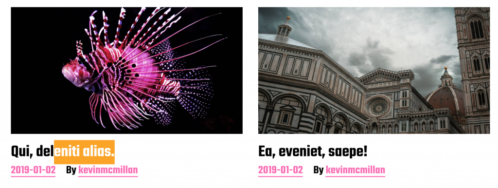
By default with this theme, if the user selects some text, that selection has a red background. Change that so that the background of any selected text is orange.
Google might be your friend here.
Post Meta Element Order
In the first part of this exercise, you added different Post Meta information to the posts in various parts of the site. Now use CSS to make sure that the author name is always the first element shown, and the date is always the last one. You might need to research flex or grid properties to do this.

If you look at the screenshot in the Home Page Site Name Overlap section earlier in this exercise, you will see the default arrangement that you are to change here.
25% Bonus: Footer Content
To get the bonus mark, you must have managed to do the majority of the tasks above. You must also get the styling of the task perfect or nearly so.
If this is not a test, this is not a bonus: it is just another part of the exercise.
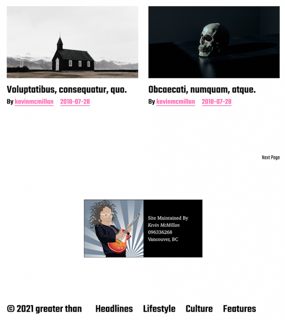
The Task: add a square picture of yourself to the information you put in the footer area.
To do this, you will need to use a widget to insert a Gutenberg Media and Text block
Figure out a way to make sure that the box is centered.
You will need a little bit of custom CSS for this task, but you won’t really need much. Try to get as much done via Gutenberg.
(Note, this “site maintained by” box is not seen in any of the downloaded screenshots).
When You Are Done
Once you are done, please make a new Duplicator package, download the installer and zip archive files, and put them in a folder named yourfirstname-yourlastname-miyazaki.
Make sure that there are two files. One is called installer.php, the other has a long name, and is a zip file.
Do not unzip that zip file.
If you are using Safari, it unzips elements automatically: you can change that in the preferences, or just use another browser.
Do not rename either of the two Duplicator files, or you will break the installation.
Then zip that file folder. This means that there will be a zip file inside another zip file. This is totally fine. The zipping of the folder makes it easier to hand in.
Now hand the zipped folder into the assignment handin area, which of course is:
Langara brightspace
Emily Carr: moodle