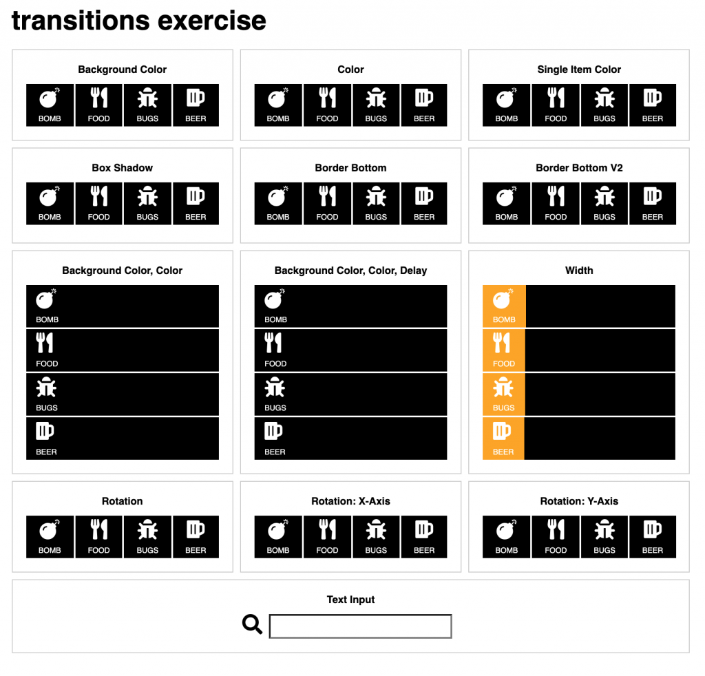
Using font-awesome for icons, make thirteen divs with child elements like in the screenshot below.
The first twelve are menus—whose anchor tags contain icons and the associated text. The last element is a simple form.
To reinforce your Emmet skills, try making the whole thing with a single emmet equation.
The font awesome icons, by the way, are bomb, utensils, bug, and beer.

Please make transitions that change the named property over .5 seconds on hover. Additional details for each pane:
- change the black background area (behind icon and word) to another color when the user hovers over the link. Remember that all transitions must take .5 seconds.
- change the color of the icon and the text on hover.
- change only the color of the icon on hover (over either the icon or the link text)
- make a box-shadow appear on hover.
- make each box have a colored border appear on hover.
- make each box have a different color border appear on hover.
- make the background (the entire width) change to pink, and the text color change to black
- make the background (the entire width) change to yellow, and then make the text change to black (over .25s)
- make the orange background color “grow” to the entire width of the container on hover.
- make the icon spin 360 degrees. For this and the next two examples, you’ll need to investigate the CSS transform property.
- make the icon flip along the x-axis (mirror image).
- make the icon flip along the y-axis (upside down).
For the input field, make it grow bigger and wider when the user clicks in it.