This is a step-by-step run-though of the layout in this exercise.
First, please first download these files and open them up as a new project in your editor of choice.
The index file has most of the content for the page. We’ll add a bit more HTML as we go through it.
Note: there will be a few differences between the downloaded screenshots and the way we’re doing the layouts here. I call these differences improvements.
Typography
From Google Fonts get the following:
- Spectral, weights 400, 400i, 700
- Spectral SC, weight 700
We will use spectral for all text except headings, which will use spectral sc (small-caps).
Add the embed code from Google to the head of your document, then make your stylesheet and connect it too:
  <title>the eatery</title>
  <link href="https://fonts.googleapis.com/css?family=Spectral+SC:700,800|Spectral:400,400i,700&display=swap"
    rel="stylesheet">
  <link rel="stylesheet" href="styles.css">
Initial Styles
First, make your responsive images code and set a default font for the document:
/* TYPOGRAPHY =============================== */
body {
    font-family: spectral, georgia, times, 'times new roman', serif;
}

/* RESPONSIVE IMAGES ======================== */
img {
    max-width: 100%;
    height: auto;
}
The Header Area
The text of the word EATERY is an SVG graphic. For semantics, there is also actual text in the h1. We will need to hide the text while keeping it accessible.
To do that, google the famous visually-hidden class and add it to the stylesheet:
/* ACCESSIBILITY =============================== */
.visually-hidden {
    position: absolute !important;
    height: 1px;
    width: 1px;
    overflow: hidden;
    clip: rect(1px 1px 1px 1px); /* IE6, IE7 */
    clip: rect(1px, 1px, 1px, 1px);
    white-space: nowrap; /* added line */
}
With this class, we can hide content while still making it accessible to search engines and screen-reading software.
So now add the class to the SPAN tag inside the H1.
Test the page: the word “eatery” that was under the big eatery SVG should now be hidden.
Top Menu: Basic Styles
First, remove the dots from ULs in Nav elements. Don’t forget to remove the space reserved for the dots, too.
Then remove the underlining in links and set default nav link and nav link color styles:
nav ul {
    list-style-type: none;
    margin: 0;
    padding: 0;
}
nav a,
nav a:visited {
    text-decoration: none;
    color: black
}
nav a:hover {
    background-color: hotpink;
}
Test the page. Hover over a link: here, you will immediately notice that the text is touching the edge of the box on hover, so definitely add padding to the nav a style.
nav a,
nav a:visited {
    text-decoration: none;
    color: black;
    padding: .5rem;
}
Test the hover state now in the browser. There is now padding, but the top and bottom of the hovered link is overlapping other links:
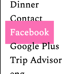
To fix that, set nav a to display: block. Because a link is an inline element, anything that increases its height (like padding top or bottom) will not push other elements away, as the text will still be fitted within its line-height.
Finally, set the text-align property on your nav a links to center.
If we test the mouseover, we see that links are rather wide. To fix that, let’s set those links to inline-block rather than block.
If we do that, the hover isn’t so over-designed.
But the links are now on the left side of the screen. This is the inline part of inline-block. Inline elements behave like text, which in most languages will align-left by default.
To fix this, just put text-align: center on a parent element like the LI or UL.
Finally, give the header area 1rem padding-left and padding-right: in an upcoming step, we’re going to remove the body element’s default margin and padding, so that would leave the logo touching the edge of the window (which would look sloppy…)
Top Menu: Icon Fonts
Next, google font awesome cdn and go to the link for cdnjs, then click on the CSS tab and copy the first link.
Add that to the head of your document, the same way you link to a stylesheet.
Once you’ve done that, go to the font awesome website and search for the facebook icon. Click on facebook-square.

In the top left, click on the <i class=”fab fa-facebook-square”></i> code. That will copy it to the clipboard.
Now in your NAV code, paste that code snippet inside the <a> element that links to facebook. You must do this inside, or the icon will not be clickable. Considering that we’re going to hide the link text in the next step, that would not be a good idea.
<li>
<a href="#"><i class="fab fa-facebook-square"></i>Facebook</a>
</li>
Test the page. If the Facebook icon shows up, go back to Font Awesome and get the code snippet for TripAdvisor and Google Plus.
Yes, I know Google Plus shut down. Feel free to use another social network, if you want.
Now wrap a span with a class of visually-hidden around the text for each of the three social links. Here’s that done with the Facebook link:
<li>
  <a href="#">
    <i class="fab fa-facebook-square"></i>
    <span class="visually-hidden">Facebook</span>
  </a>
</li>
Now set the layout of the social menu. This will be for the initial layout, for the phone size. Here we’re making it take 50% of the screen width, centered by the auto margins on the left and right.
.menu-secondary ul {
    font-size: 1.25rem;
    display: grid;
    grid-template-columns: repeat(4,auto);
    max-width: 50%;
    margin-top: .5rem;
    margin-left: auto;
    margin-right: auto;
}
Finally, let’s hide the menu button for now. We’ll work with it once we’ve got the entire layout working.
.menu-toggle {
    display: none;
}
We’ll do more header tweaks in a bit, but let’s get the major content areas taken care of first.
The Food Menus Properties
The food menu sections each have a header (h2) and three tables, each wrapped in a single DIV. Each table is a food menu, side dish menu, or drink menu.
Each section needs to have a background image (named for the section). The background images will exhibit the parallax effect: as each section scrolls, it will reveal more of the background image. In other words, the box will move, but the image will not. The background image will no longer appear on screen when its associated box is no longer on the screen.
The Background Images
Since our table styling is going to depend on what the tables are composited against, let’s get the backgrounds done first.
If you look at the SECTIONs holding the tables, you’ll notice that each has a class of menu-food, along with a class for each meal time.
So we should set common properties on the menu-food class, then use the meal time classes for properties unique to each.
First, put in a background image:
.menu-food {
    background-image: url('images/breakfast.jpg');
}
Test the page. Don’t worry that the image is in all three sections: we’ll fix that shortly.
However, you will likely notice that the image is not sizing down yet. To do that, we need to use the background-size property:
.menu-food {
    background-image: url('images/breakfast.jpg');
    background-size: cover;
}
Background-size can have percentage or pixel values, allowing you to precisely size the image(s) used. The keyword I’ve used here (contain) will scale the image as large as possible without cropping or distorting it.
Moreover, using the background-position property, we can place a background image anywhere on an element. (We’re not using that property here, but I wanted to mention it.)
Anyway, resize the page, and you will see that the image is doing what we want: covering the entire background of each section.
Next, give each menus their respective backgrounds. Here, I’m moving the breakfast image into a new style for that section.
.menu-food {
    background-size: cover;
}
.breakfast {
    background-image: url('images/breakfast.jpg');
}
.lunch {
    background-image: url('images/lunch.jpg');
}
.dinner {
    background-image: url('images/dinner.jpg');
}
Finally, to create the parallax effect, we just need to use the background-attachment property set to fixed. That value means that the background will not move when the page scrolls (it’s similar to position: fixed, in a way).
.menu-food {
    background-size: cover;
    background-attachment: fixed;
}
Test the page. The background images should stay (fixed within their sections) as the page scrolls.
The Menu Sections
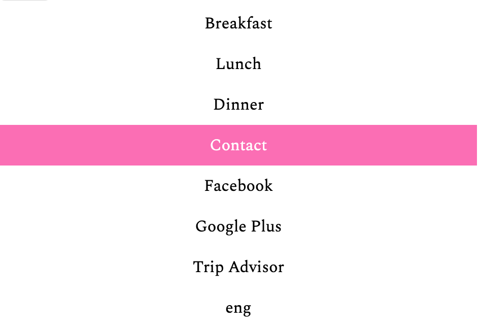
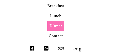
At this point, please look at the screenshots, paying attention to the look of the food menus in the phone and desktop views.
First of all, we notice that the menu sections are touching in the screenshot, but not yet in our actual page.
If we inspect the sections, we see that the SECTION tag does not have any default margins:

However, if we open the second section and click on the first item, the H2 with a class of section-heading, we find what’s causing the spacing issue: the default margin on the H2:

So set the .section-heading class to have zero margins. While we’re at it, let’s set the section-heading’s font properties, too.
.section-heading {
    font-family: "spectral sc", georgia, serif;
    font-weight: 700;
    margin: 0;
    font-size: 1.25rem;
    letter-spacing: 2px;
    color: white;
    background-color: hotpink;
    text-align: center;
    padding: .5rem;
}
Test the page. We’re getting closer to what we want for the phone layout.
But the background images need to go all the way to the edge of the screen. To do that, set the BODY margin and padding to ZERO.
That brings the content all the way to the edge, but now we need to compensate for what we’ve doing, because the text is touching the edge of the browser window, which is always something to avoid. Modify the .menu-food style:
.menu-food {
    background-size: cover;
    background-attachment: fixed;
    padding: 1rem;
}
The Menu Tables
If you haven’t worked with tables before, the important thing to remember is that they are used to present tabular data. A table is a natural choice for a restaurant menu because it presents a series of dishes and the price of each. In other words, each row of a table implies a semantic relationship between the information in each column of that row.
Tables are made from the following tags:
| table | Outer Table Structure |
| tr | Table Row |
| td | Table Data (cells) |
| th | Table Header (used at top of column or left of row, like a td) |
| caption | Label |
| thead | Table Header. Appears after CAPTION. Contains TH row. |
| tfoot | Table Footer. Similar to THEAD, but at bottom of Table. |
| tbody | Table Body. Contains the remaining rows. |
Our tables here are basic, with just table, caption, tr, and td.
Anyway, look at the screenshots to figure out what we need to do.
First of all, the table needs to take the full width of the section, and the price needs to line up at the right side.
If you inspect the table and click on TDs, you’ll see that the browser is making each column only as wide as the widest text content contained inside the TDs. So we’ll here be more explicit.
.menu-food table {
    width: 100%;
    color: white;
    text-align: left;
}
.menu-food tr td:nth-of-type(1) {
    width: 92%;
}
.menu-food tr td:nth-of-type(2) {
    width: 8%;
    text-align: right;
}

.menu-food caption {
    text-align: left;
    font-size: 1.5rem;
}
The second and third styles use pseudo-classes, which might be new to you. Pseudo-classes are like classes but based on conditions (like order) or events (like hover) rather than actual markup.
Here, they are selecting TD elements (cells) by their position in the TRs (rows) using a very powerful selector technique: nth-of-type(n)
If you test the page, you’ll see that the menus are taking shape.
But the text isn’t exactly readable for much of them, so let’s put a translucent screen behind our tables.
We have a number of elements we can use to do that: tr, td, table, and div. Let’s use the DIVs.
.main,
.sides,
.drinks {
    background-color: rgba(0,0,0,.7);
    padding: 1rem;
}
Looks good. I’ve added some padding, as well, so that the tables aren’t sitting right at the edge of their containing boxes.
Text touching the edge of a box always looks like a mistake.
Finally, let’s add some separator lines, like in the screenshot below.

Here we’ll try a translucent and thick bottom border on the TR element.
.menu-food tr {
    border-bottom: 10px solid rgba(255,255,255,.2)
}
If you test it in the browser, the border doesn’t show up.
A lot of people would just scratch their heads, then put the border on the TD. And there’s no harm in doing that. But there’s another fix: if you add border-collapse:collapse to the table style, it will work:
.menu-food table {
    width: 100%;
    color: white;
    text-align: left;
    border-collapse: collapse;
}
.menu-food tr {
    border-bottom: 10px solid rgba(255,255,255,.2)
}
The reasons why you need to do this to make TRs accept rows are obscure, having to do with table attributes that few people use anymore: don’t worry about them right now.
The Staff Section: Basic Stuff
Now let’s add some basic styles for the Staff section:
.staff {
    padding: 2rem 1rem;
    color: white;
    background-color: black;
    text-align: center;
}
The Staff Section: The Gradient
If you look in the mobile screenshot, you’ll see a black – purple – black gradient behind the staff members.
To make a gradient, use the background-image property with a linear-gradient function:
.staff {
    padding: 2rem 1rem;
    color: white;
    background-color: black;
    text-align: center;
    background-image: linear-gradient(#000, hsl(300,30%,30%), #000);
}
Each color value inside the brackets is a point of change in the gradient. By default the gradient will go top to bottom, but later will change this direction.
Incidentally, the middle color in the gradient is a a dark, muted purple. HSL makes mixing your own colors very easy.
In the HSL color model, 0 = red, 120 = green, and 240 = blue. Purple is a combination of blue and red, so I chose a number between 240 and 360 (which is the same as 0). The next value, saturation, is for the strength of the purple, while the last number is for the lightness. I didn’t want a really vivid purple, so I chose a low saturation value. I wanted a color closer to black than white, so I chose a low lightness value.
The Staff Section: Rounded Article Tops
You are likely family with using border-radius: 50% to make a rounded image. We can use the same technique to round just the tops of other elements. Here we’re applying the value to two rather than four corners.
Try this style:
.staff-member img {
    border-top-left-radius: 50%;
    border-top-right-radius: 50%;
}
Test the page. We should now see the staff members looking like this:

Now set the background behind the staff-member-name and the staff-member-description to black
.staff-member-name,
.staff-member-description {
    background-color: black;
}
Test your page. The result is probably not quite what you expected to see: there’s name and description go all the way across, while the image does not
The name and description are blocks, so they take 100% of the width of their containers. However, since these images are only 700px wide, we can easily “run out of image.”
The fix?
Set a max-width on the staff-member class. Make it the same size as the image. This, in other words, will prevent the box holding the image, name and description from ever growing bigger than the image itself.
.staff-member {
   max-width: 700px;
   margin: 1rem auto;
}
That leaves us with only one thing to fix here: the space between the staff member name and the image. Note: in the screenshots, the gap is there, but I want to remove it here.

If you inspect the page, you’ll find that it’s not a default margin causing this problem. Instead, the problem is that images are inline elements, which means that they do not sit flush in the bottom of their boxes: in CSS, text sits in the vertical middle of its line-height.
Setting the display property of staff-member images to block will fix this issue.
.staff-member img {
  display: block;
}
The Location / Contact Area
For smaller screens, we’re just going to put the .contact-info ahead of the iframe.
If we look in the HTML, we’ll see that the iframe with the map is ahead of the .contact-info div. But our initial design needs the contact info higher up the page than the iframe.
We could change the order of the elements in the HTML, but we’ll do this a different way, because the technique is worth knowing (sometimes you can’t change HTML source order).
Specifically, both Grid and Flex layout methods allow us to specify the order of the grid-children or flex-children.
First, we’ll add some basic styles to take care of the appearance of the block. (I’m hiding the H2 for now because it’s arguably redundant).
.contact-info {
    padding: .5rem;
    text-align: center;
}
.contact-info h2 {
    display: none;
}
.contact-info h3 {
    font-size: 1rem;
    text-transform: uppercase;
    margin-top: 0;
    margin-bottom: .25rem;
}
.contact-info h3 {
    font-size: 1rem;
    color: hotpink;
}
.contact-info .address,
.contact-info .hours,
.contact-info .reservation{
    font-style: italic;
    line-height: 1;
    font-size: .875rem;
    margin-bottom: 0.5rem;
}
.contact-info a {
    font-weight: 800;
    color: black;
}
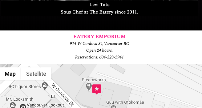
This makes the Contact Info look OK:

But it’s still coming after the map. Let’s change that. First set the location-contact div to grid (the default one column is fine at this point) and then set the order properties on its children:
.location-contact {
    display: grid;
    padding: .5rem;
}
.location-contact .contact-info {
    background-color: rgba(255,255,255,.9);
    order: 1;
}
.location-contact iframe {
    order: 2;
}
Test the page, and you’ll see the order of those two elements reversed.
Footer Area
Now let’s take care of the footer area. If you look in the HTML, you’ll see a typical list-based menu structure.
First go to font awesome and find the icons for utensils and telephone-square. Then add them to the document, inside the <a> tag on the appropriate footer link.
Styling the footer menu is easy. To make the icons sit above their associated link text, just set them to block. I will also here set the <a> element to block, so that it takes up the full width of its container.
.site-footer {
    background-color: #000;
    text-align: center;
}
.site-footer .footer-menu ul {
    display: grid;
    grid-template-columns: repeat(4,1fr);
}
.footer-menu li {
    border-right: 1px solid #666;
}
.footer-menu li:last-of-type {
    border-right: none;
}
.site-footer .footer-menu a {
    color: white;
    text-decoration: none;
    display: block;
}
.site-footer i {
    display: block;
}
In part two of these instructions, we’ll make the layouts for desktops and tablets.