Responsible Responsive Design: SRCSet
In this exercise, please use the Firefox or Firefox Developer Edition browser: Chrome very aggressively caches images, which will make the demonstration appear to not work as described.
To begin, please download these files.
A basic strategy that evolved to deal with different screen widths is the now-classic img {max-width:100%} responsive image style.
However, with the rise of high-resolution screens on mobile devices (and some desktops), potential limitations of this approach become obvious.
This is part of the reason for the rise of icon fonts and svg graphics: the high resolution of some devices made raster interface art often look grainy.
Similarly, images in web pages originally designed for non-retina screens can also look grainy on higher-resolution screens. In response to these considerations, developers started using bigger images and then scaling them down via the above CSS.
The obvious drawback, however, it that this forces regular-resolution devices to download high-resolution images. Remember: if we double the resolution, we potentially quadruple the file size.
Some Background
To understand why that works in the first place, we must understand the difference between a device pixel and a css pixel.
To illustrate, let me tell you about my computer setup: I have a new 27″ iMac with the retina (high-resolution) screen. For a second monitor, I have connected my old 27″ non-retina iMac to the new one via the DisplayPort.
2020 Note: the next two paragraphs refer to a site that doesn’t appear to be working anymore, but the screenshots still illustrate the point. As well, there are other sites that offer the same functionality. One that provides the same information and more, but not as concisely, is browserleaks.com
Anyway, if I go to mqtest.io on the high-resolution screen, here is what is shown on screen:
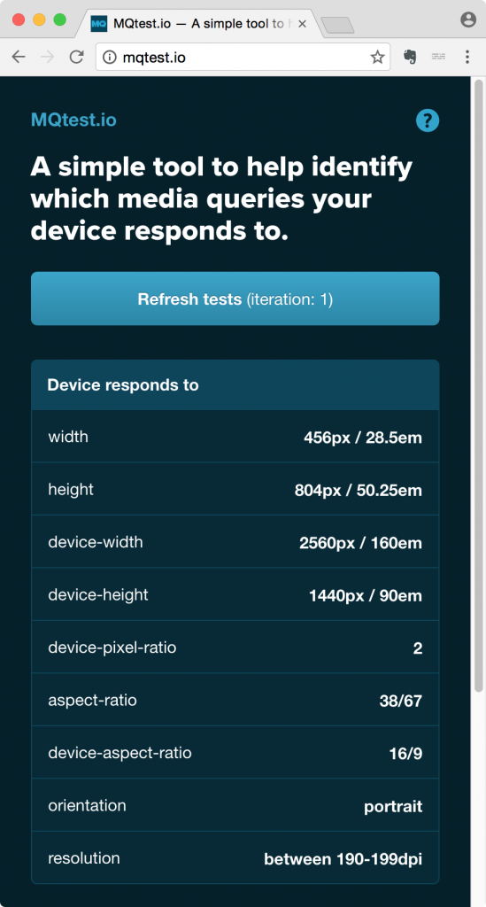
Then if I drag that browser window to the lower-resolution screen and reload the page, I get this information displayed:

The device-height and device-width are the same on the two devices. However, the device-pixel-ratio differs. Note, also, that the resolution differs, too.
This illustrates the difference between CSS pixels and device pixels.
On the regular-resolution screen, the ratio is 1:1. On the higher resolution screen, the ratio is 2:1. Some newer phones, in fact, have a 3:1 or even 4:1 ratio.
If you multiply the device-width by the pixel density, you get the number of device pixels.
On my higher-resolution retina screen, there are 5120 device pixels on the horizontal axis. On the lower-resolution iMac, there are 2560 px. But both screens have 2560 CSS pixels.
The two screenshots show the same values for the width & height of the screen, but if you download each and then compare their sizes, you will see that the high-resolution screenshot actually has twice as many pixels horizontally and twice as many vertically.
In other words, on the retina screen, two device pixels are used for every css pixel.
To illustrate another way, if you have a retina screen iMac, open up Photoshop and make a new document that is 2560 x 1440 pixels. Then press the tab key to remove the interface elements and then press Command-1 to view the file at actual size. You will see that it takes up the entire screen.
Now compare that to the Tech Specs section of the Apple Store:
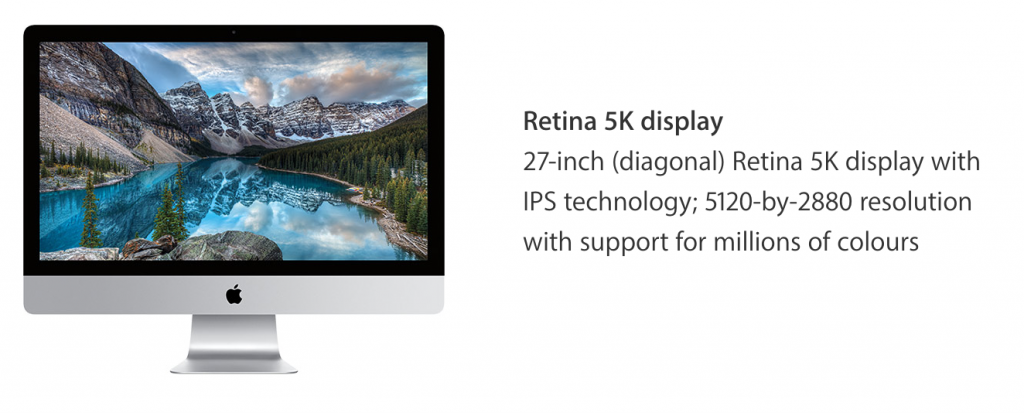
And that’s just desktop machines. As noted, some phone screens have 3x or 4x pixel density.
More Info: Physical Pixels vs Logical Pixels.
Srcset: Different Images to Different Screens
A new attribute, srcset, has been developed to help deal responsibly with screens of different sizes or pixel density.
Using this attribute, we can get higher-resolution devices to download higher-resolution images while not forcing less capable devices to download images that will just get scaled down anyway.
Examine the files I got you to download at the top of this page. Inside the images-sized folder are images of a New York subway station and St Paul’s Cathedral in London, England.
Each image is saved at a width of 600px, 900px, 1200px, 1800px, and 2560px. The filename shows that width. As well, each image has its width written in the top left corner of the image.
Think of the srcset attribute as specifying a set of sources.
Srcset in Action
Make a new html file inside the srcset-sizes folder. Call it index.html. Make a new stylesheet called mystyles.css, and connect it to the html page you just made.
Add the following code to the html document, just after the opening BODY tag:
<header class="panel">
  <span></span>
  <span></span>
  <span></span>
  <span></span>
  <span></span>
</header>
Now, add two FIGURE elements to the HTML page, after the header element:
<figure>
  <img src="images-sized/st-pauls-1200.jpg" alt="St Paul's Cathedral">
  <figcaption>St Paul's Cathedral: London, England</figcaption>
</figure>

<figure>
  <img  src="images-sized/ny-subway-1200.jpg" alt="New York Subway">
  <figcaption>Subway Station: New York City</figcaption>
</figure>
Then, add some basic CSS to your stylesheet, including the common responsive images code of max-width: 100% on image elements:
body {
  margin: 0;
  padding: 0;
}

figure {
  margin: 2rem 0;
}

figcaption {
  font-size: .75rem;
  font-style: italic;
  padding-left: .5rem;
  margin: 0;
}

.panel {
  background-color: #000;
  color:#fff;
  padding: 1rem;
}

.panel span {
  display: block;
}

img {
  max-width: 100%;
  height: auto;
}
Resize the page. The images will scale, but not go above their actual 1200px width.
None of this should be surprising.
Add The Srcset Attribute
Now edit your image declarations to do the following.
Remember that the srcset attribute is INSIDE the IMG tag, so the closing of the IMG tag comes after the full SRCSET declaration.
Here, I have put each item in the SRCSET declaration on its own line for easier readability: that formatting isn’t required, but it does make it easy to understand the code.
And remember to test this in Firefox, not Chrome (because of Chrome’s aggressive caching).
 <figure>
        <img src="images-sized/st-pauls-1200.jpg" alt="St Paul's Cathedral"
            srcset = "images-sized/st-pauls-600.jpg 600w,
                      images-sized/st-pauls-900.jpg 900w,
                      images-sized/st-pauls-1200.jpg 1200w,
                      images-sized/st-pauls-1800.jpg 1800w,
                      images-sized/st-pauls-2560.jpg 2560w">

         <figcaption>St Paul's Cathedral, London England</figcaption>

      </figure>

      <figure>
        <img src="images-sized/ny-subway-1200.jpg" alt="New York Subway"

             srcset = "images-sized/ny-subway-600.jpg 600w,
                      images-sized/ny-subway-900.jpg 900w,
                      images-sized/ny-subway-1200.jpg 1200w,
                      images-sized/ny-subway-1800.jpg 1800w,
                      images-sized/ny-subway-2560.jpg 2560w">

         <figcaption>Subway Station, New York City</figcaption>

      </figure>
For what we’re doing here, the figure and figcaption elements are not required, but I just felt like using them ( figure is generally used the same way it might appear in a textbook, as an accompanying element explaining some text ).
Resize the page (in Firefox or Safari) and notice how the size of the loaded images changes. You might have to reload the page after you resize the window.
How SRCSET Works
The srcset attribute lists a number of images for the browser to load under different conditions, such as viewport width (width of the browser window, in other words) or screen pixel density.
This a comma-separated list of images, each with a width value.
This width value refers to the width of each of the images in px. Note, however, that you must use the “w” unit even though it is pixels that are being referred to.
Which image gets loaded is based on the width of the viewport. Since the browser wants to load images as quickly as possible, it starts downloading the images before the CSS is fully read by the browser. Since the srcset is in the HTML, it gives a quick clue to the browser about which image to download.
In the example, here, the browser will load the 600px image if the width of the browser viewport is 600px or less.
 <srcset = "images-sized/ny-subway-600.jpg 600w,
                images-sized/ny-subway-900.jpg 900w,
                images-sized/ny-subway-1200.jpg 1200w,
                images-sized/ny-subway-1800.jpg 1800w,
                images-sized/ny-subway-2560.jpg 2560w" >
This assumes, however, a pixel-density of 1.
If the user has a retina screen, the number will be multiplied by the screen pixel density. So if the browser window is currently at 450px width on a retina (double pixel density) screen, the 900px wide image will be loaded.
If the window were 400px or less with a screen pixel density of 3, it would load the 1200px image.
If the user is on a device with a pixel-density of 3, and the browser window is 450px wide, the browser will load the 1800px image: 3 x 450 = 1350px, so the 1200px image is too small, which means that the browser will take the next highest sized image.
Any iMac made in the last five or six years will have a pixel density of 2. An iPhone X has a pixel density of 3. Some high-end Android phones even have a pixel density of 4.
In other words, SRCSET lets us serve the most appropriate high-resolution images to high-resolution screens, while avoiding serving high-resolution images to screens that cannot actually use the high resolution. The browser will load the best image for the circumstance, in other words.
The Math in Action
With a little JavaScript, we can make what’s happening here clearer, displaying information about the page inside the SPAN elements we put in.
To do that, add the following line inside the head of the document:
<script src = "panel.js" defer ></script >
Then make a new JS file and call it panel.js, saved in the same folder your html file is in.
First, let’s select the spans in the .panel header and all the figure elements on the page.
const spans = document.querySelectorAll('.panel span');
const figures = document.querySelectorAll('figure');
Then get the window to listen for the resize event and run a simple function when the event fires:
window.addEventListener('resize', showInfo);

function showInfo(){
  console.log("Resize event fired.");
}
Go to the console, resize the browser window and make sure that everything is wired up correctly. Every time you resize the page, the console should output the message about the resize event firing.
Now add the following to the script:
function showInfo(){
    console.log('RESIZE event fired');
    spans[0].textContent = `Window Width: ${window.innerWidth} (CSS Pixels)`;
    spans[1].textContent = `First Figure Width: ${figures[0].offsetWidth} (CSS Pixels)`;
    spans[2].textContent = `Last Figure Width: ${figures[figures.length - 1].offsetWidth} (CSS Pixels)`;
    spans[3].textContent = `Device Pixel Density: ${window.devicePixelRatio}`;
    spans[4].textContent = `Device Pixels: ${window.devicePixelRatio * window.innerWidth}`;
}

showInfo();
What we’re doing here is running the function on page load and on window resize. When either of those events happens, we output some information to the header of the document.
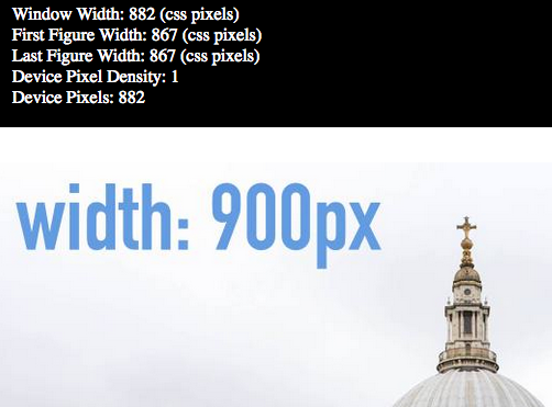
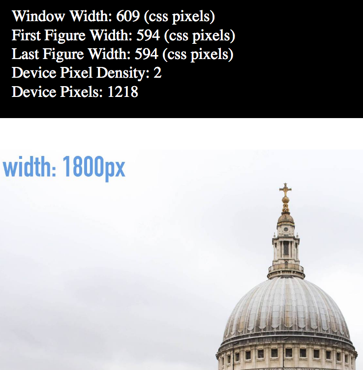
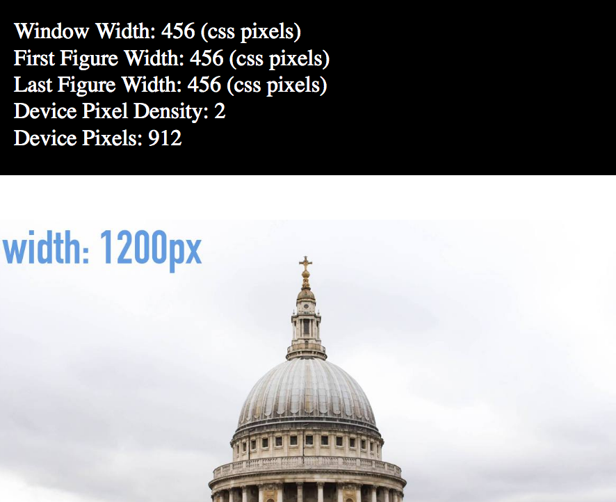
If you look at that information, you will see that which image loads is determined by the Window Width multiplied by the Device Pixel Density (in other words, by the number of Device Pixels)
If I am on a device with a pixel density of 1, the 900px image will be loaded when the window width is between 601 and 900px. At 901px, the 1200px image will load. At 1201px, the 1800px image will load, and so on.
Compare the values displayed in the following screenshots.
The first is from a regular-resolution (single pixel density) monitor.
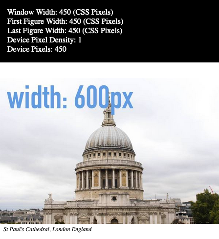
The second is from a retina monitor (double density).
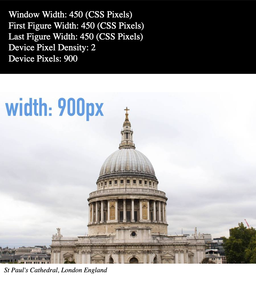
I literally moved the Firefox screen from my second monitor to my first one. The window was not resized, as you can see from the Window Width values.
A Slightly More Complex Comparison
Compare these next three screenshots.
Notice how the single pixel density screen window is actually wider when this screenshot was taken, but that browser is loading a smaller image than the two that are loaded on the double density screens.
Of course, not all images need to take up the whole screen width. In the next part of this discussion of responsible responsive design, we will refine things a little more to deal with that very common scenario.