In this exercise, please make sure that you are using Firefox: Chrome’s aggressive image caching will make the example appear not to work.
As noted in the discussion of the SRCSET attribute, not all of our images need to take the full width of the screen.
Depending on the layout, some might take half the width, or a quarter, or some other fraction.
As a result, we might not need images as big as those that would be downloaded if we relied on srcset alone.
We can account for this size-of-image-actually-needed-by-the-layout issue by adding another attribute: sizes.
Limitations of SRCSET Demonstrated
Modify the file you made in the srcset exercise by putting a single DIV with a class of layout-1 around the two figure elements.
Now add the following CSS to your stylesheet:
@media screen and (min-width: 900px) {
  .layout-1 {
    display: grid;
    grid-template-columns: 1fr 1fr;
    grid-gap: .5rem;
    margin: 1rem;
  }

}
This will set up a simple two column grid whenever the browser is wider than 900px. So each figure will take up approximately 1/2 the screen.
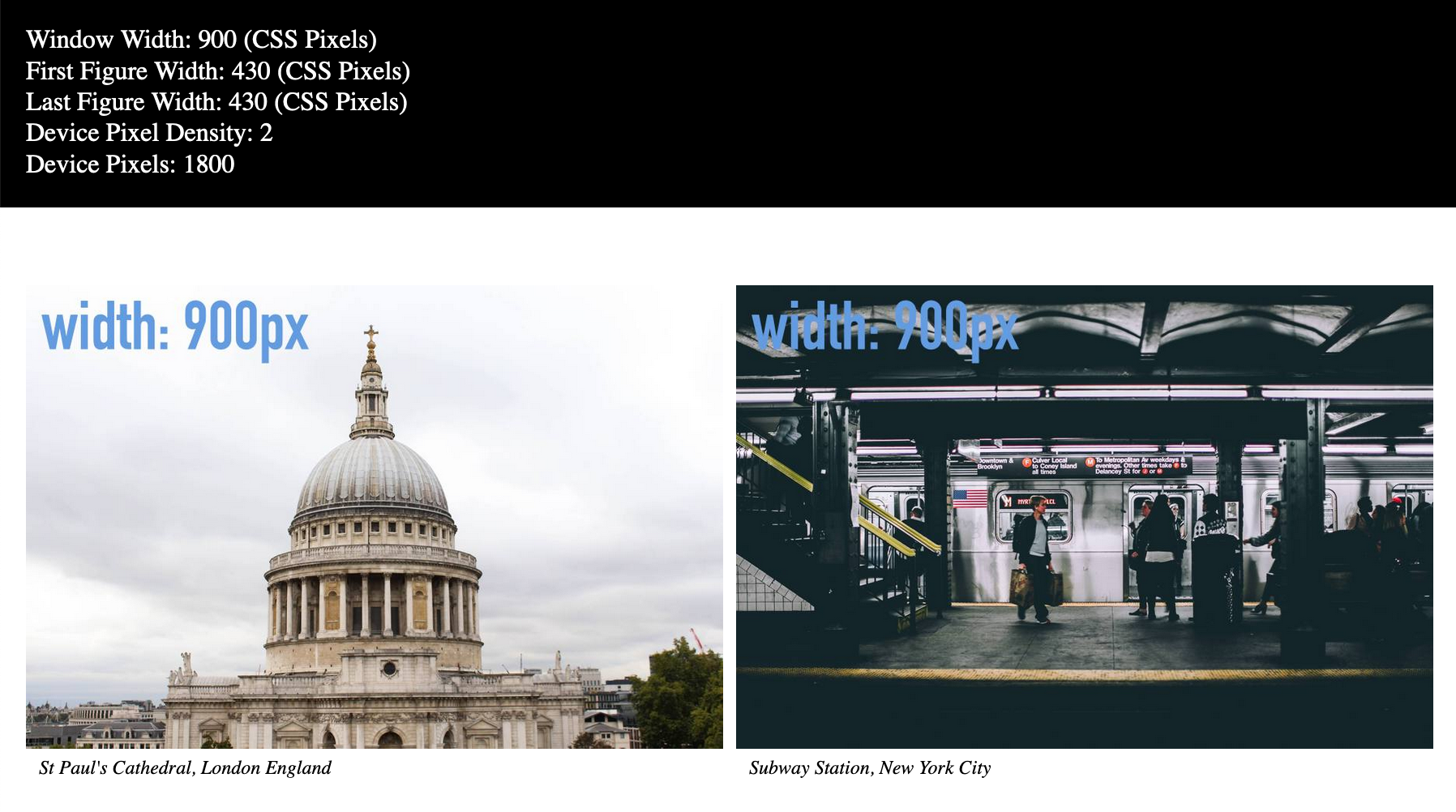
Now size your window to approximately 900px width.
If we test the page on a non-retina screen (single density), here is what we will see:
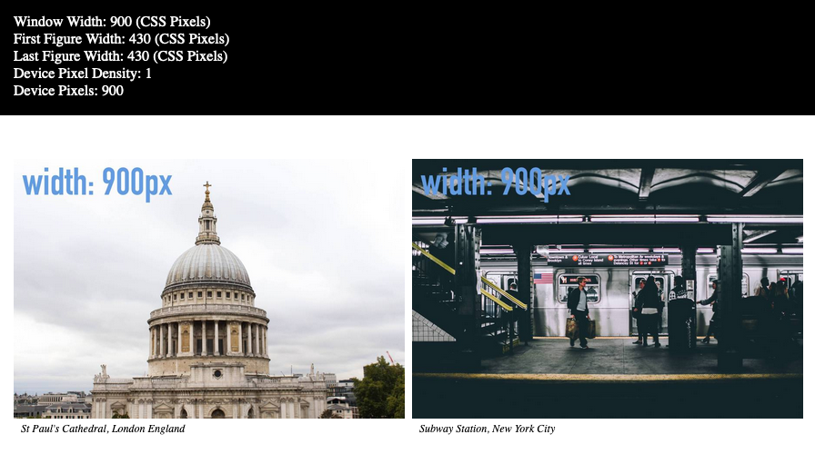
At this screen size, each image here really needs to be only 450px wide, because the figure itself is only taking half the browser width, which is 900px. So ideally, at this size, the 600px image (our smallest image) should load.
However, because srcset is based on the full browser width, rather than the size of the image required by the layout, an unnecessarily large image is downloaded.
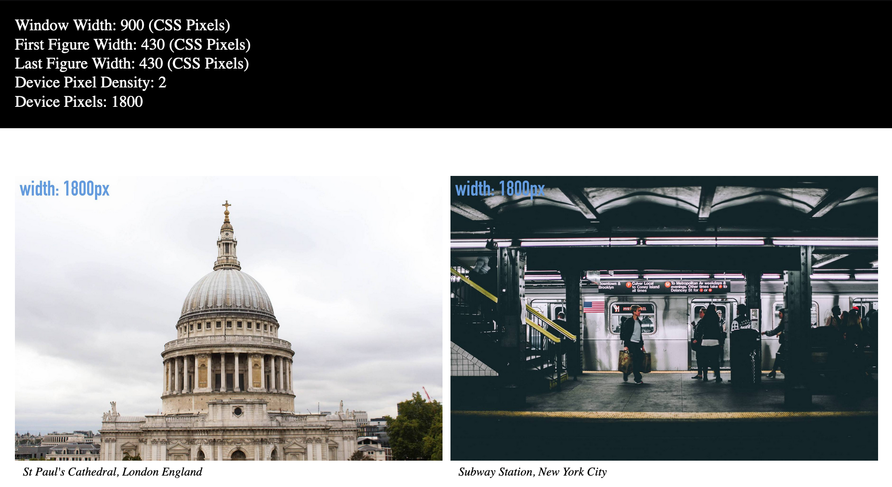
And this is just as wasteful on a retina screen (double density). Here, I have again dragged the window above onto my retina monitor. No resizing of the browser window took place.
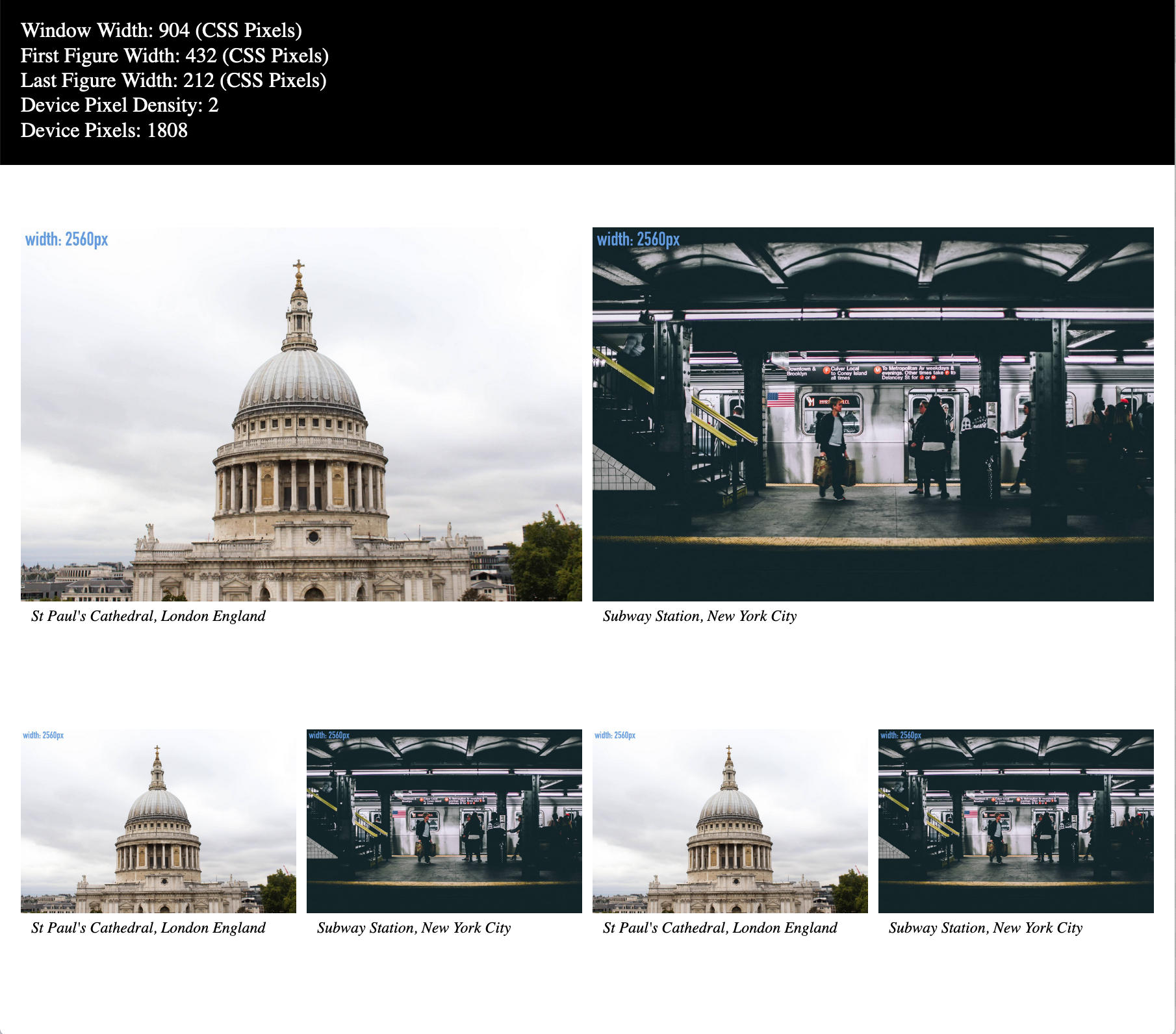
Can This Get Worse? Oh, Yah…
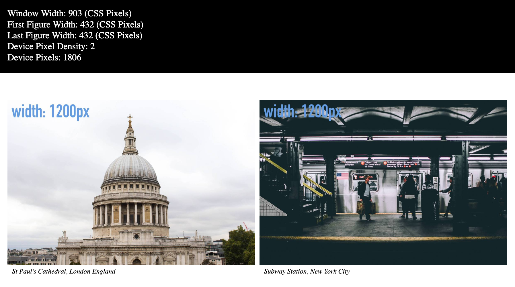
Resize the browser window to just a little bit over 900px width. If you have a retina screen, look at the statistics. If you don’t have a retina screen, just look at this screenshot.
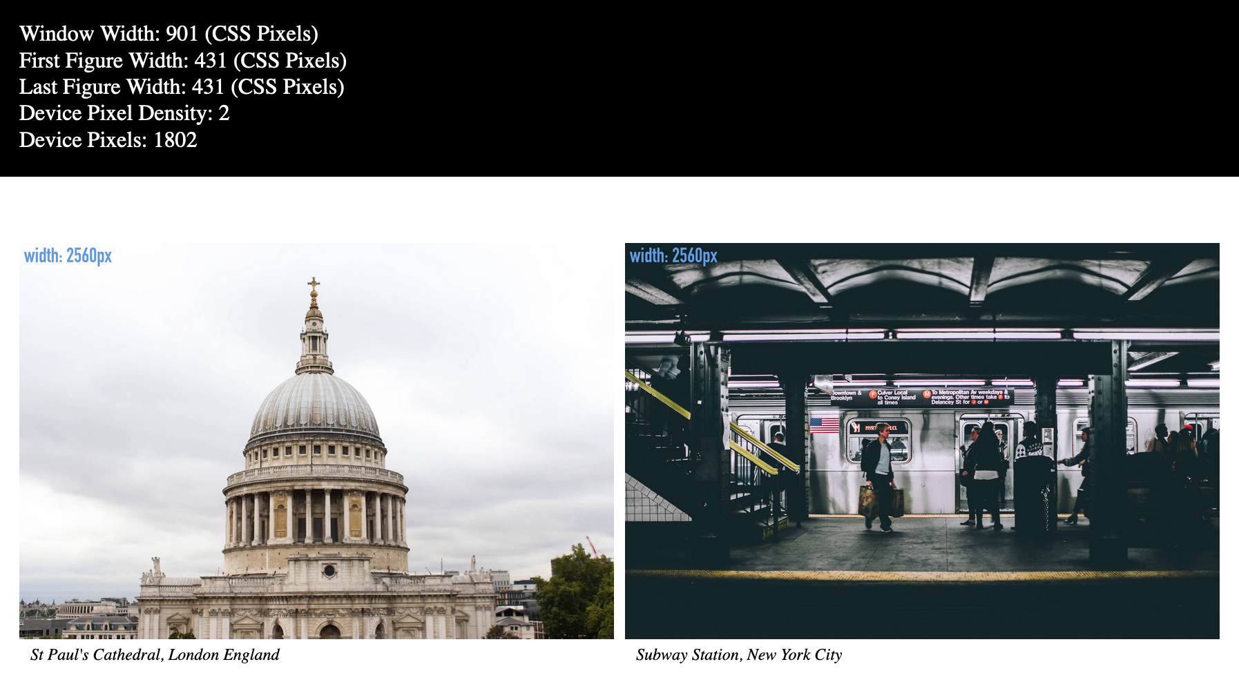
At 901px screen width (the second of the screenshots above), the 900px images would still display at high (“retina”) resolution
figure width (431) x device pixel density (2) = 866
The browser, however, has downloaded the much bigger 2560px images.
Hence, the Sizes Attribute
To remedy this, add to each of the img tags the sizes attribute, with a value as shown below:
<div class="layout-1">
<figure>
  <img src="images-sized/st-pauls-1200.jpg" alt="St Paul's Cathedral"
      srcset = "images-sized/st-pauls-600.jpg 600w,
                images-sized/st-pauls-900.jpg 900w,
                images-sized/st-pauls-1200.jpg 1200w,
                images-sized/st-pauls-1800.jpg 1800w,
                images-sized/st-pauls-2560.jpg 2560w"

    sizes =   "(min-width: 900px) 50vw">

  <figcaption>St Paul's Cathedral, London England</figcaption>
</figure>
<figure>
  <img src="images-sized/ny-subway-1200.jpg" alt="New York Subway"

       srcset = "images-sized/ny-subway-600.jpg 600w,
                images-sized/ny-subway-900.jpg 900w,
                images-sized/ny-subway-1200.jpg 1200w,
                images-sized/ny-subway-1800.jpg 1800w,
                images-sized/ny-subway-2560.jpg 2560w"

      sizes =   "(min-width: 900px) 50vw"  >

  <figcaption>Subway Station, New York City</figcaption>

</figure>
</div>
Like with the srcset attribute, the sizes attribute takes a comma-separated list of conditions, to accommodate multiple media queries.
The single one we have added to our example states that above 900px screen width, the image will take up 50 viewport width units (viewport units are percentages of the width or height of the visible area of the screen).
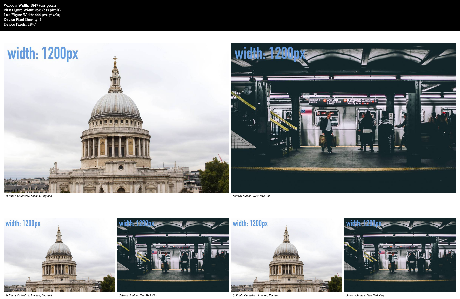
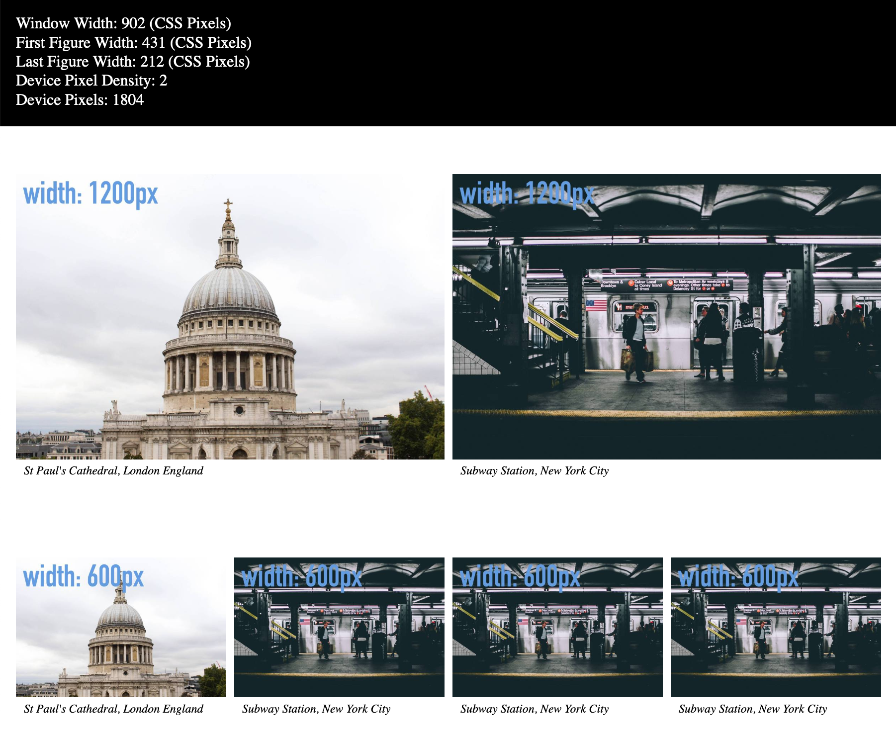
Now reload the page.
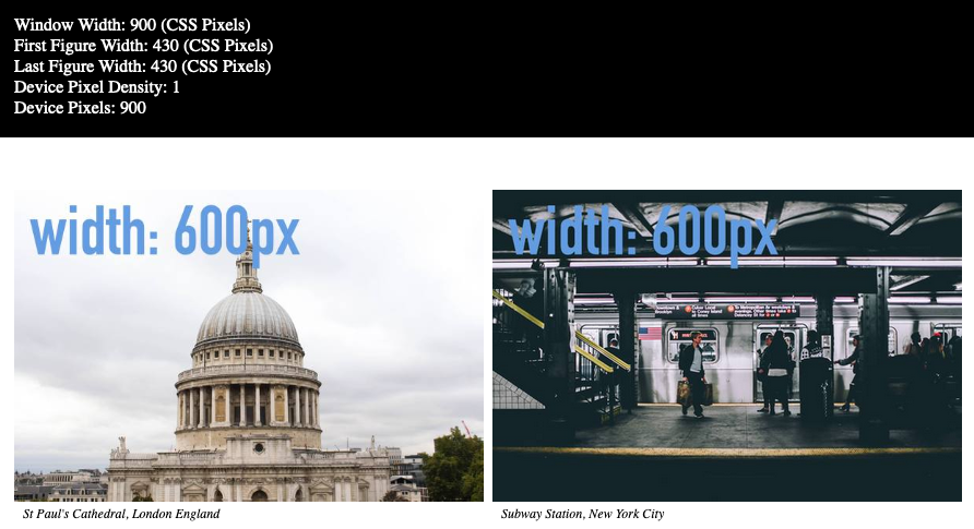
On a regular resolution screen, the additional information provided by the sizes attribute causes the smaller 600px images to load when the browser is under approximately 1200px width — since the browser is only taking about 1/2 the window width. If we actually had 450px images, they would load here.
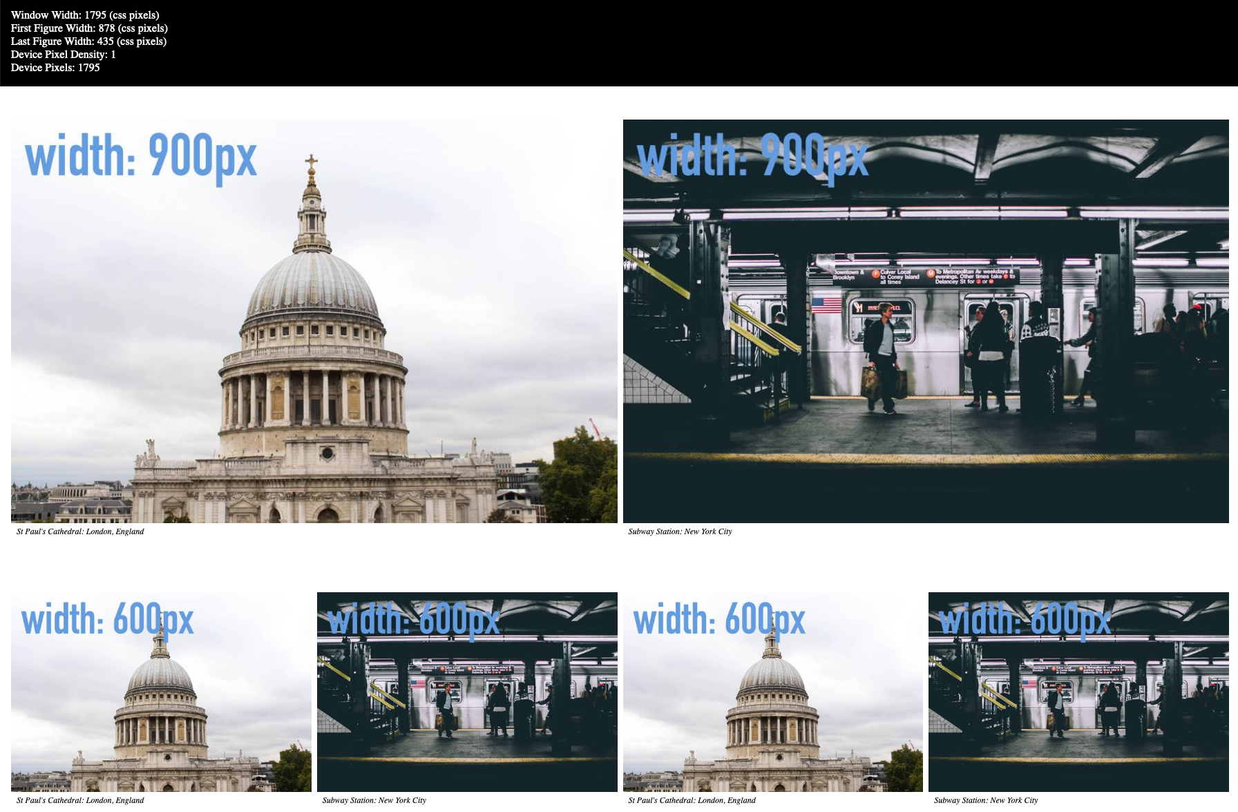
And check out what happens on a retina screen. Remember that the values here are the same as used in our earlier comparisons.
At 903 px, the 1200px images were downloaded. Recall earlier that without the sizes attribute, the 2560px images were downloaded.
Remember, also, that doubling the dimensions of an image will roughly quadruple its file size. A real estate analogy will help explain that:
A room that is 10 feet by 10ft has an area of 100 square feet. A room that is 20ft by 20ft is 400 feet square. So it is with px dimensions: length times width.
In other words, our tiny little attribute sizes=”(min-width:900px) 50vw” is giving us up to a 400% file size reduction.
400%!
Multiple Size Values
Now duplicate the layout-1 div, changing its class name to layout-2. Inside that DIV, duplicate the figures, so that now you will have four figures in the second DIV.
In your stylesheet, add the following CSS to the 900px media query:
  .layout-2 {
    display: grid;
    grid-template-columns: repeat(4, 1fr);
    grid-gap: .5rem;
    margin: 1rem;
  }
Test your page: above 1200px, you will see that the browser is still downloading image sizes appropriate for the layout above it.
To make our responsive design even more responsible, we can now edit the sizes attribute on the images in all four figures in the second layout div. Here’s one of them. Edit all four.
  <figure>
    <img  src="images-sized/ny-subway-1200.jpg" alt="New York Subway"
        srcset = "images-sized/ny-subway-600.jpg 600w,
                 images-sized/ny-subway-900.jpg 900w,
                 images-sized/ny-subway-1200.jpg 1200w,
                 images-sized/ny-subway-1800.jpg 1800w,
                 images-sized/ny-subway-2560.jpg 2560w"

        sizes =  "(min-width: 900px) 25vw">

    <figcaption>Subway Station: New York City</figcaption>
  </figure>
Test your page. You should see that the correct images are now loading for the intended usage in the layout:
In other words, in the layout-1 div, our figures take roughly half the screen width. In the layout-2 div, our figures take roughly one quarter.
And Now For the Exploding Heads
The above screenshot was on a single density screen.
Now I’m going to delete all the sizes attributes and load the page on the double pixel density screen:
And look at the starting results when we restore those sizes attributes:
In other words, restoring the sizes attribute causes the files that load in the lower row to be 1/4 the dimension.
Which, in turn, means approximately 1/16 the file size.
For those of you who are percentagely inclined, that’s less than 7%.