Please download the starter files and set them up as a new project in the editor of your choice.
In this exercise, you will make a single-page responsive design. You can definitely use the Internet or your notes.
If this is a test, you may not talk to anyone other than me or the Instructional Assistant.
Included in the download is an index.html file that has partially-complete HTML: in order to save time, I have marked up the articles.
You will need to add more HTML. Validate regularly.
Try to make the layouts as close as possible to the ones in the screenshots, which are included with the starter files download.
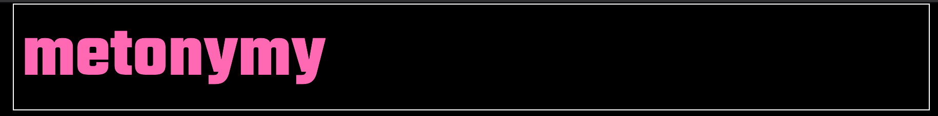
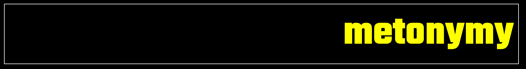
The font used for the site name is from google: teko. All other text in the document is merriweather, also from google.
You will need to look at the screenshots and then pick the appropriate font weights to include in your google download.
Layouts
You decide all responsive breakpoints in the exercise. Make sure that article layouts do not break, or get awkward, at any size.
Make the layout take no more than 1500px. At all sizes, make sure that the whole layout is in the horizontal center of the screen.
Main Area
There will be five layouts for the main area. As the screen gets bigger, the main layout gets additional columns.
The largest layout is shown below. Consult the screenshots for all layouts.
Definitely use a mobile-first approach to your coding.
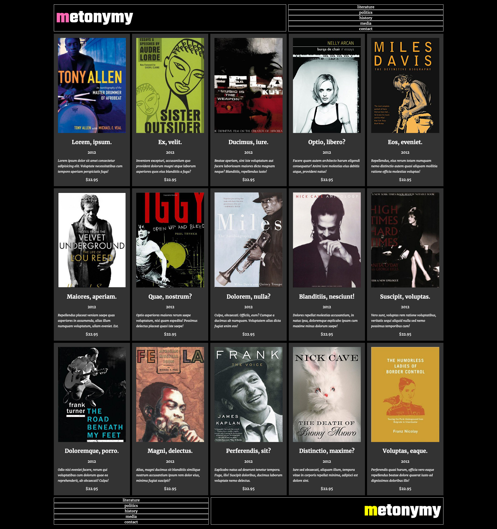
Hidden Articles
In order to have an even layout, hide articles if they do not make a full row.
For example, the page has 18 articles, but in the five-column layout, hide the last three so that there is no empty space in the last row.
The display property that will help you do that.
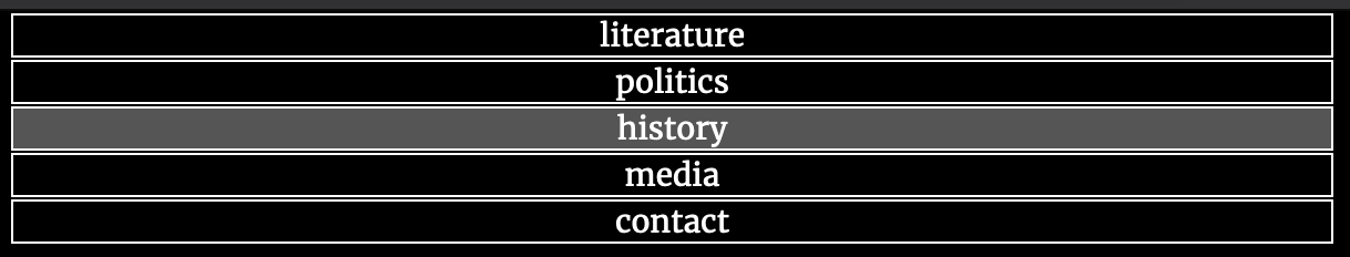
Header / Footer Areas
Depending on page size, there are different arrangements for the elements in the header and footer areas:
- one and two column main layouts: h1 and nav stacked.
- three column main layout: site-title and nav side by side, unequal widths.
- four column main layout: site-title and nav side by side, equal widths.
- five column main layout: site-title and nav side by side, unequal widths.
The changes to the different header/footer layouts will occur at the same breakpoints as when the main area layouts change.
Consult the screenshots.
Header vs Footer Differences
There are a few difference between the header and footer:
The first letter of the site name in the header has the color hotpink.
The first letter of the site name in the footer has the color yellow.
In layouts that are three column or more, the header and footer child elements are on opposite sides of the screen.


Hover Effects
When moused over, links in the menus exhibit the following effect:
When the site name box is hovered over, the rest of the letters in the site-name take the same color as the first letter:
Marking Matrix
If this is a test, your mark will be broken down as follows:
| Main Layout | 7 |
| Header / Footer | 5 |
| Typography | 5 |
| Hover Effects | 3 |
H1 & Nav Alignment
Make sure that the top and bottom of the site title box and the nav align perfectly, with the site name in the vertical middle of its box.
When You Are Done
If this is a Langara test, please hand in the exercise to the class hand in folder.
Otherwise, please show it me or our Instructional Assistant.
If this is an Emily Carr exercise, I’ll give you instructions in class on what to do when you finish.