Please download the starter files.
In this exercise, you will make a page comparing two American guitar companies: Fender & Gibson. In case you’re wondering why there are no menus: I want the focus here to be on layout and design principles.
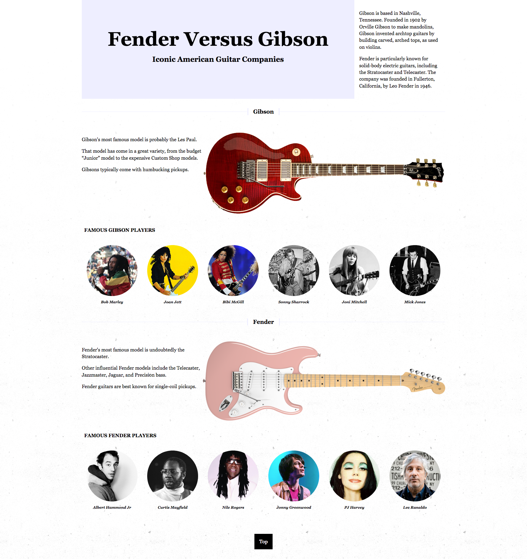
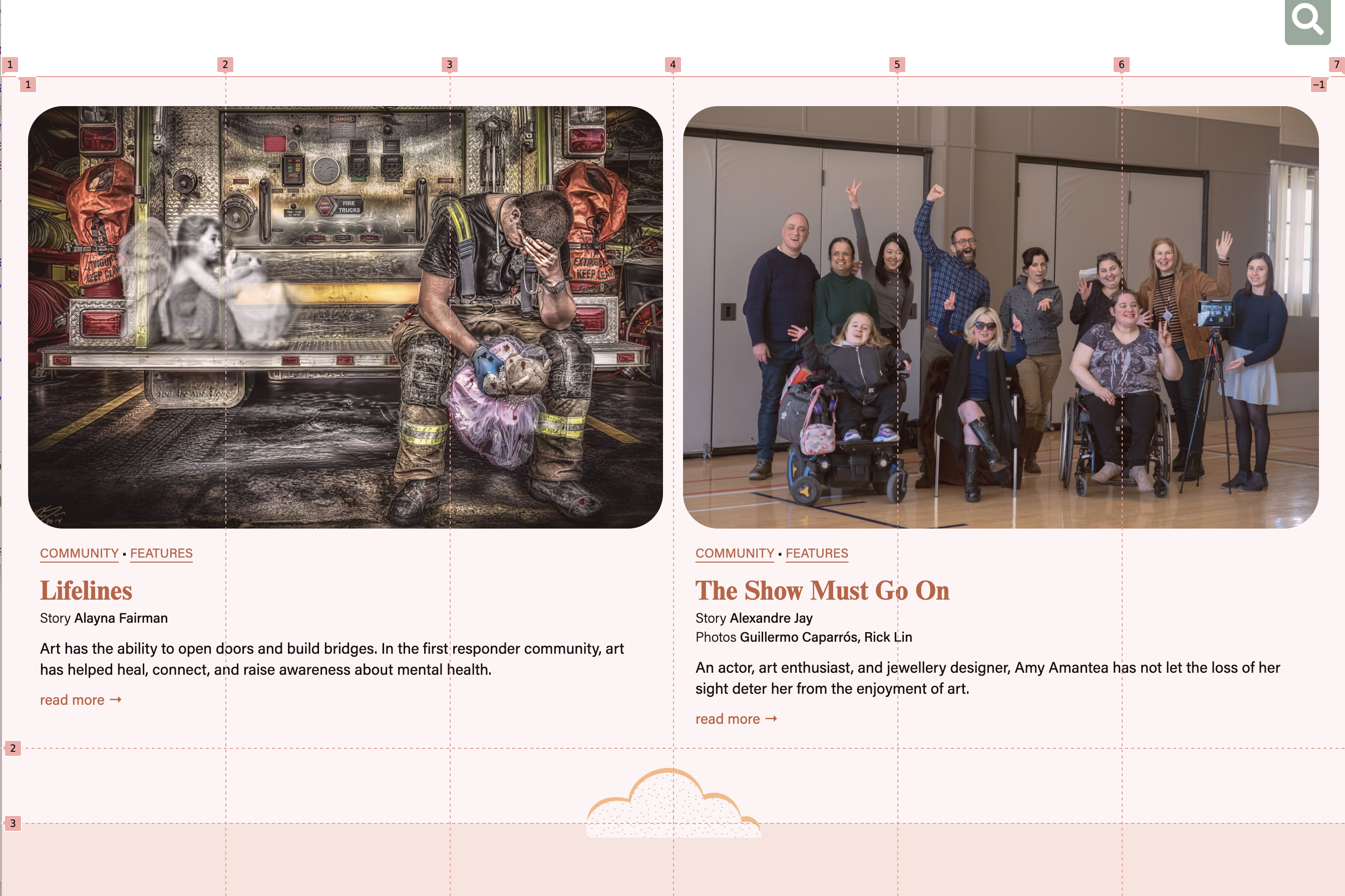
Inside the downloaded package of files you will find three screenshots showing the Phone, Desktop, and Section Titles treatments.
Use them as the guide for your layout: viewing them Full Size will help you make sense of the alignments and other features.
You will also find an index.html file. You will need to add appropriate markup and all the images.
Make everything as close as possible to what’s in the screenshots.
Save your stylesheet in the CSS folder.
Do not use the normalize.css stylesheet that is included in the project. This is what’s known as a reset stylesheet, intended to smooth out browser bugs and inconsistencies. Its usage was pretty much mandatory in earlier days of web development, but browsers are much more consistent these days.
Additional Details:
- the font throughout is the traditional georgia & times css font stack.
- the big gibson guitar is called lifeson-transparent-bg.png.
- the big fender guitar is called strat-vintage56.png.
- some images are rounded via CSS. If you don’t know how to do that, google will help.
- open the screenshot file section-title-detail to see how each the two section headings are treated.
- the TOP button at the bottom of the page needs to take you to the top of the page.
About The Border Treatment
In the screenshots, there is an interesting border treatment on the Gibson and Fender headings. If you have not yet covered CSS positioning or pseudo-elements in this or another class, don’t include the border on those headings.
If you’re in WMDD 4835, I assume you covered positioning in 4815, so please do the section header treatment.
About The Background Image Treatment
If you look closely at the bottom of the Desktop size screenshot, you will notice that the background of the page has a pattern.
That image is from the patterns folder in the img folder. The file itself is called concrete-wall.png
If you look more closely, you will notice that the pattern is more visible at the bottom of the page than at the top. In other words, the background pattern appears to fade in from the top to the bottom of the document (becoming more visible as you scroll down the page).
Use information from this article at CSS Tricks in order to figure out how to create this effect.
Final Hint
The Firefox Developer Edition browser has a great tool for visualizing Grid layouts.
Simple instructions on how to use it are here.
Note: in late 2020, Chrome added similar functionality, so pretty much the same UI is available in Chrome.
To use it, right-click in the page and choose Inspect.
In the HTML part of the Inspector, beside any element with a grid there will be a button:
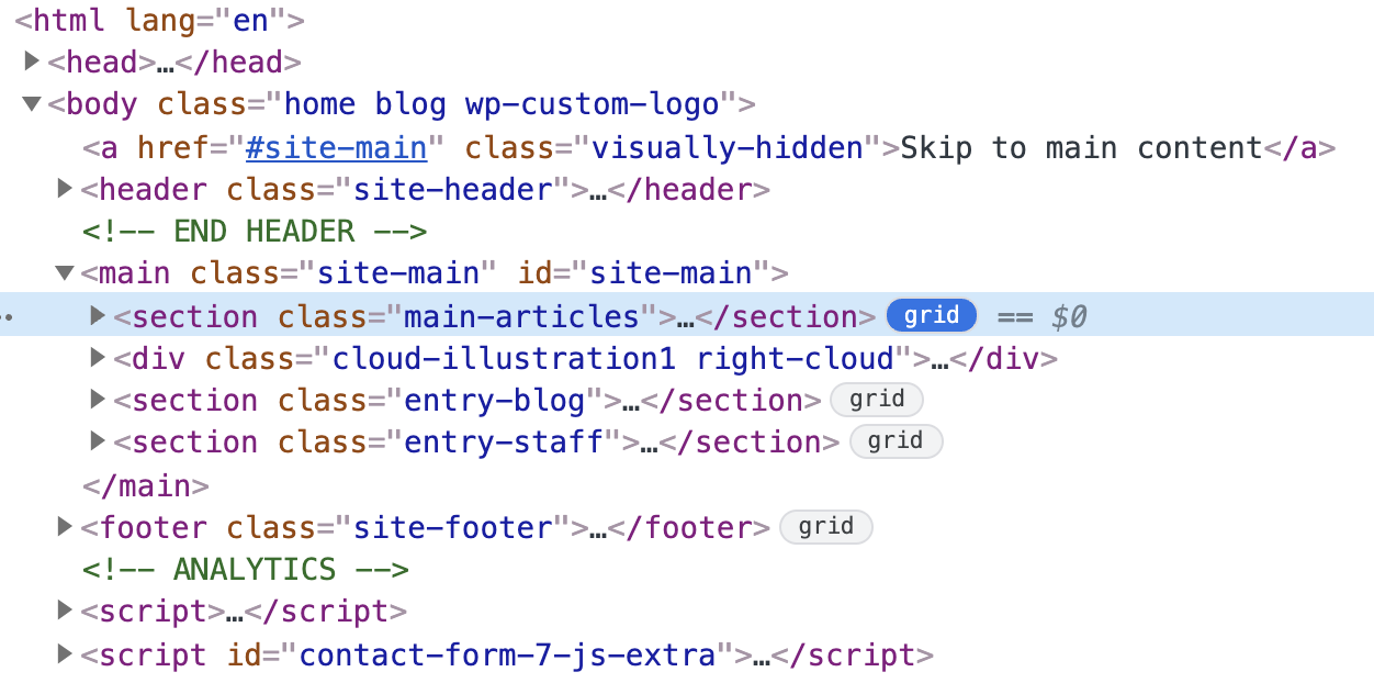
If you click the button, the grid will be shown in the browser. As an example, in the screenshot below from LangaraPRM.com, we see a six-column grid with (at least) three rows.