First please download the starter files. The difference between the two is that the first has the javascript written for you, but the second asks you to write the javascript.
If you are a Langara Publishing or Emily Carr Intro to Web Design student, please download this one.
If you are a Langara WMDD student, please download this one.
The task:
The file you downloaded is called grid-starter-template.html file. It contains two unordered lists—one containing numbers, the other containing numbers and stanzas from a poem by the poet Lewis Carrol.
There is also a NAV area with 19 buttons inside. When the user clicks on a button, the corresponding layout will display (as shown in the screenshots).
If you are a WMDD student, this will require a small amount of JavaScript: the classList or className properties will be very helpful in this. Here is one way you can set up your buttons quickly.
If you are a PUBL student, the JavaScript is already set up for you.
Click on any screenshot to see a larger version.
Common characteristics
- All the layouts involve a grid relationship between the parent UL and its children.
- All layouts, except for number 14, have 1 rem of space between each list item.
- All layouts, except for number 13 and maybe number 12, take the full width and height of the browser window (minus the sidebar navigation area).
- Layouts 1 – 16 use the UL with a class of wrapper.
- Layouts 17 – 19 use the UL with a class of poems.
- Only one UL is visible at a time.
- No layouts use the css position property.
- No layouts use flexbox.
- Unless otherwise specified, the widths and heights of each LI will vary with browser height and width.
- Apart from adding or removing classes on the BODY element, no other HTML changes can be made via JavaScript.
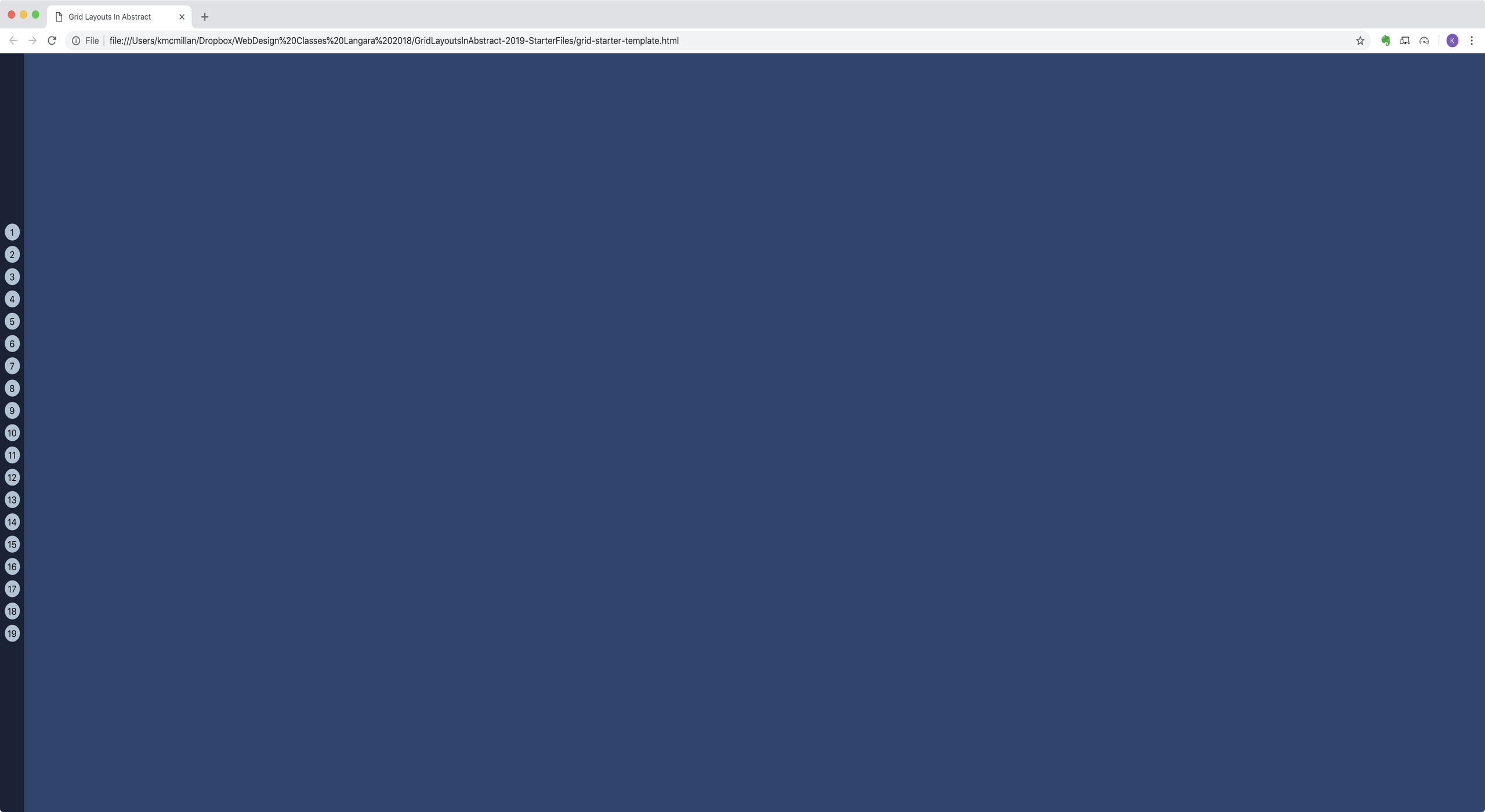
The Starting Layout
- A menu is on the far left. The menu area is 40px wide. The main area, to the right of the menu, looks empty at page load.
- The buttons are always in the horizontal and vertical middle of their area at the side of the screen.
- The buttons will have a hover, active, and focus states (visible in the other screenshots).
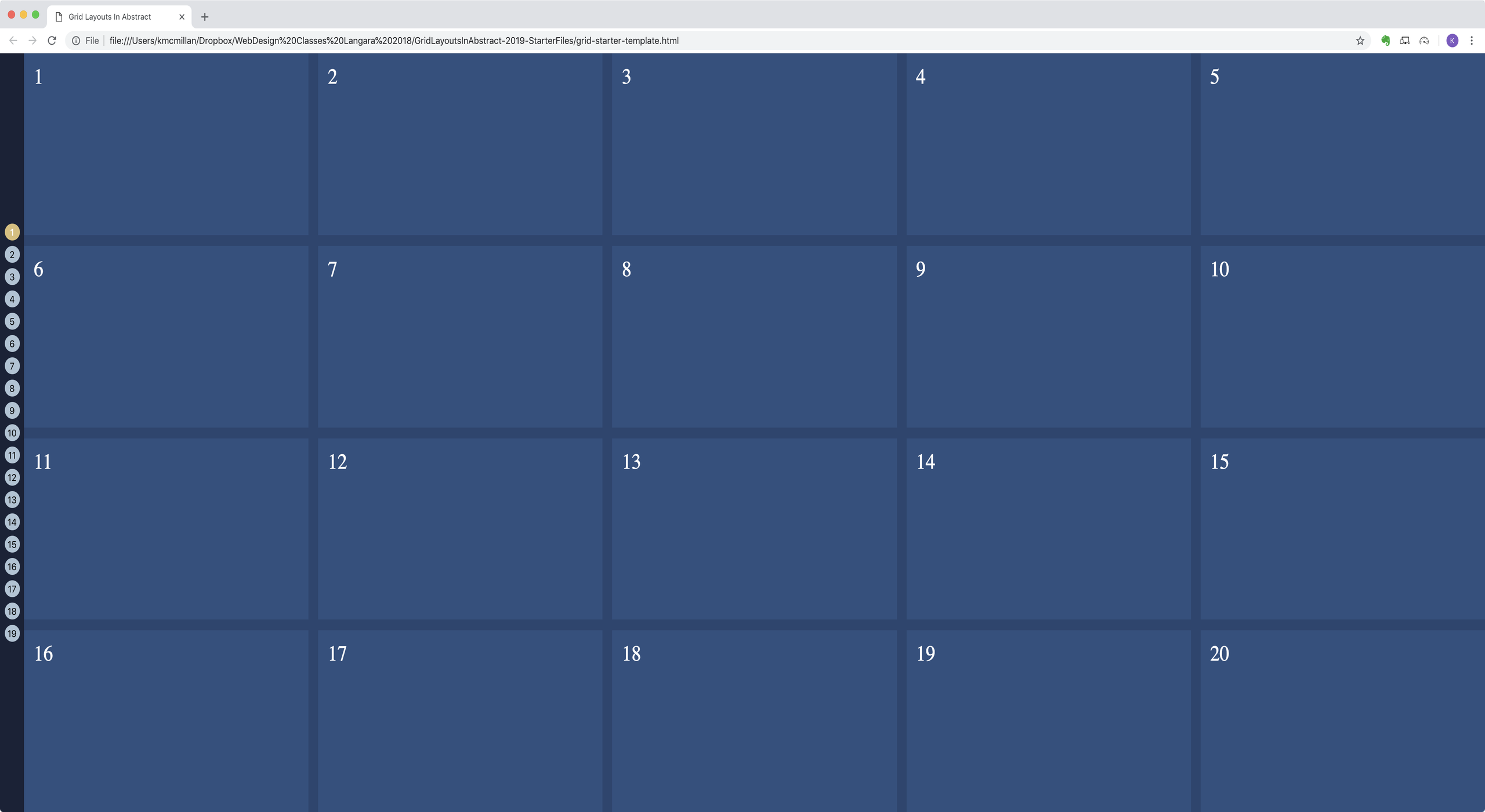
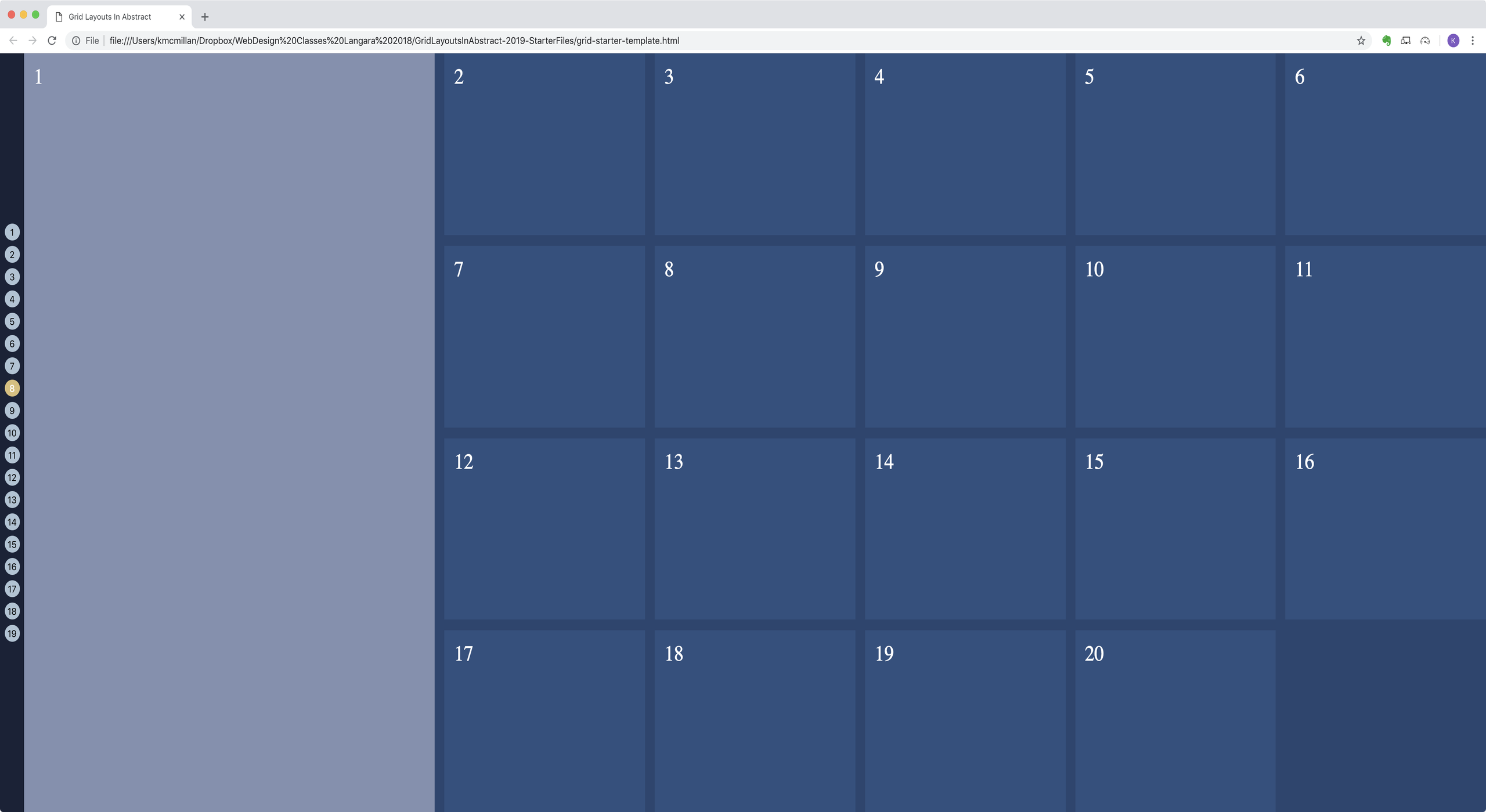
Example 1:
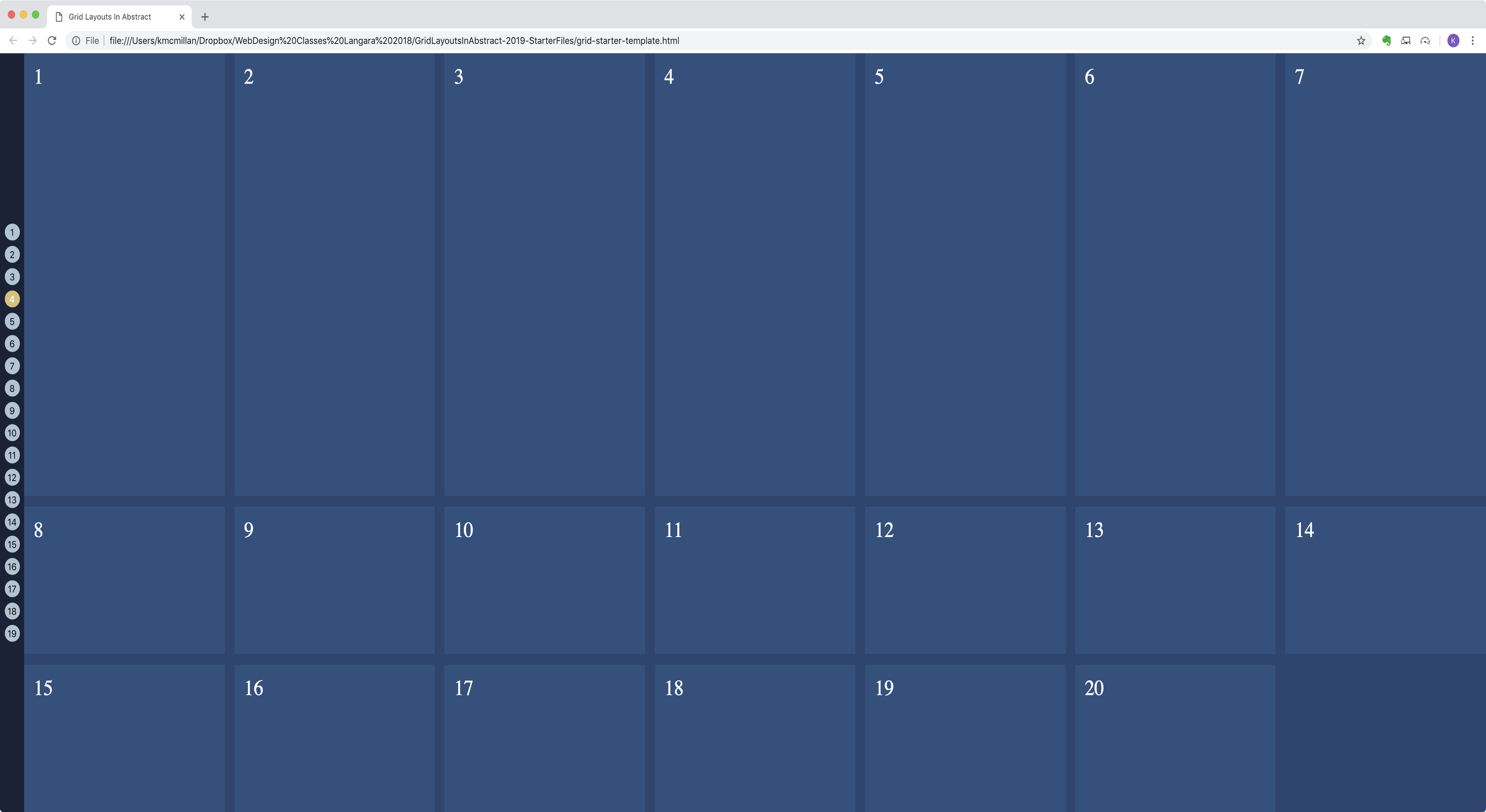
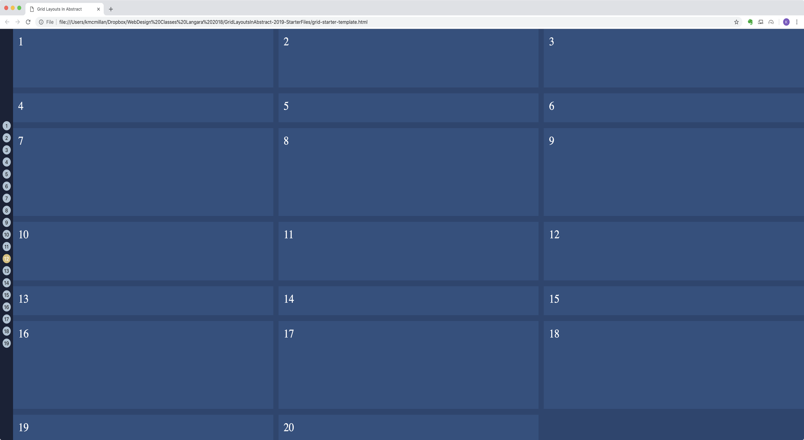
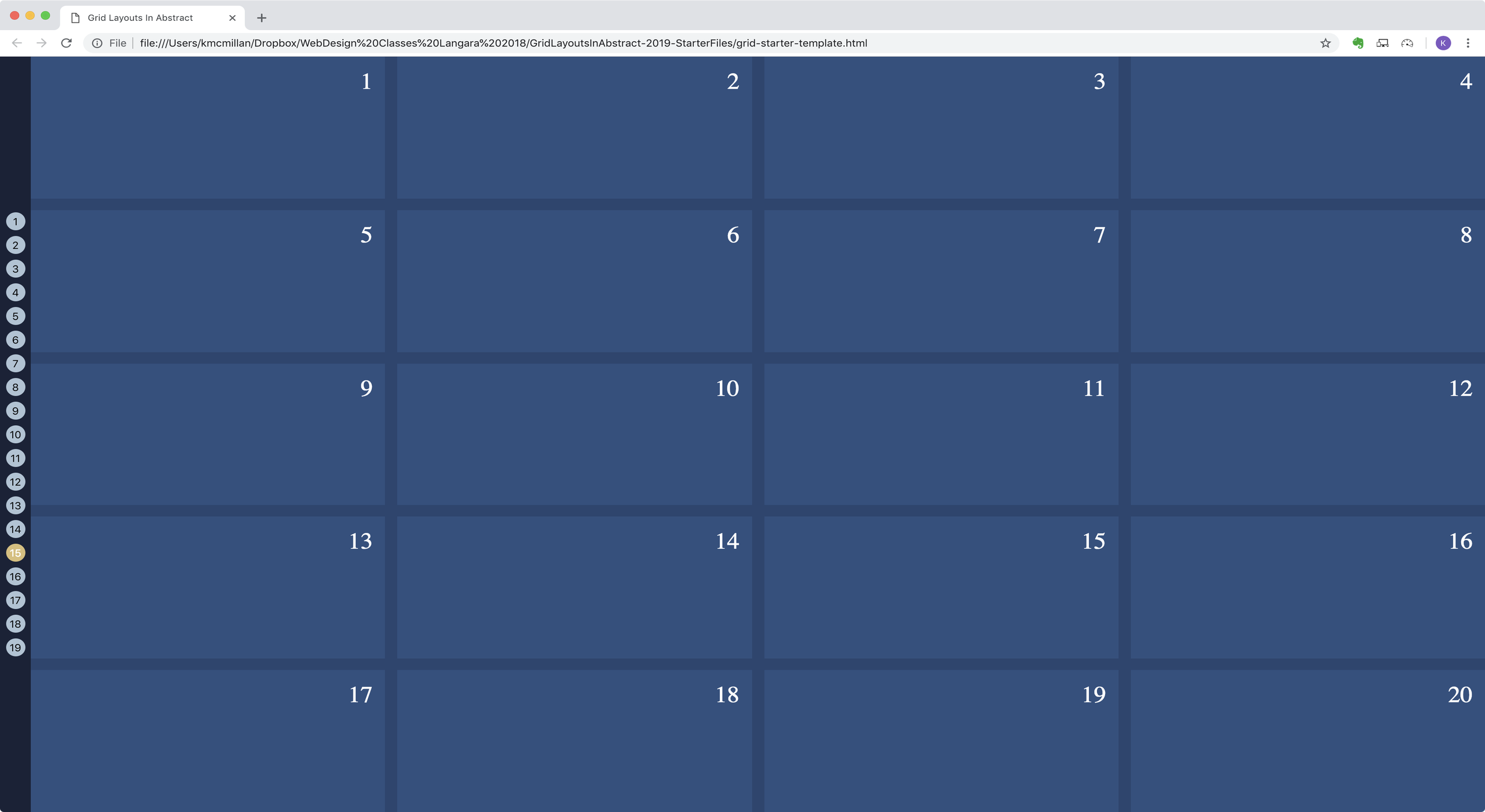
- Four equal-height rows, five equal-width columns.
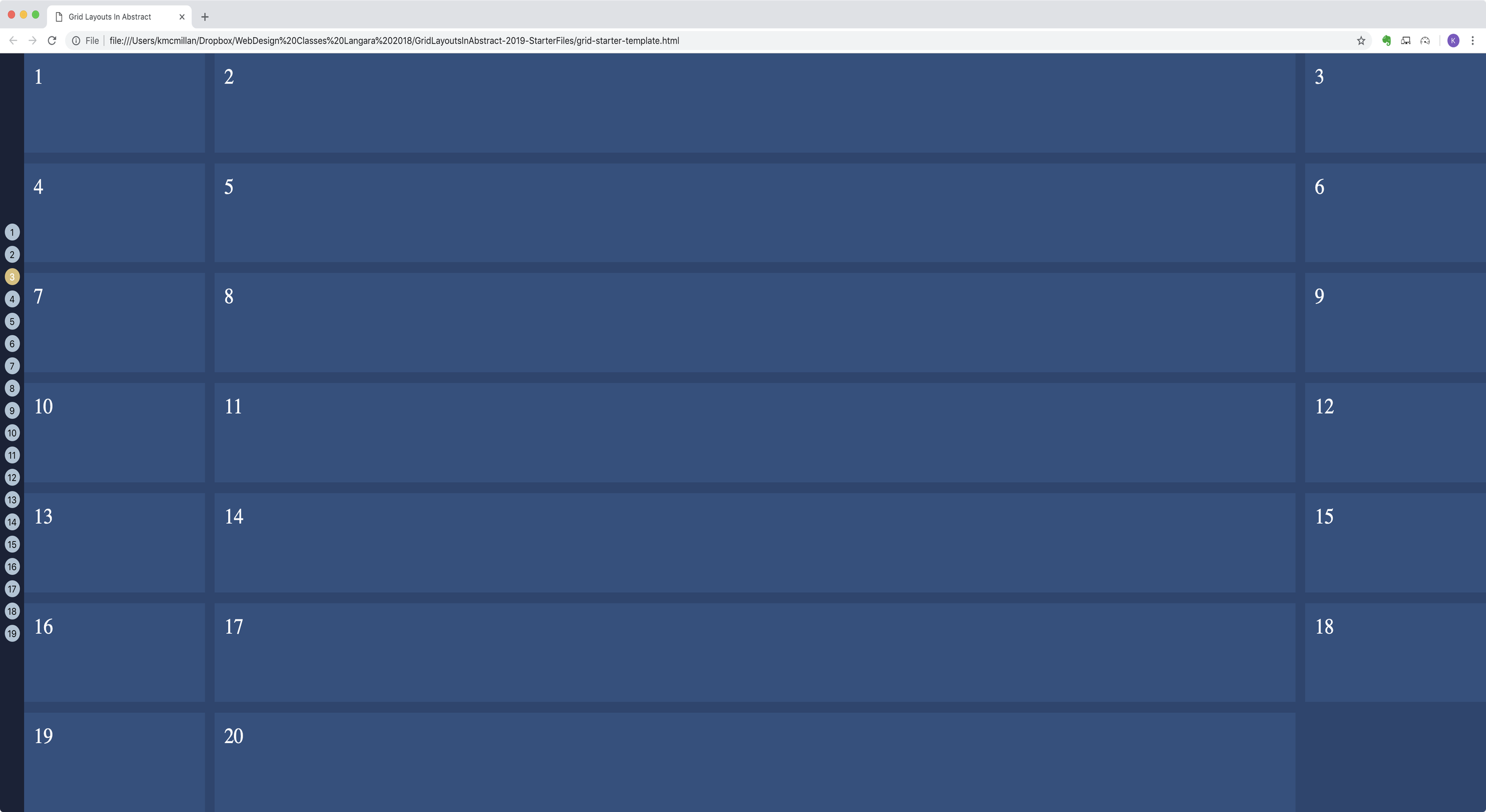
Example 2
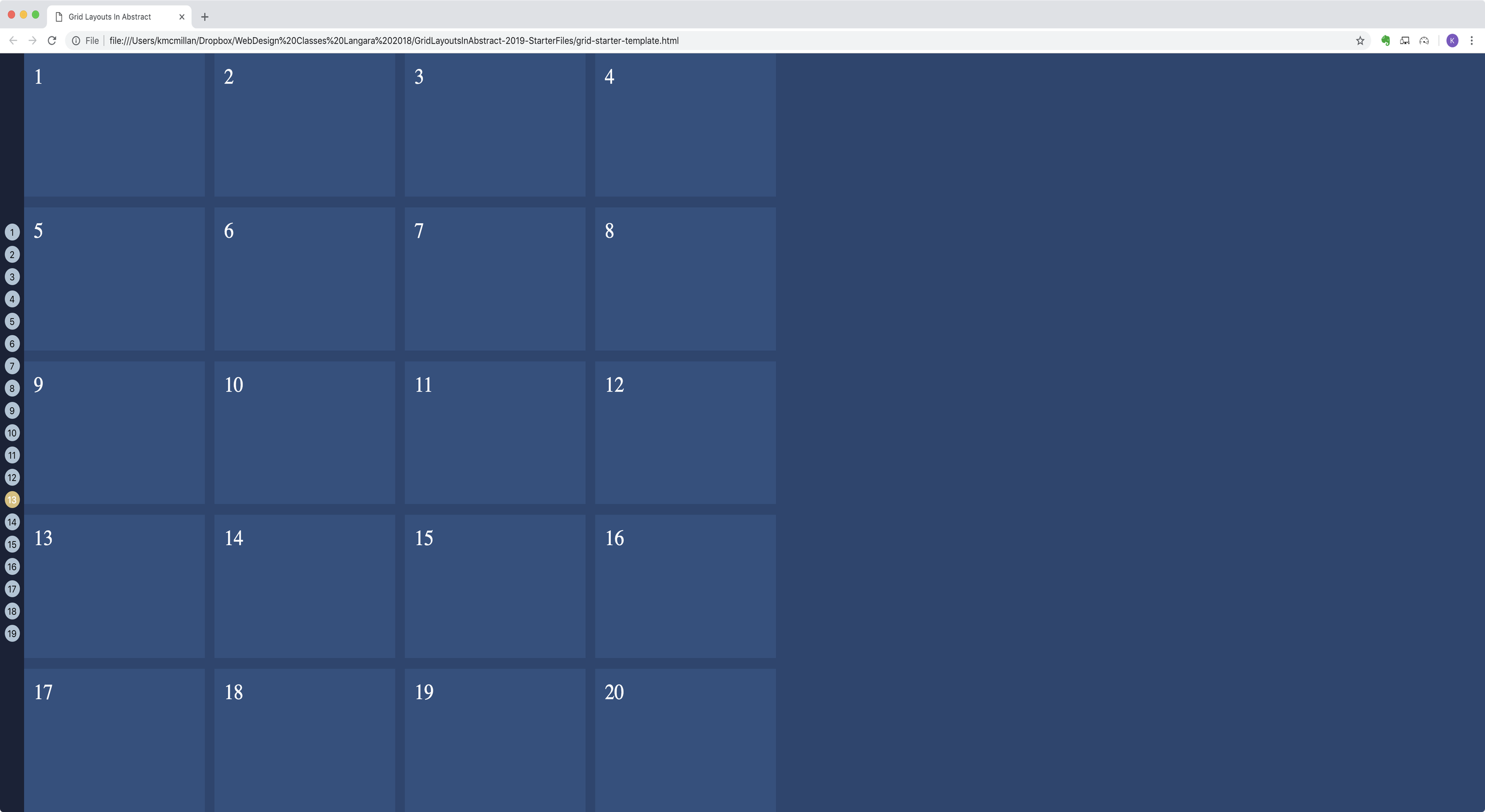
- Five rows, four columns
- First column is always 300px; other columns vary with browser width

Example 3
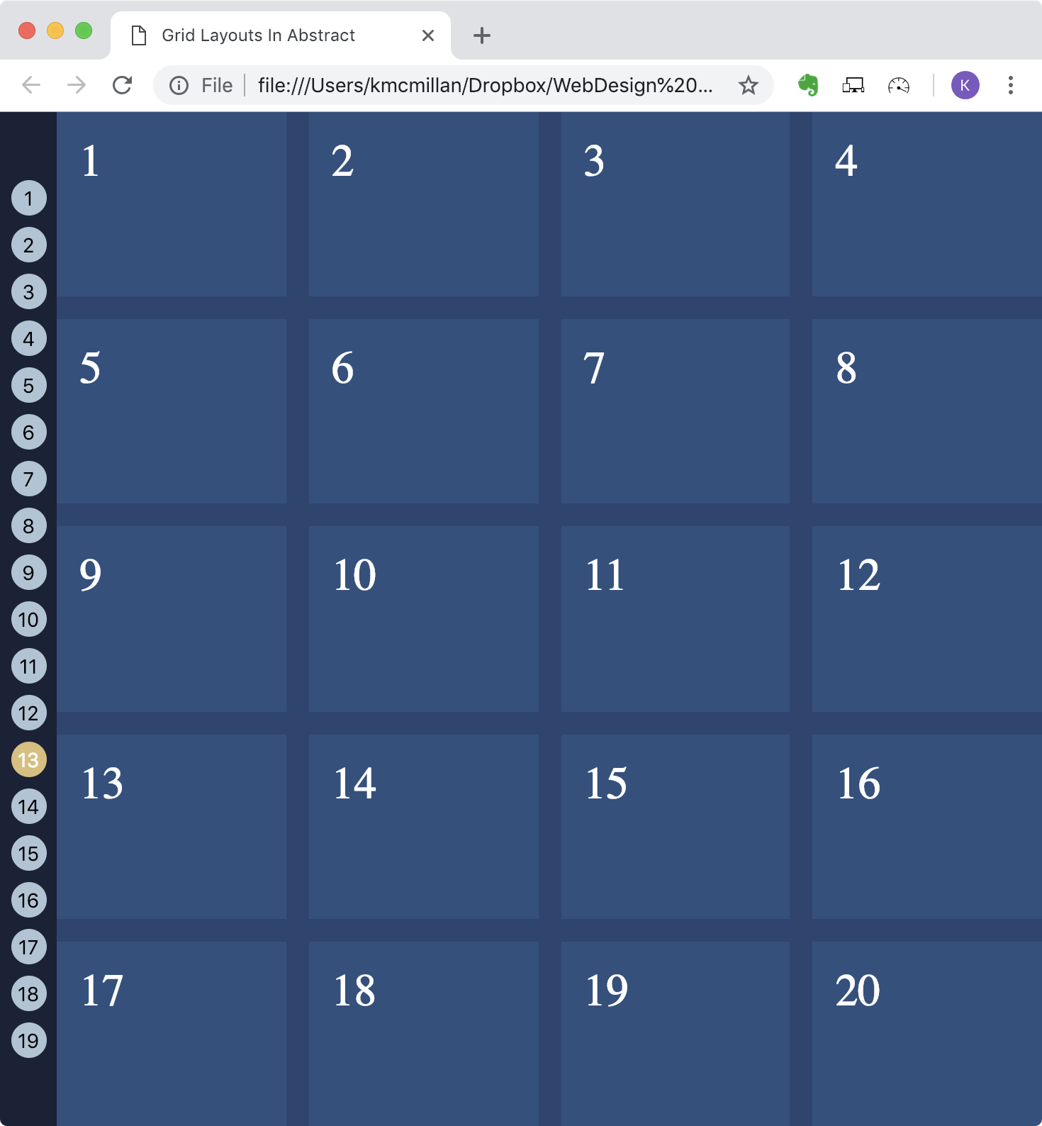
- Seven rows, three columns
- First and last columns are 300px; middle column varies with browser width.
Example 4
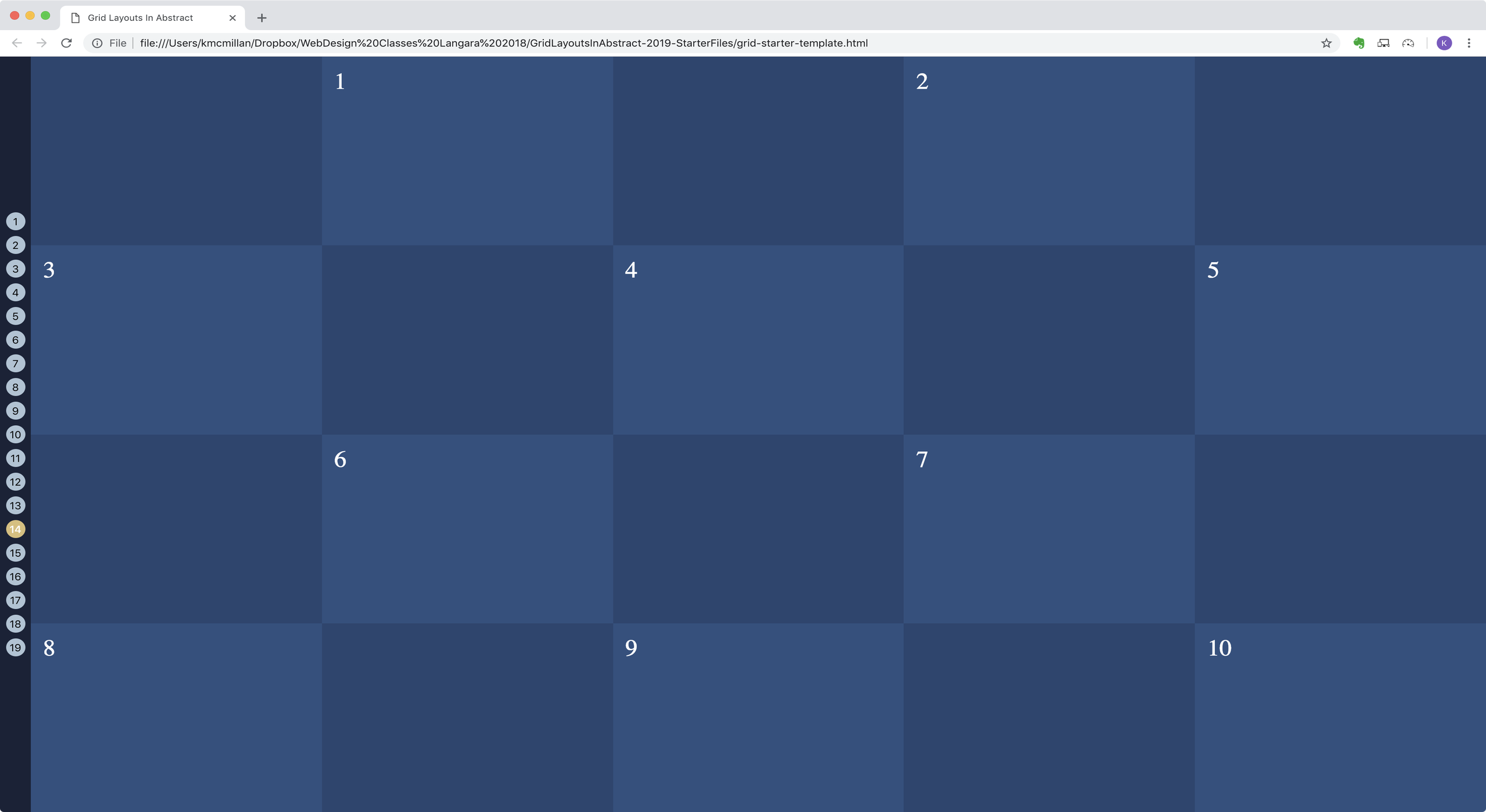
- Three rows, seven columns. First row is 3x the height of other rows. Columns are equal width.
Example 5
- Four rows, seven columns. First item in row 1 covers four columns
Example 6
- Four rows, seven columns. Last item in row 1 covers four columns
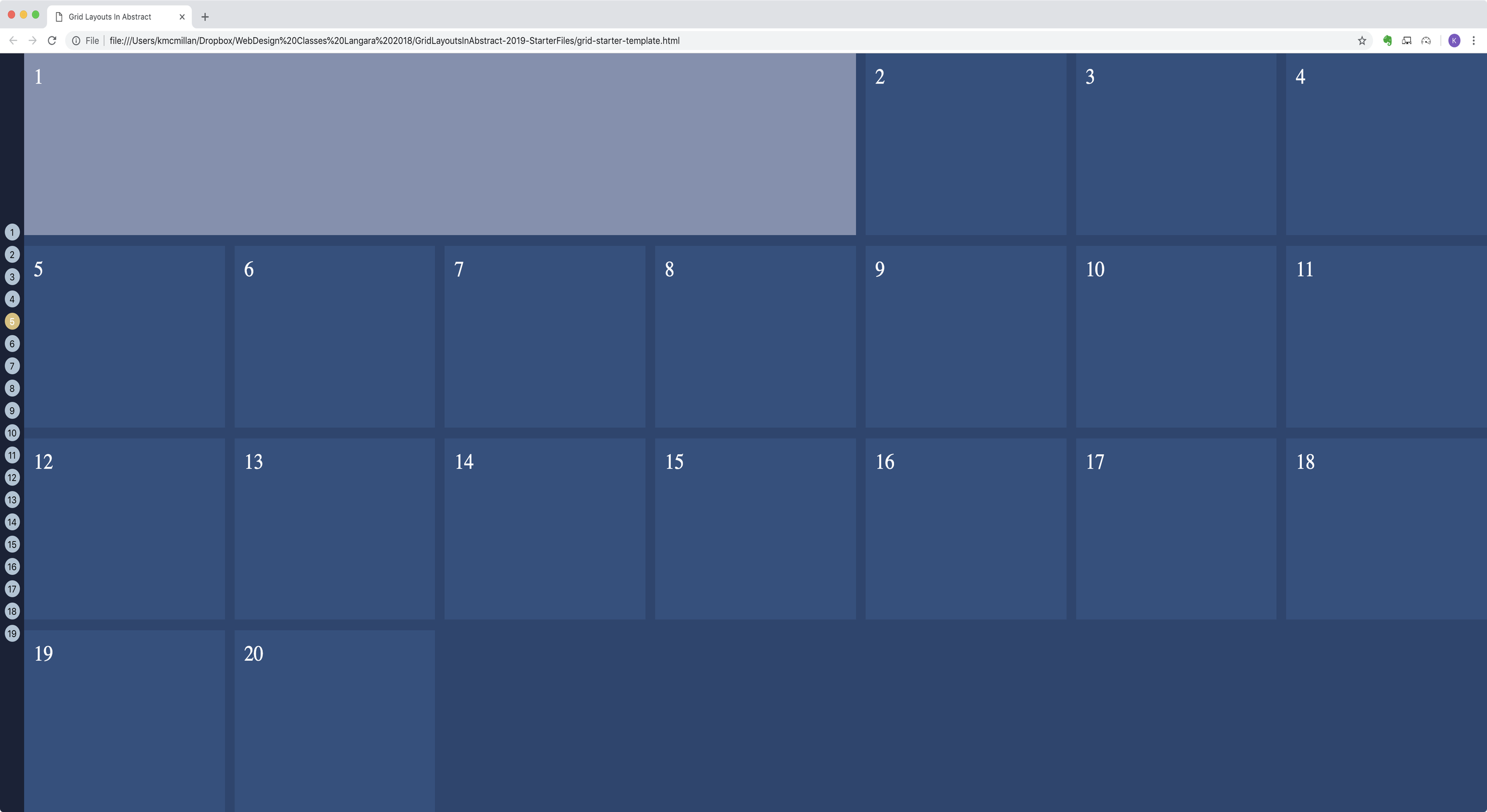
Example 7
- First item in row 1 covers four rows
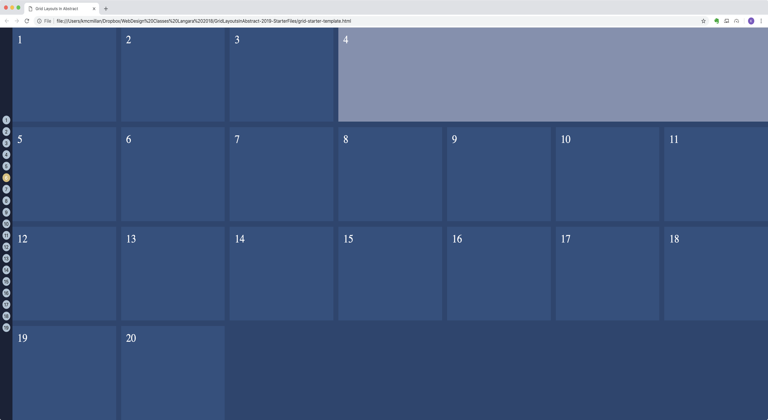
Example 8
- First item in row 1 covers four rows and two columns
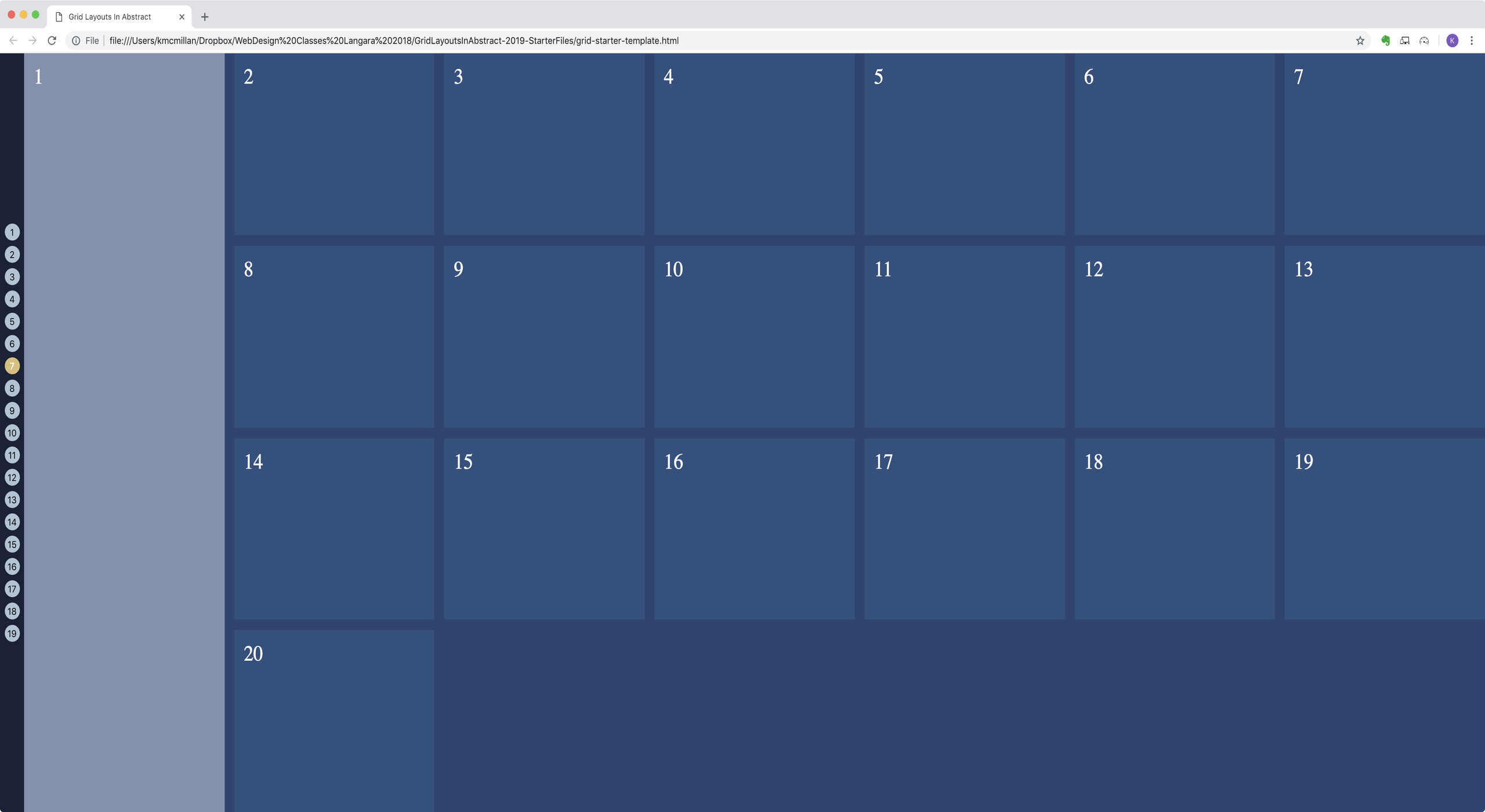
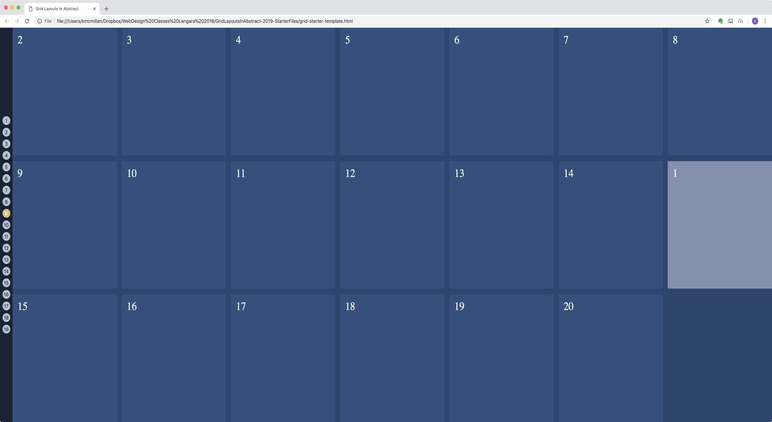
Example 9
- Item number 1 appears at the end of row 2.
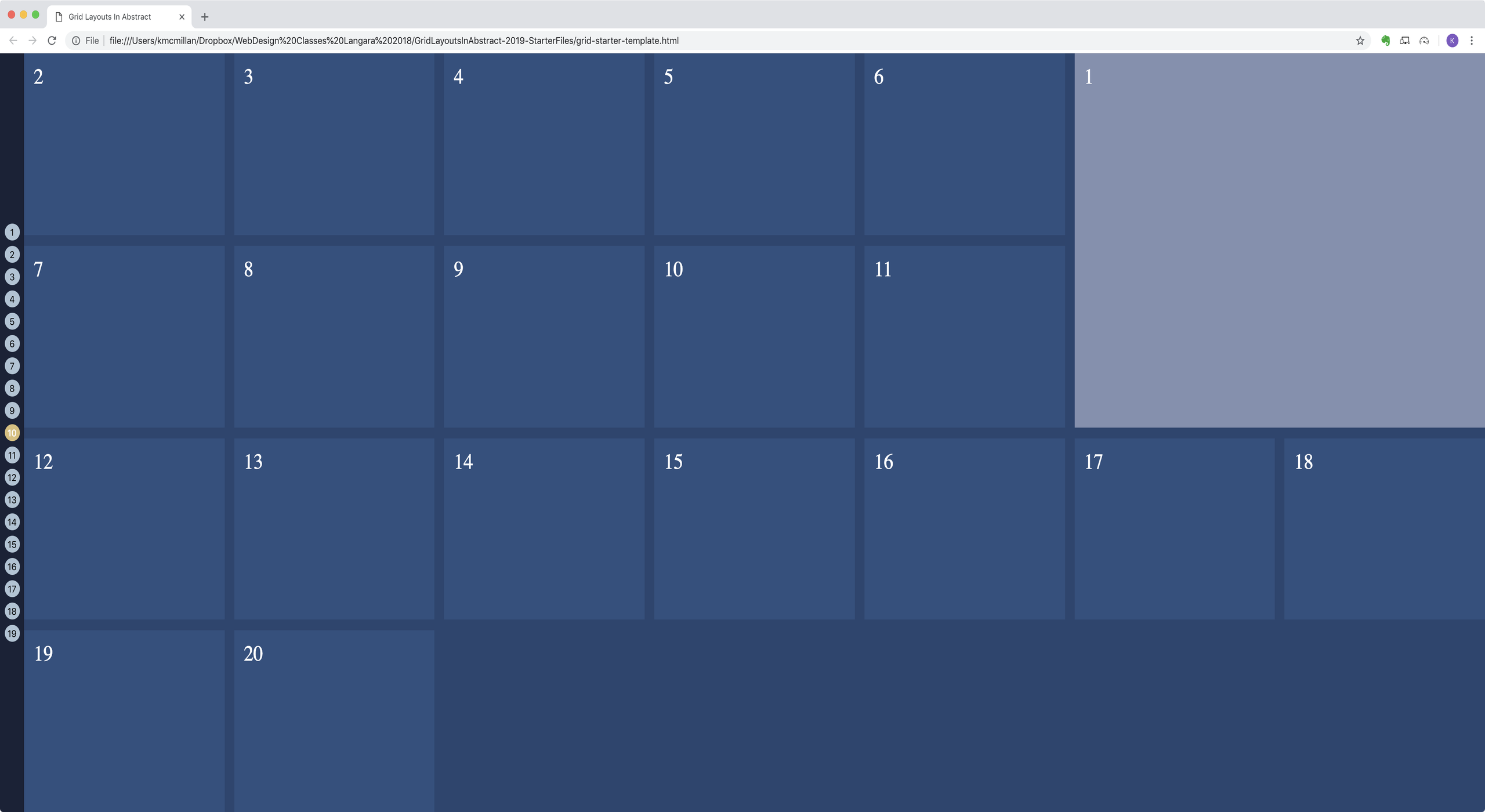
Example 10
- Item number 1 takes up two rows and two columns from the right edge of the wrapper.
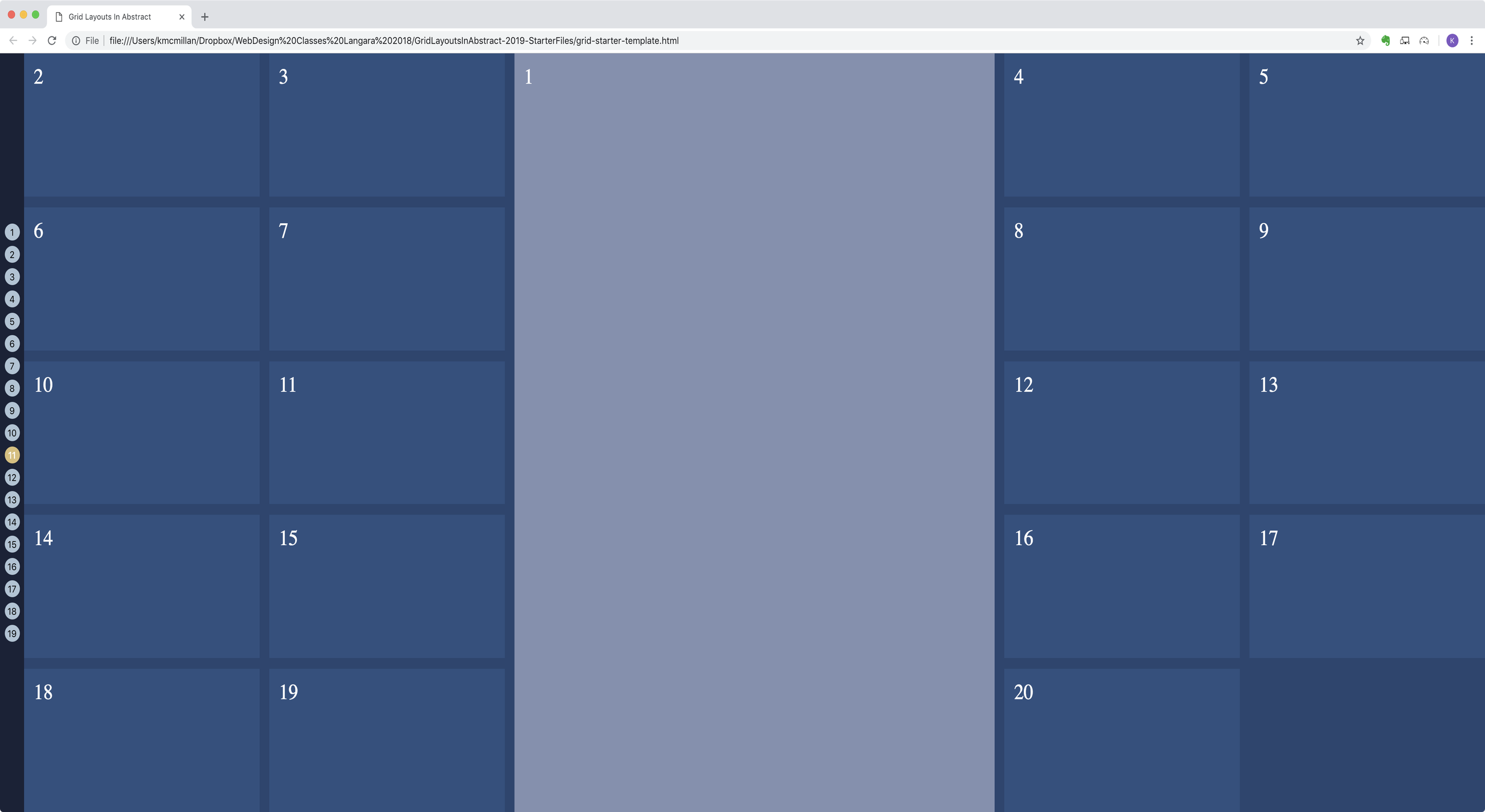
Example 11
- Item number 1 takes up three columns in the middle of the entire wrapper.
- Remember: no changes to the HTML.
Example 12
- 3 columns, equal width.
- 7 rows. Row 2 is 1/2 the height of row 1, and 1/3 the height of row 3.
- That pattern continues with rows 4,5, & 6.
- But the last row does not continue the pattern: the only thing determining its height will be the content itself.
Example 13
- Four columns. Each is an equal width, but each one never gets smaller than 200px or bigger than 400px.
- Hint: requires minmax()
Example 14
- 4 rows, 5 columns.
- Only the first 10 LIs are visible.
- Content forms a checkerboard pattern.
Example 15
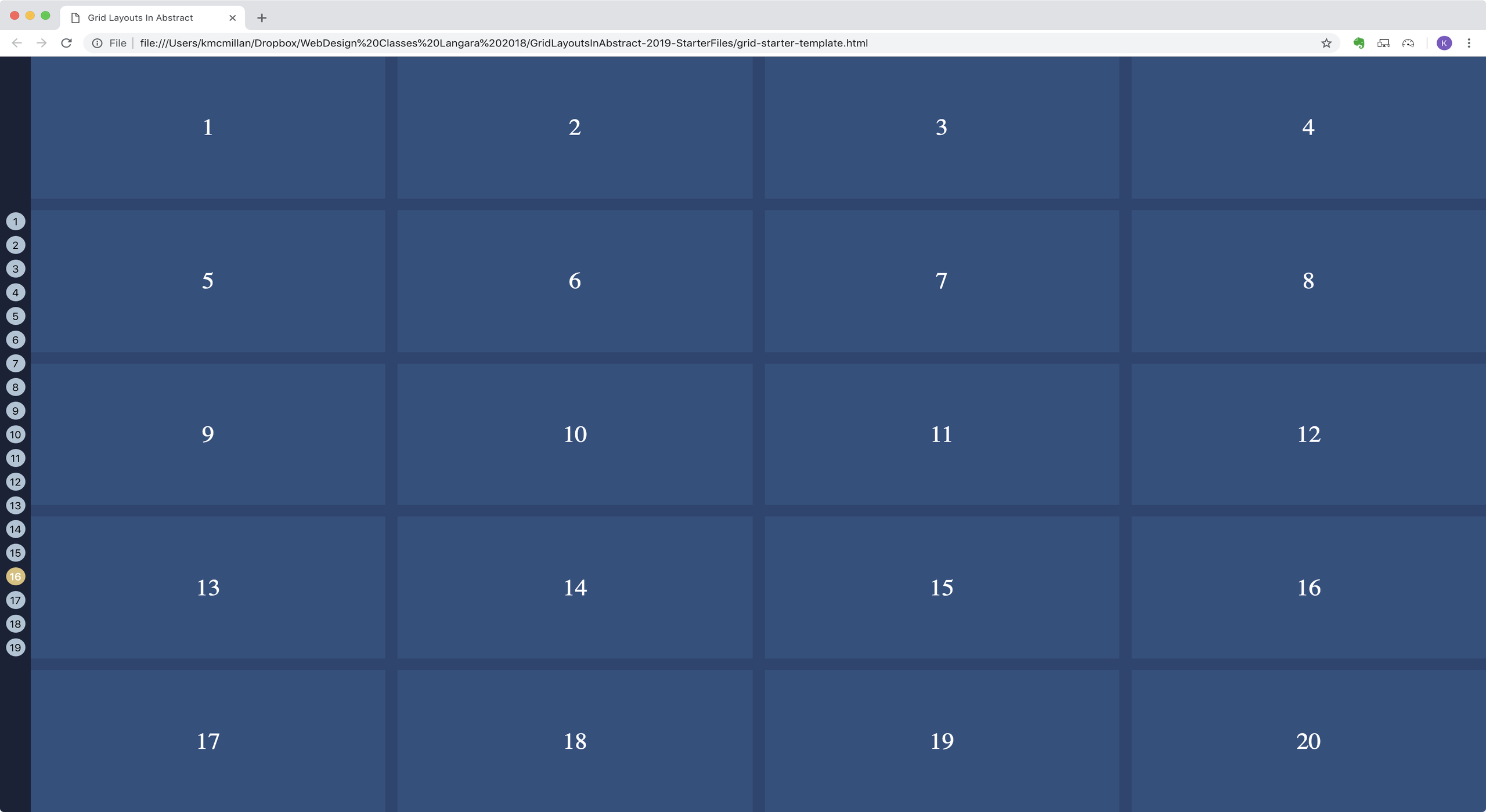
- Same layout as example 1, but item number is in top right of box.
Example 16
- Same layout as example 15, but text is in the horizontal and vertical center of the box.
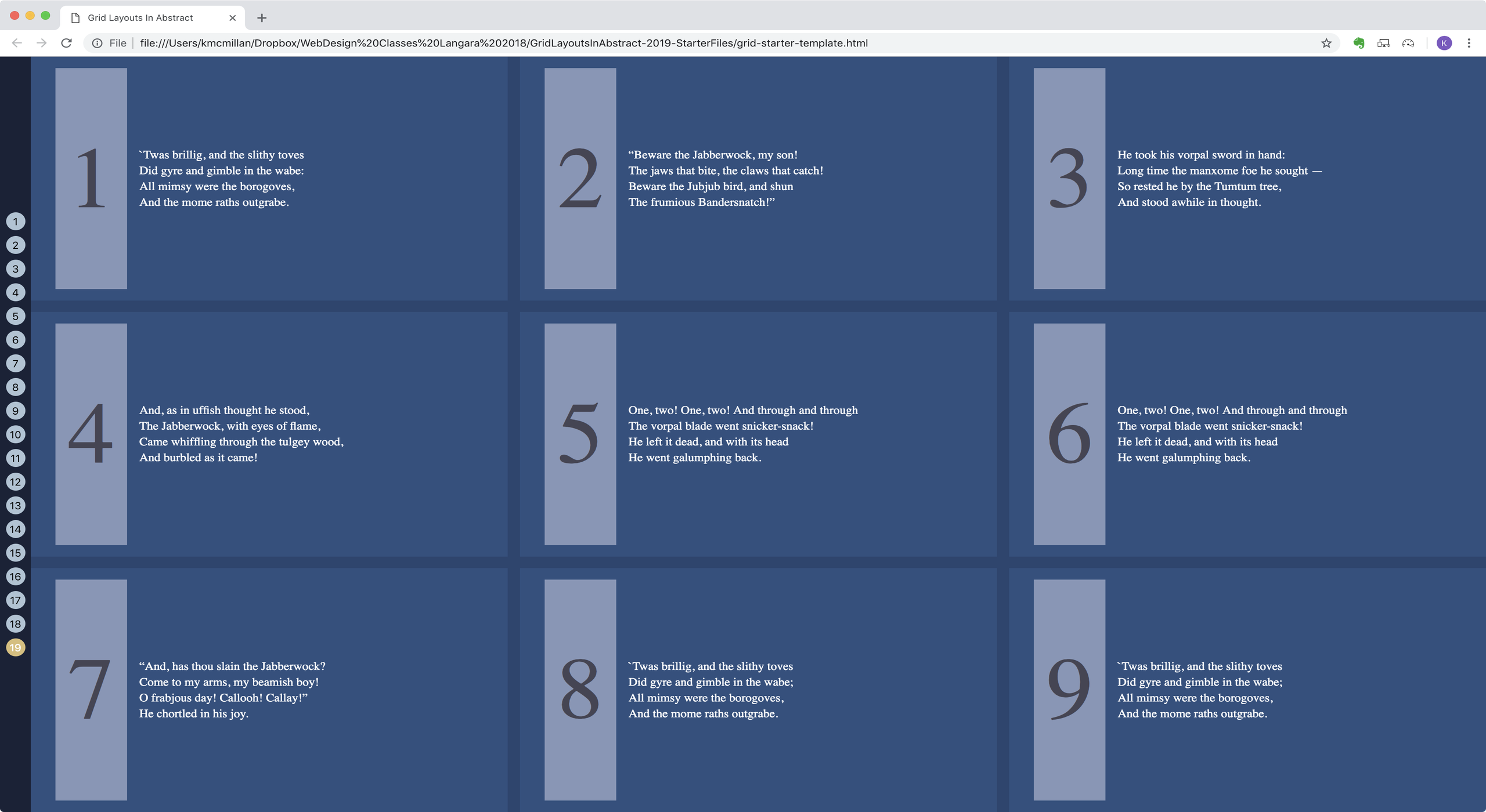
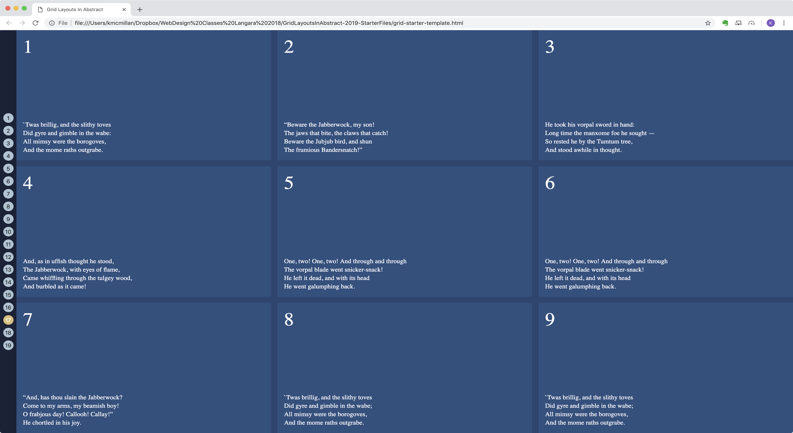
For layouts 17-20, use the UL with a class of poem as your grid parent.
Example 17
- Style it like in the screenshot. Don’t worry that the text is different than in the text in the screenshot.
- Make the number be in the top left corner and the text be in the bottom left corner.
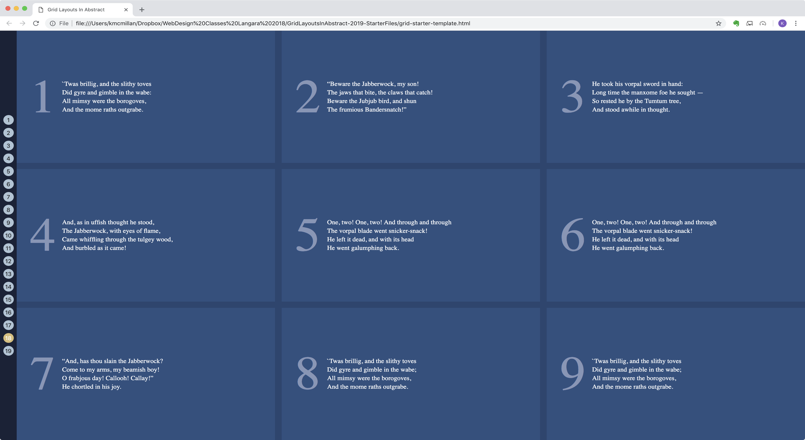
Example 18
- Lay it out like in the screenshot. Do not push the content down with margin or padding. It needs to be vertically centered, but not horizontally.
Example 19
- Lay it out like in the screenshot
- Modify the design so that the item number has a light background.
- Have the number text centered vertically and horizontally in its box.