First, download the required files.
Using Firefox for your browser will allow you to use its Layout tab in its Inspector. If you’re at Langara, use the Firefox Developers Edition.
The task:
In the files you download is a grid-starter-template.html file. For each layout you are to build, duplicate and rename to reflect the layout you need to build.
There is a stylesheet called common-styles.html which just removes the dots on the list and does some basic formatting.
Put your styles for each exercise in the <style> area at the top of HTML.
Do the exercises in sequence: some build on what’s done in the previous exercise.
Example 1:
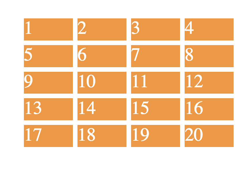
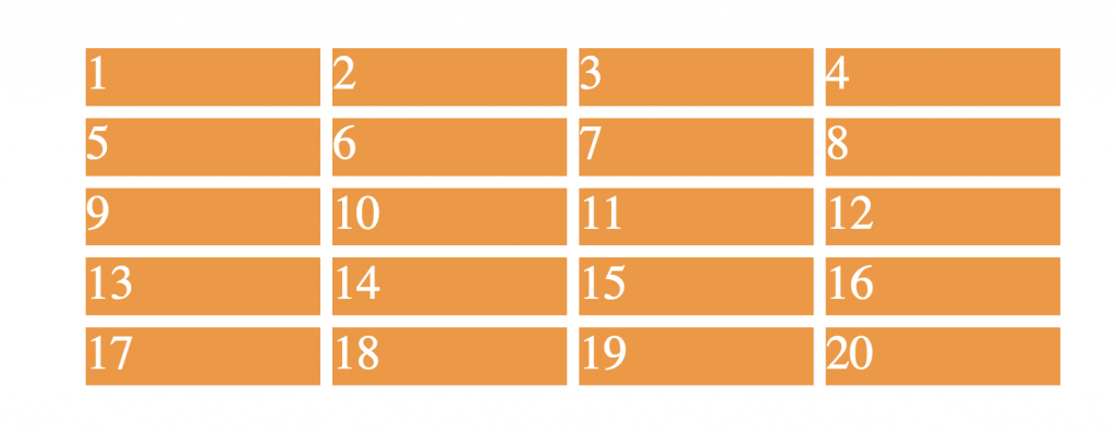
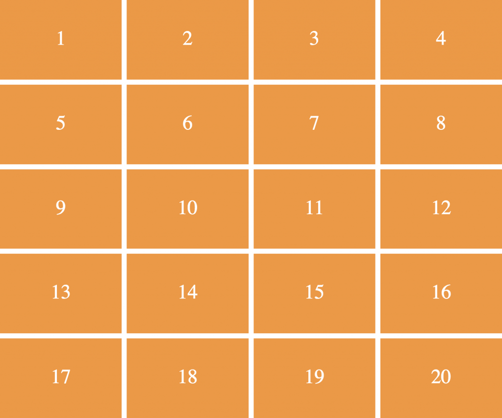
Four rows, five columns.
- Columns take all available space (i.e. between the BODY margins).
- Font size determines height of rows
- 1em space between items.
Example 2
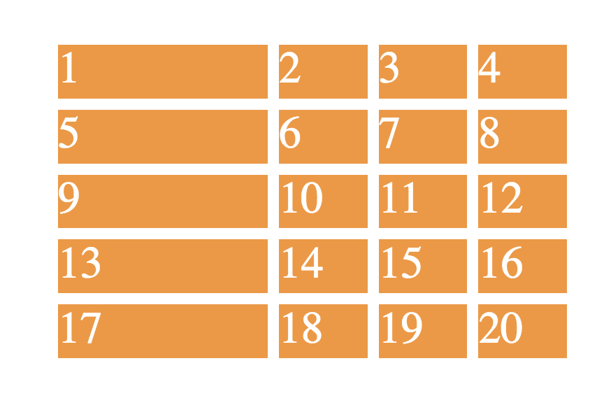
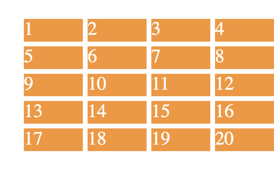
- Five rows, four columns
- First column is always 300px; other columns vary with browser width
Example 3
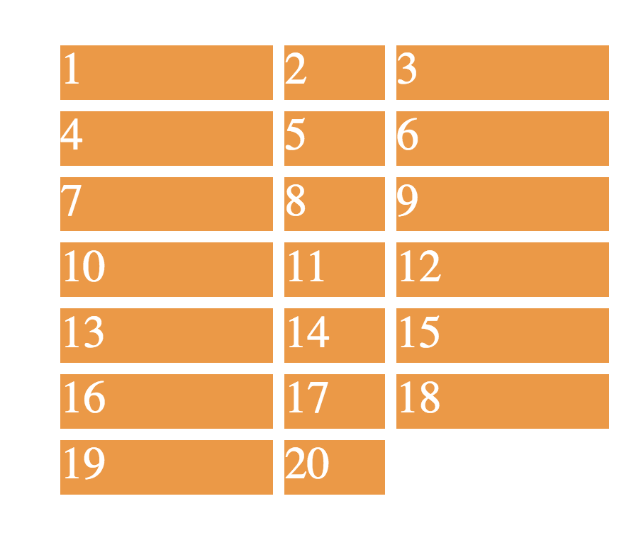
- Seven rows, three columns
- First and last columns are 300px; middle column varies with browser width.
Example 4
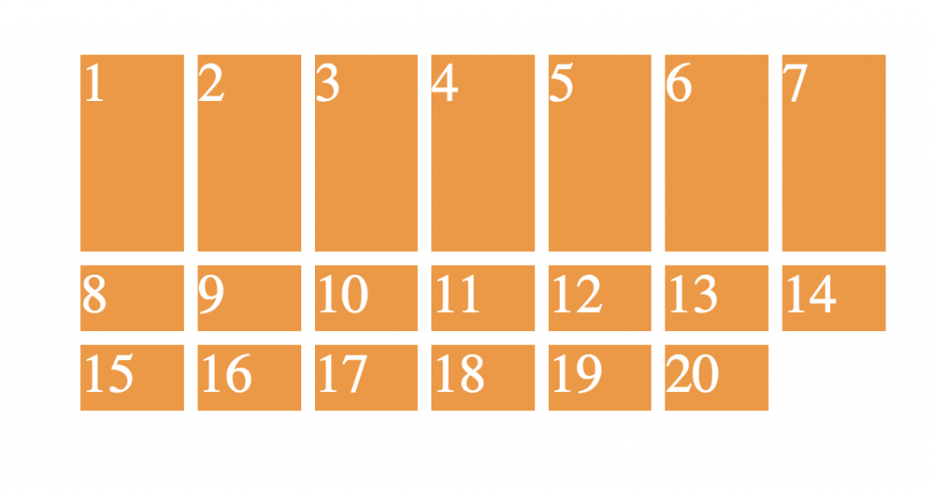
- Three rows, seven columns. First row 3x the size of other rows. Columns are equal width.
Example 5
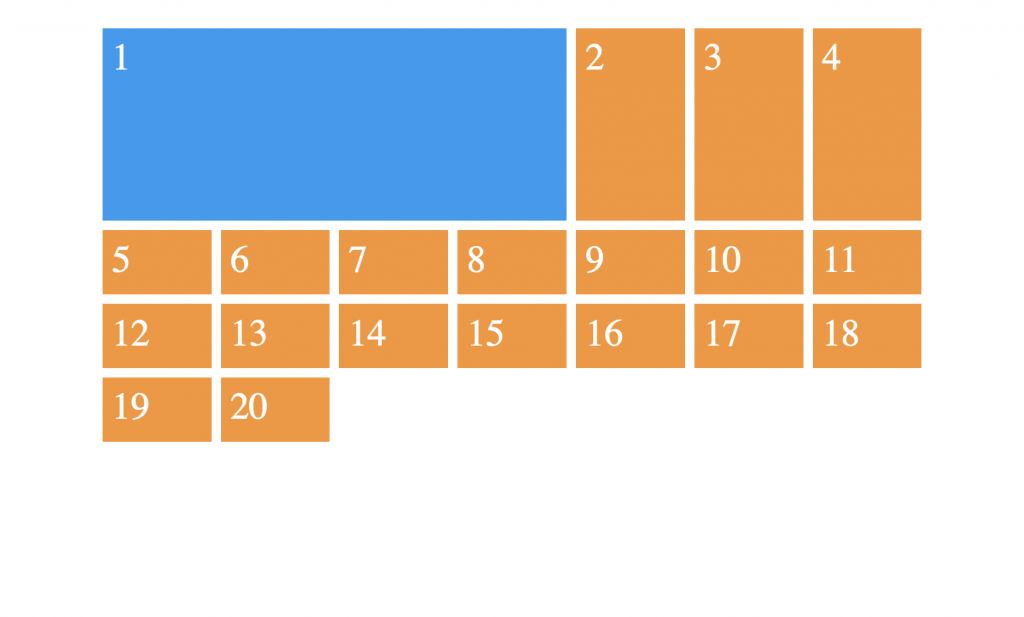
- Four rows, seven columns. First item in row 1 covers four columns
Example 6
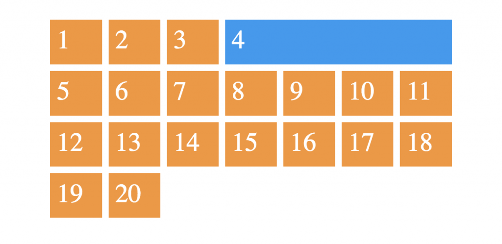
- Four rows, seven columns. Last item in row 1 covers four columns
Example 7
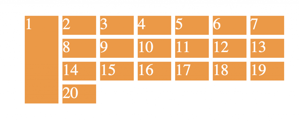
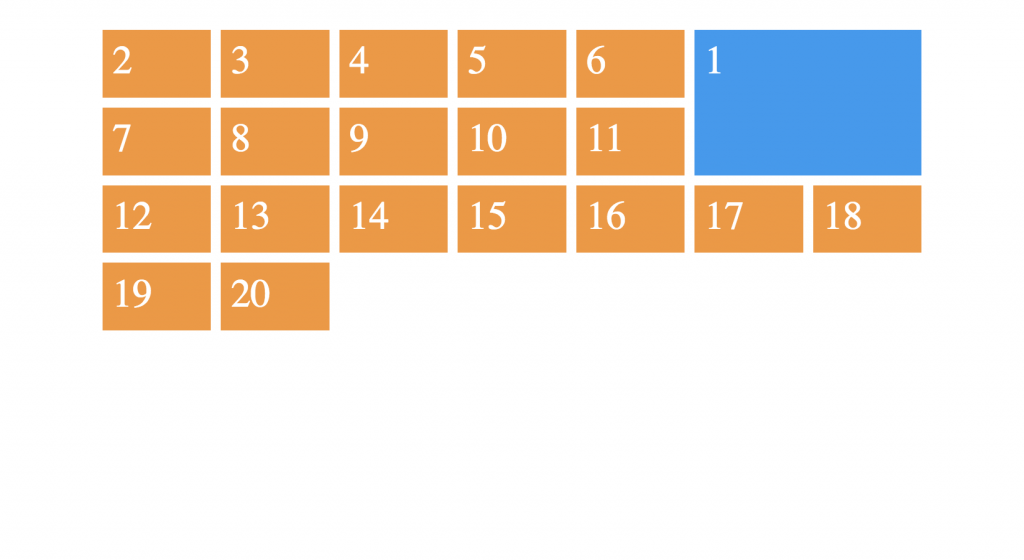
- First item in row 1 covers four rows
Example 8
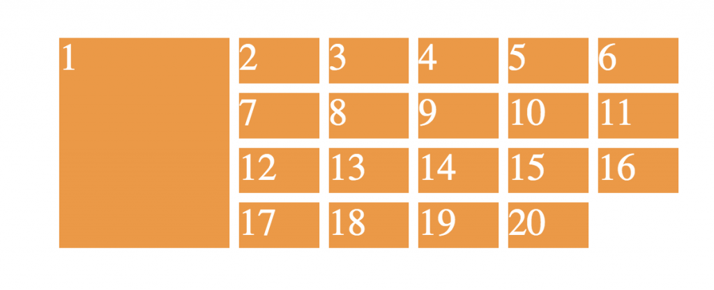
- First item in row 1 covers four rows and two columns
Example 9
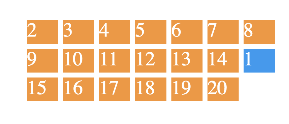
- Item number 1 appears at the end of row 2.
Example 10
- Item number 1 takes up two rows and two columns from the right edge of the wrapper.
Example 11
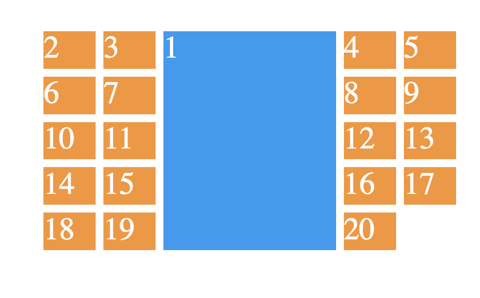
- Item number 1 takes up three columns in the middle of the entire wrapper.
- Remember: no changes to the HTML.
Example 12
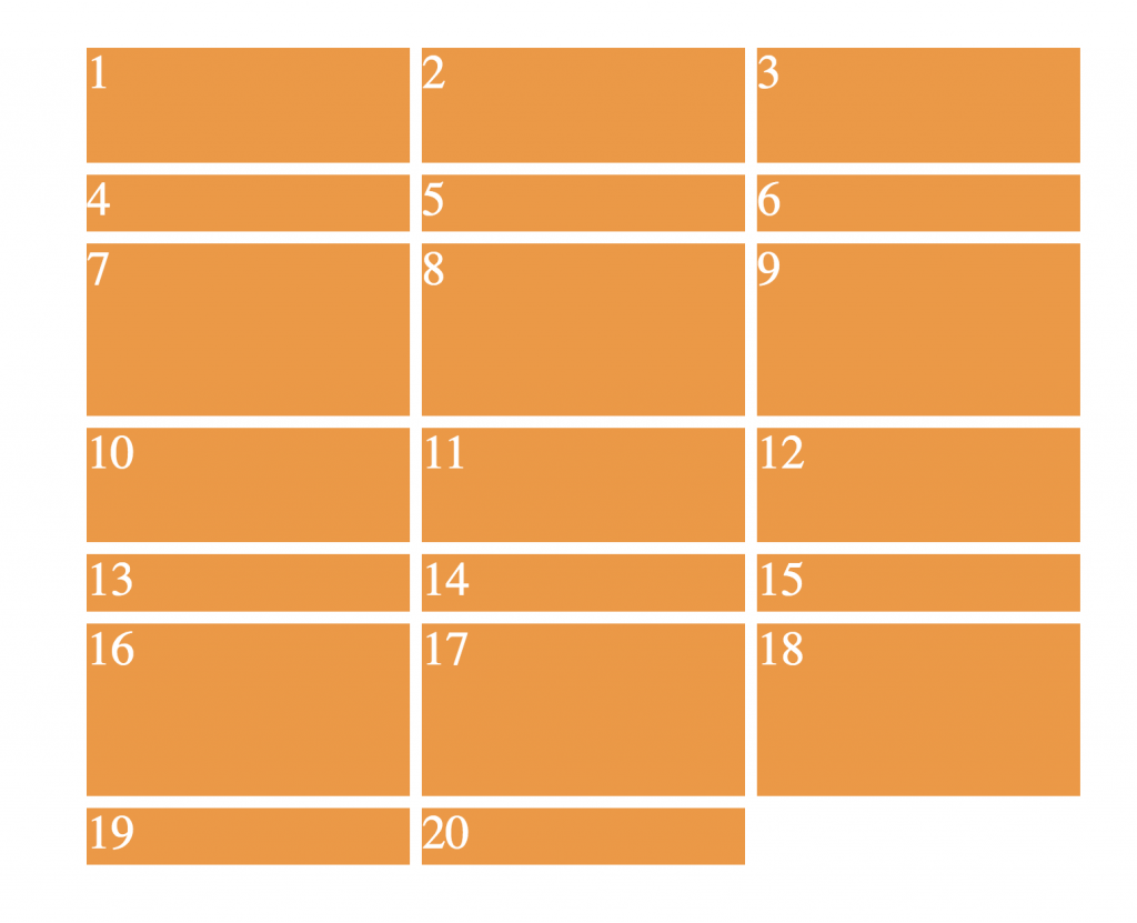
- 3 columns, equal width.
- 7 rows. Row 2 is 1/2 the height of row 1, and 1/3 the height of row 3.
- That pattern continues with rows 4,5, & 6.
- But the last row does not continue the pattern: the only thing determining its height will be the content itself.
Example 13
- Four columns. Each is an equal width, but each one never gets smaller than 200px or bigger than 400px.
- Hint: requires minmax()
Example 14
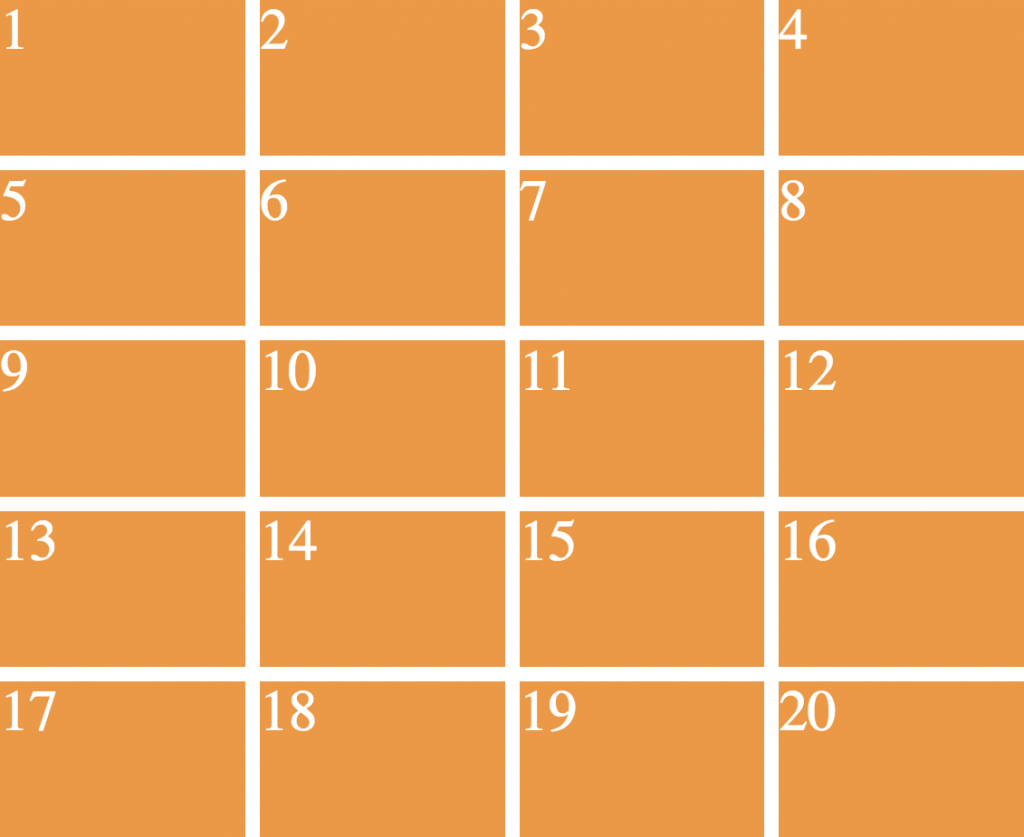
- 4 rows, 5 columns.
- Wrapper takes entire width and height of the page.
- Hint: set the UL to a height of 100vh. VH stands for viewport height (the height of the window)
Example 15
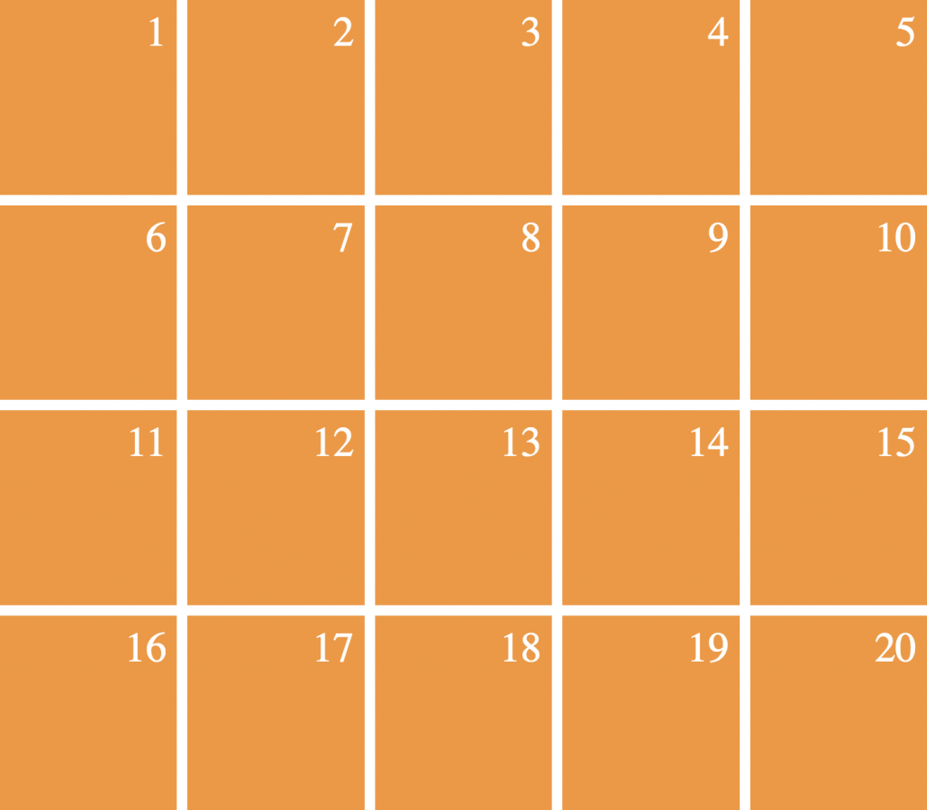
- Same layout as example 14, but item number is in top right of box.
- Add 1rem of padding, too.
Example 16
- Same layout as example 15, but text is in the horizontal and vertical center of the box
- Hint: this will require both grid and flex.
For layouts 20 – 23, use the file poem.html as your starting point. You will need to use grid and flex in these ones.
Example 20
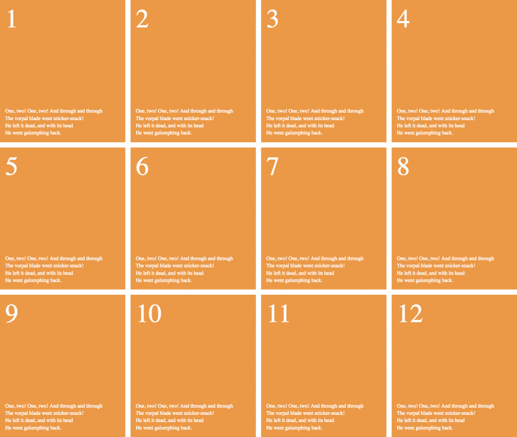
- Style it like in the screenshot. Don’t worry that the text is different than in the screenshot.
- Divide the items up such that they cover the entire page.
- Make the number be in the top left corner and the text be in the bottom left corner.
Example 21
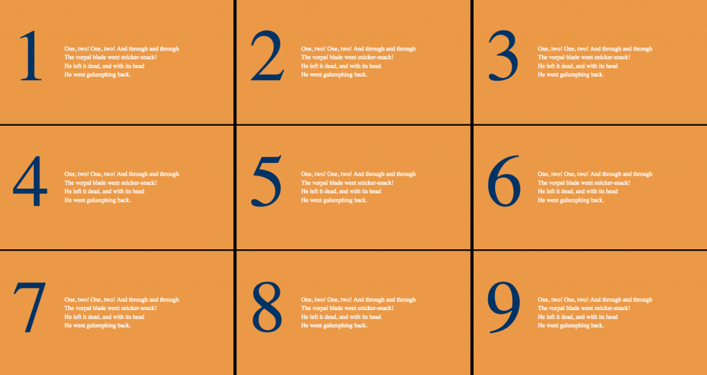
- Lay it out like in the screenshot. Do not push the content down with margin or padding: use flex properties.
Example 22
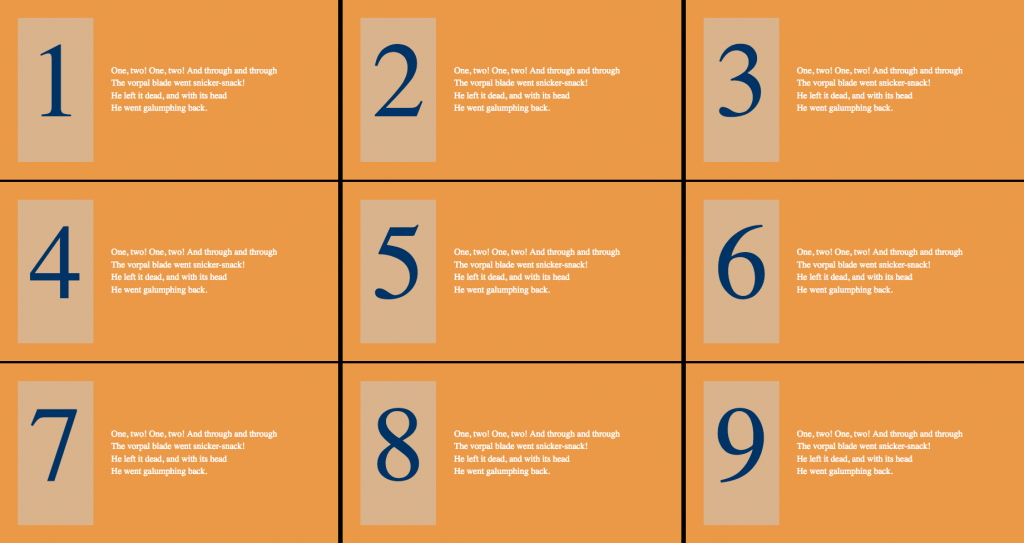
- Lay it out like in the screenshot
- Modify the design so that the item number has a light background.
- Have the number text centered vertically and horizontally in its box.
